 Government of India
 Contact Us


Project Background
The T App Folio serves as a crucial portal for citizens to access a wide array of services offered by the Government of Telangana. This platform enables users to obtain essential documents like Birth Certificates, Residence Certificates, and OBC Certificates. Additionally, it streamlines processes for bill payments, bookings, and donations, ensuring that the people of Telangana have seamless access to vital government services.
Objective
The objective is to comprehensively define the problems affecting the platform's usability, accessibility and visual design. By gathering and analyzing user feedback, the study aims to recommend effective solutions and improvements to enhance the overall user experience and satisfaction.
Challenges and Concerns:
The existing application design of T App Folio presents several issues, including usability concerns that hinder a seamless user experience and data security vulnerabilities that pose risks to sensitive information. Additionally, stakeholders face technical difficulties related to platform development, resource constraints that limit project capabilities, and the need to ensure regulatory compliance. Addressing these challenges requires teamwork, clear communication, and proactive problem-solving.
Research Phase
Information Architecture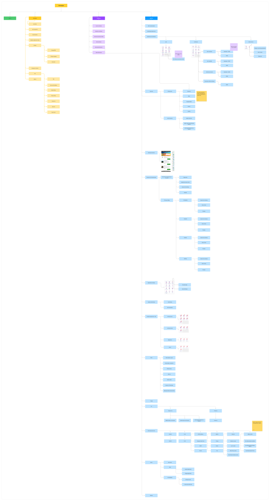
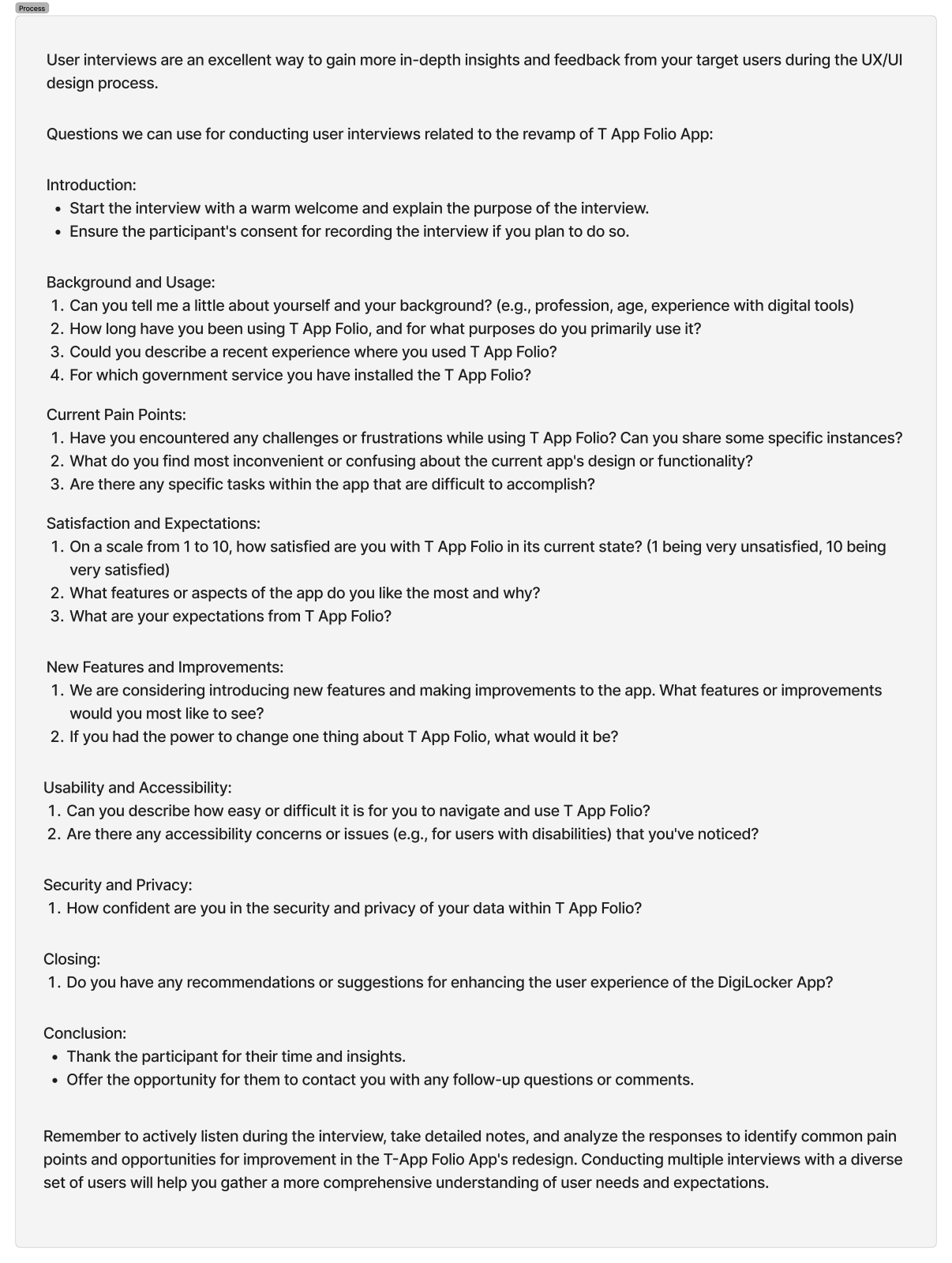
Usability Issues
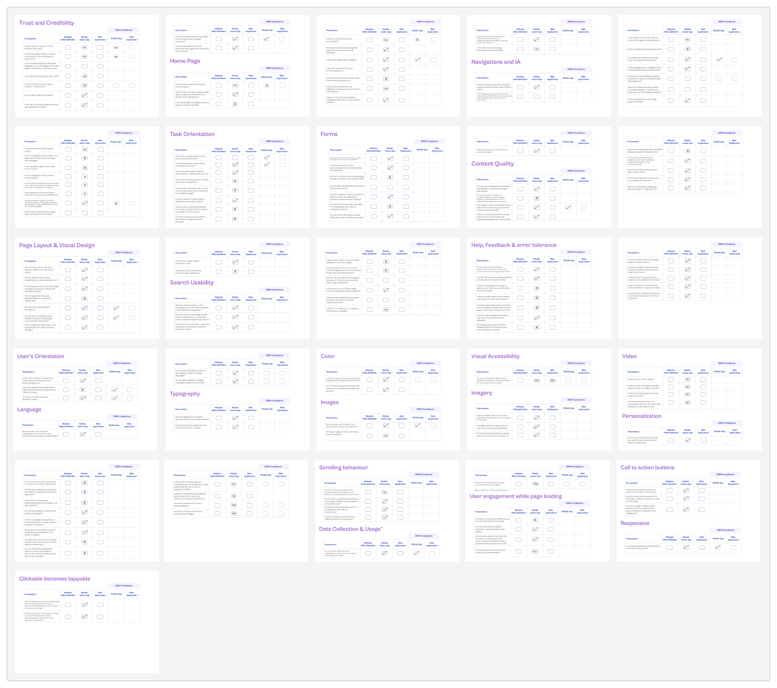
Section: Login and registration
- The limited language options restrict user preferences.
(User Control and Freedom) - The login screen uses input field designs that are not used anymore, this may create
potentially confusing user experience. Overall design is currently too overloaded in a
small card.
(Aesthetics and Minimalism) - The absence of real-time progress indicators or feedback during login may leave users
uncertain about the accuracy of their input. After filling in the mobile and MPIN and
clicking on the login CTA, users discover if one of the fields is incorrect,
highlighting the need for immediate feedback.
(Visibility of System Status) - iOS and Android, both devices feature distinct login screens, with Android offering
Indian and non-Indian options. Conversely, iOS devices lack this choice, indicating a
discrepancy in user experience between the two platforms.
(User Control and Freedom)
Unified Login Experience with Country-specific Options: To ensure consistency and inclusivity, the login screen on both iOS and Android platforms will be standardized. The options "Indian" and "Non-Indian" will be offered on both platforms to accommodate users' preferences. Additionally, a flexible login flow will be implemented, adapting based on the user's location when applicable, to enhance usability and accessibility.
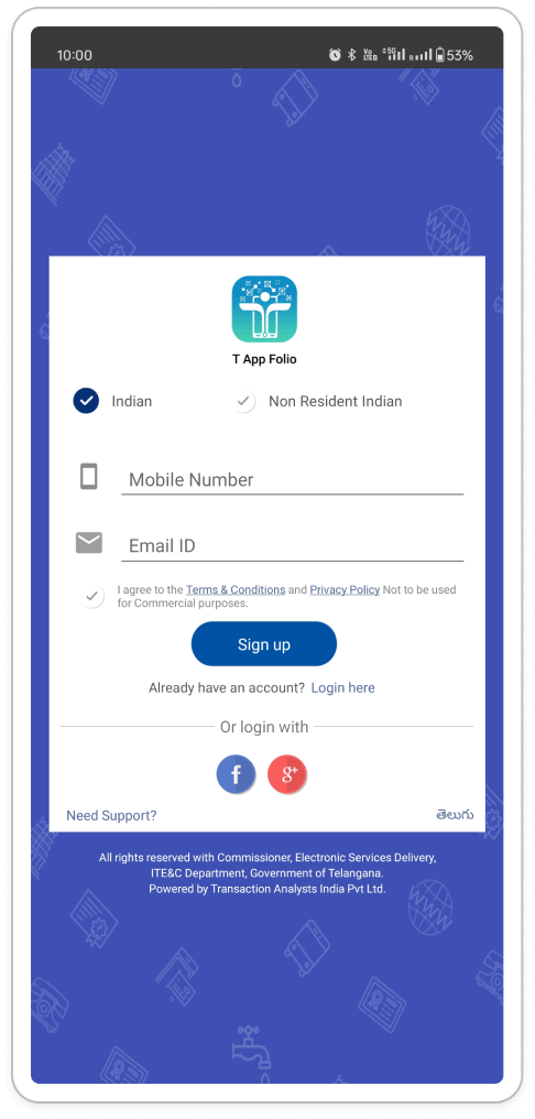
- Non-Default Language: When a user selects NRI, the language selection may not default to
English, which could cause confusion for users unfamiliar with the displayed language.
(Match Between System and the Real World) - Outdated Design: The login screen employs outdated input field designs, resulting in a
dated and potentially perplexing user experience.
(Aesthetics and Minimalism)
- Update Design: Implement modern and user-friendly input field designs for a more polished look and feel.
- Streamline Layout: Evaluate if the checkbox for terms and conditions can be visually integrated into the registration flow for a cleaner look.
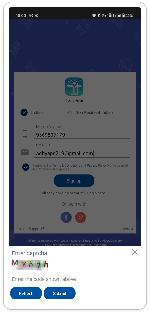
- Issues with the CAPTCHA and OTP Login Flow: The CAPTCHA functions as a security measure
to deter bots from logging in. However, since OTP verification is already in place in
the subsequent step, the CAPTCHA serves as an unnecessary obstacle for genuine users.
(User Control and Freedom) - Frustration and Inefficiency: Requiring both CAPTCHA and OTP verification can frustrate
users and consume unnecessary time.
(Efficiency and Usability)
- Evaluate CAPTCHA Necessity: Consider removing the CAPTCHA entirely if login attempts are not excessively high or if other security measures are in place.
- Prioritize OTP Verification: If a CAPTCHA is deemed necessary, prioritize it before the OTP step. This allows users to receive the OTP only after confirming they are not a bot.
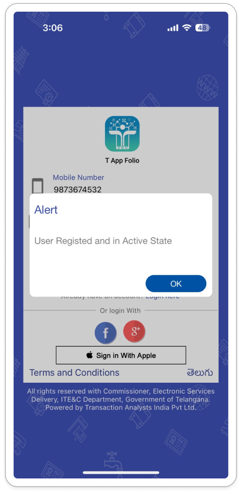
- Unclear Error Message: Users may find the current error message ("user registered and in
an active state") irrelevant to the CAPTCHA and insufficient in informing them about
incorrect input.
(Error Messages) - Lack of Alternative Solutions: Users facing difficulties in entering the CAPTCHA
correctly are not provided with alternative pathways for proceeding, potentially
resulting in frustration and abandonment of the login process.
(Help and Documentation)
- Specific Error Message: Ensure a clear and specific error message appears for incorrect CAPTCHA entries, such as "The CAPTCHA you entered is incorrect. Please try again."
- Consider Audio CAPTCHA: Explore the implementation of an audio CAPTCHA option to assist users with visual impairments or difficulty reading the visual CAPTCHA.
- Offer Refresh Option: Provide users with a "Refresh CAPTCHA" button, enabling them to obtain a new CAPTCHA image if they encounter difficulty reading the current one.
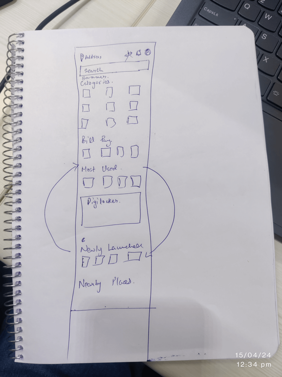
Section: Home page
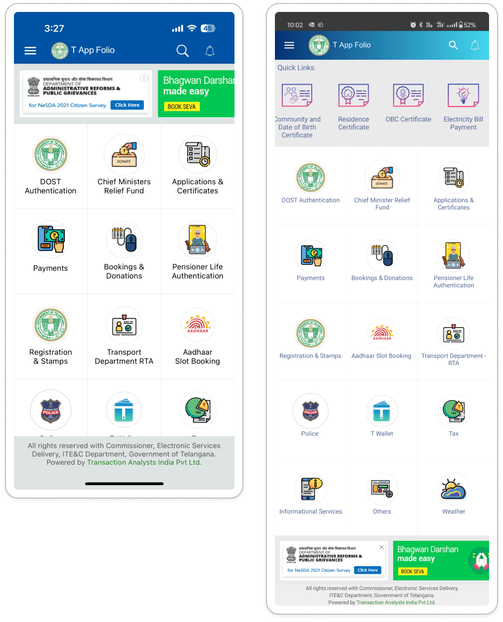
- Inconsistent Icons: Variations in icon styles may compromise visual consistency within
the interface. This lack of uniformity can contribute to a cluttered and unprofessional
appearance, potentially undermining user trust and confidence in navigating the app.
(Match Between System and the Real World, Consistency and Standards) - Absence of Confirmation for Hidden Banners: Users may inadvertently tap the close icon
on banners they wish to view, as there is no confirmation step before hiding them.
(Visibility of System Status) - Hidden Functionality: New users may not realize that tapping the app logo in the header
can restore hidden banners.
(Visibility of System Status) - Platform-Specific UI Inconsistencies: The UI layout varies between Android and iOS devices, affecting elements such as banner placement, quick link location, and app logo functionality. This inconsistency may confuse users accustomed to one platform when transitioning to another, leading to an uneven user experience across platforms.
- Consistent Icon Style Guide: Establish a standardized icon style guide that maintains uniformity in font family and visual style across all icons. This fosters a cohesive and intuitive user experience.
- Clear Confirmation for Hidden Banners: Provide a clear visual indication or message when users click the close button on a banner to signify that it has been hidden.
- Banner Management Settings for Users: Introduce a user setting or menu option allowing users to manage both hidden and displayed banners.
- Banner Management Upgrade: Enhance user experience by providing visual feedback upon closing banners and introducing banner management settings for users' control and customization.
- Platform Harmony Handbook: Aim for uniform layout across platforms whenever feasible. If specific layout elements necessitate platform-specific modifications, prioritize maintaining a consistent core user experience to uphold user familiarity.
- Enhanced Banner Restoration Recommendation: Add a subtle visual cue or tooltip near the app logo for Android users to indicate its function in restoring hidden banners. Maintain consistency by implementing banner restoration functionality for the app logo across both platforms, if possible.
Section: Tool Tip Walk Through
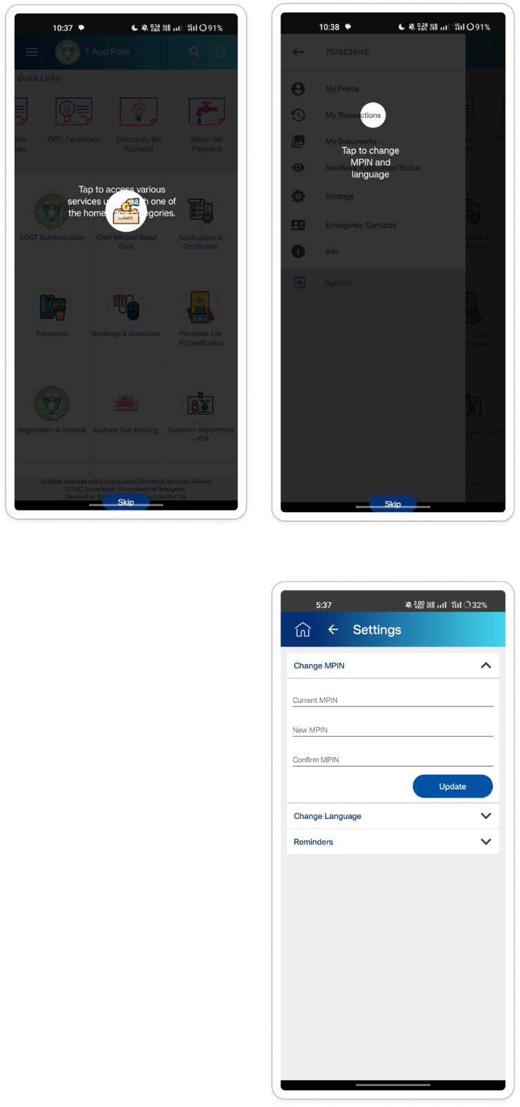
- Obscured Text: The guidance text for tooltips sometimes overlaps with the highlighted
icon, making it difficult or impossible for users to read.
(Match Between System and the First User) - Incorrect Placement: Tooltip placement might be inaccurate on some screens, directing
users' attention to the wrong area.
(Visibility of System Status) - Limited Reusability: Users might not be able to access tooltips for previously
encountered features later in the app.
(Visibility of System Status)
- Optimize Tooltip Design: Ensure tooltip text is clearly visible and positioned alongside the highlighted element without obstructing it.
- Review Tooltip Placement: Verify that tooltips accurately point to the feature or functionality they are explaining across all screens.
- Consider Alternative Onboarding Methods: Explore offering a skippable, interactive walkthrough or a dedicated "Help" section within the app to provide users with more readily accessible guidance on features.
Section: Side Menu/ Hamburger Menu
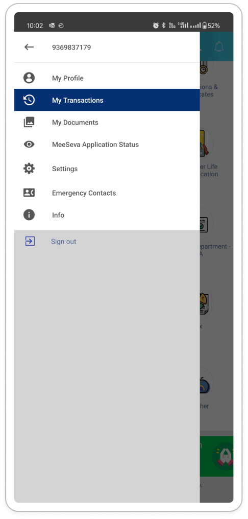
- Inconsistency in Mobile Number Behavior: Clicking the user's mobile number within the
hamburger menu yields different outcomes on Android and iOS platforms (Android:
non-clickable, iOS returns to home screen). This may confuse users and result in an
inconsistent experience across platforms.
(Consistency and Standards) - Inconsistent Menu Dismissal Behavior: Tapping outside the hamburger menu closes the menu
on Android but leaves it open on iOS. Inconsistency can violate user expectations and
lead to confusion. Users accustomed to one platform's behavior might be surprised by the
other.
(Consistency and Standards) - Redundant Home Icons and Unclear Back Button Functionality: Within pages accessed via
the hamburger menu, both a home icon and a back arrow are present. Selecting either
returns the user to the home screen, whereas the back button ideally should navigate
back to the previous menu level. This unclear functionality can lead to user confusion
while navigating the app.
(Clarity and Efficiency) - Sign Out Button Inconsistency: The "Sign Out" option within the hamburger menu displays
a distinct background color compared to other menu items. Positioned above a grey
background, it contrasts with the clear white background of other options. This visual
inconsistency can make the "Sign Out" option appear disconnected from the menu.
(Visual Consistency)
- Consistent Mobile Number Behavior and Profile Access: Ensure uniform behavior of the mobile number across platforms by making it non-clickable within the menu. Additionally, contemplate incorporating a profile section within the menu, granting users access to their profile information, including the phone number, as required.
- Uniform Menu Dismissal Action: Ensure consistency in menu dismissal across Android and iOS by implementing a universal action were tapping outside the menu closes it on both platforms.
- Enhancing Navigation Efficiency: Adjust the back button functionality to navigate users back to the previous level within the hamburger menu hierarchy, rather than returning them all the way to the home screen.
- Consistent Background Color for Menu Options: Ensure uniform background color for all menu options, including "Sign Out." This promotes visual cohesion within the menu and reduces confusion for users.
Section: Home Screen weather
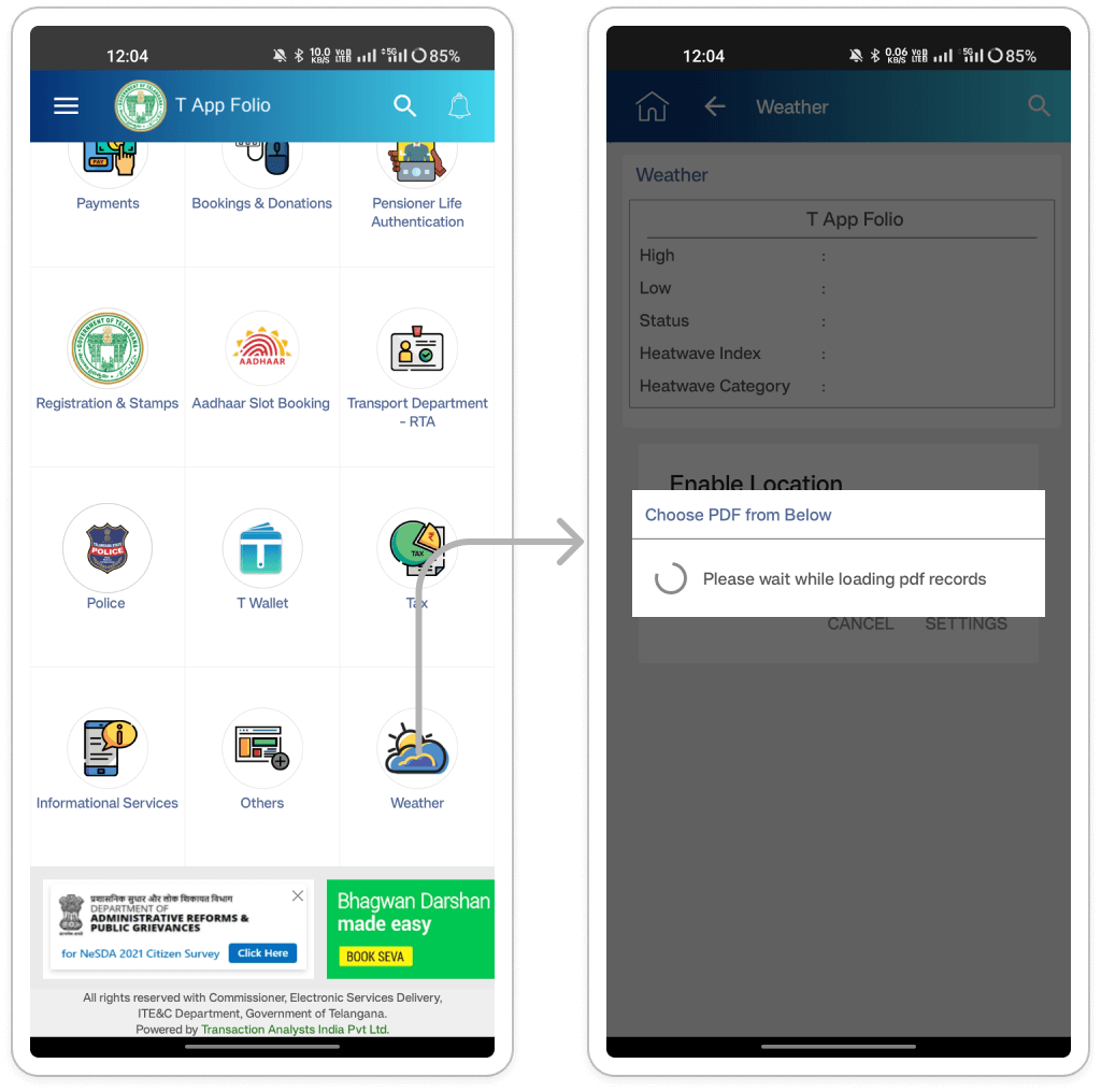
- Unnecessary Loading Pop-up: An intrusive loading pop-up appears even when no PDF records
are available, potentially frustrating users.
(Efficiency and Usability) - Missing Pop-Ups: The absence of pop-ups observed on iOS leads to inconsistency across
platforms. Users may anticipate these prompts based on their experiences elsewhere in
the app.
(Consistency and Standards)
- Evaluate Pop-Ups: Assess the relevance of the loading pop-up on Android. If it fails to provide significant value, contemplate its removal.
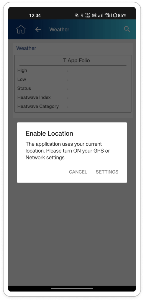
- Redundant Location Permission Request: The presence of multiple modal pop-ups can
frustrate and confuse users, resulting in an overall poor user experience. Additionally,
the app continues to request location permission even after users have already enabled
it in their device settings.
(User Control and Freedom) - Location Permission Handling on iOS Devices: The method for managing location
permissions on iOS is unclear. Ideally, the app should prompt users to grant permission
if it has not already been provided.
(Match Between System and the Real World)
Improved Location Permission Handling Recommendation: Introduce a location detection mode to determine if the user's device already has location detection enabled. This helps avoid redundant permission requests and enhances user experience.
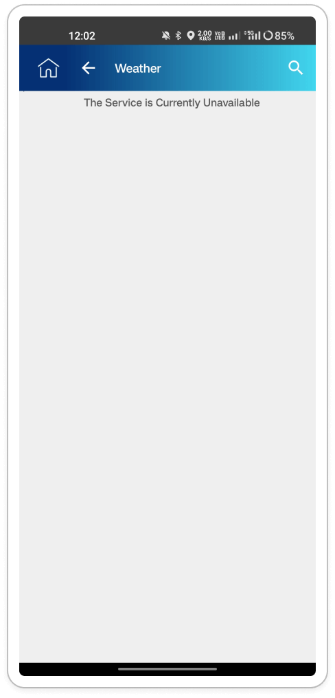
- Weather Service Unavailability: Presently, the app lacks weather service functionality
on Android devices.
(Visibility of System Status) - Weather Service Unavailability: Similar to Android, the weather service functionality is
presently unavailable on iOS devices.
(Visibility of System Status)
- Fix Weather Service: Resolve the underlying issue causing the weather service malfunction across both platforms. (May be a development bug)
- Clear Error Messages: Implement clear and informative error messages in case of weather service unavailability. These messages should explain the reason and provide potential solutions, such as retrying later.
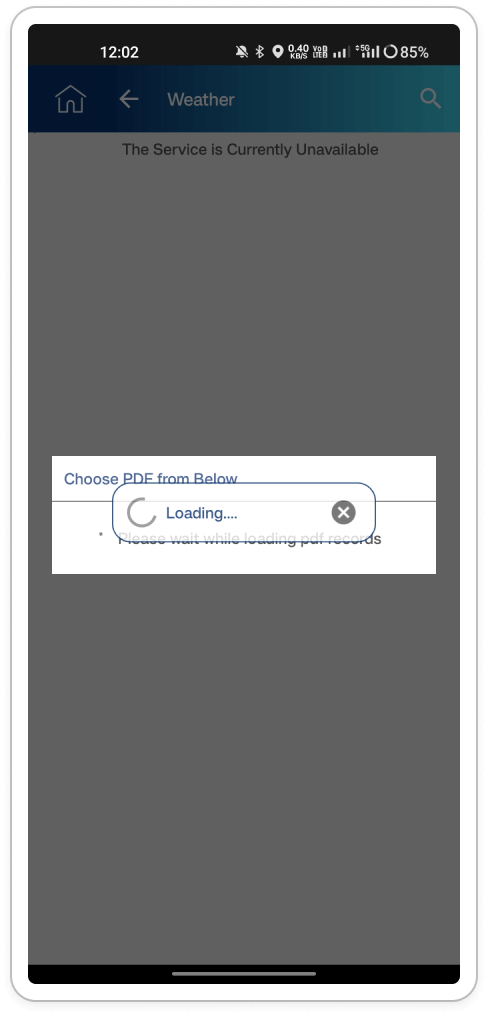
Inconsistent Modal Display: The loading screen inconsistently overlays the modal card,
leading to a visually confusing experience.
(Aesthetics and Minimalism)
- Explore Alternative Layouts: Investigate alternative layouts that subtly indicate loading activity while maintaining the visibility of the modal card. Options include dimming the background of the modal card during data retrieval or displaying a discreet loading indicator within the card itself, such as an animated icon.
- Utilize In-Card Progress Indicators: Incorporate progress indicators directly within the modal card, such as a progress bar or spinner, to inform users about the loading process without obstructing the weather data.
Section: Tax Walkthrough
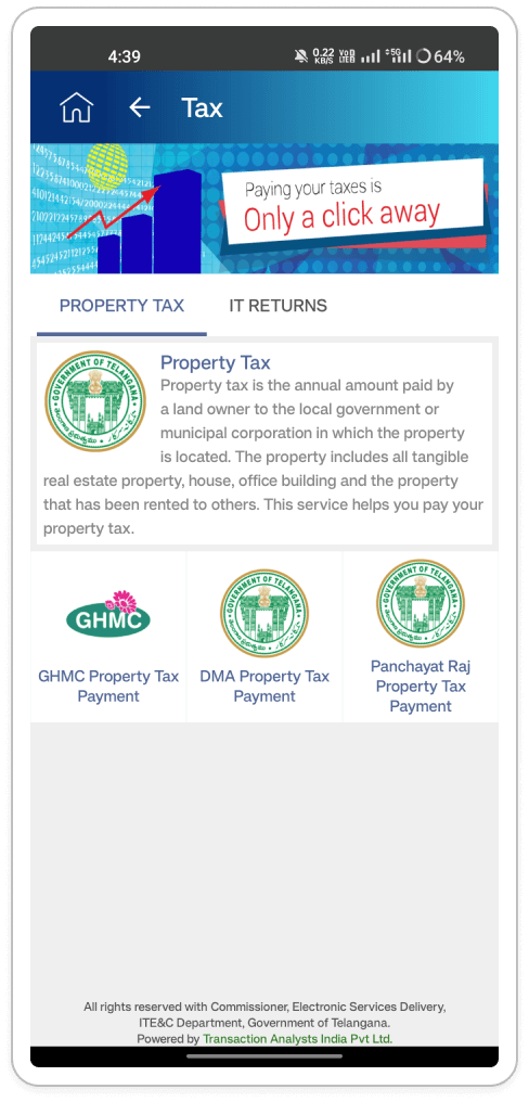
Inconsistent text alignment within the "Property Tax" card on the Tax page: Users who are
trying to learn more about property tax are likely to be confused by the misaligned text
within the "Property Tax" card. The text starts aligned to the right next to the image but
then abruptly switches to left alignment and continues below the image. This inconsistency
might make it difficult to read and scan the information.
(Readability )
- Maintain Consistent Text Alignment: Choose a single alignment style (either left or right) for the entire text block within the card to create visual coherence and improve readability.
- Consider Text Wrapping: If the text exceeds the width of a single line next to the image, consider wrapping it to fit the card's designated space. Alternatively, use an ellipsis (...) to indicate truncated text and a "See More" link to allow users to view full details.
- Left Alignment is Preferred: For longer text blocks, prioritize left alignment as it aligns with natural reading patterns, especially for users accustomed to left-to-right languages.
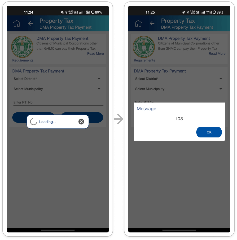
- Streamline Modal Experience and Improve Error Messaging: Users encounter consecutive
modal popups ("loading" and "message") before accessing the payment page, disrupting the
user flow. Users paying DMA property tax face frustration with unnecessary loading and
message modals, hindering task completion.
(Efficiency of use) - Vague Error Message: The "message" modal displays the cryptic code "103," causing
confusion for users. Users encounter the uninformative "103" code in the "message"
modal, leading to frustration and confusion.
(User error prevention)
- Enhancing Modal Functionality and Error Handling: Consolidate modal functions or integrate progress indicators directly within the page to streamline the user experience. Eliminate the "message" modal if it lacks pertinent information for users and restrict the display of troubleshooting code "103" to internal users or system administrators for enhanced security.
- Improving Error Messages and Providing Additional Context: Replace the cryptic "103" error code with a clear error message that explains the issue and offers potential solutions. Also, include a "Help" or "Learn More" option in the error message to give users additional context and guidance.
Redundant headings in the app header and on the page itself: Users who are trying to navigate
the "DMA Property Tax Payment" page are presented with redundant information. The app header
displays both "Property Tax" and "DMA Property Tax Payment" headings, and the same
information is repeated as a heading on the page itself. This repetition can be confusing
and create information overload.
( Clarity and transparency)
- Simplify the App Header: Since "DMA Property Tax Payment" is a more specific sub-category of "Property Tax," consider removing the general "Property Tax" heading from the app header on this specific page. This will leave only the relevant "DMA Property Tax Payment" heading, providing a clear indication of the user's location within the app hierarchy.
- Heading Hierarchy: If there's a need to keep both headings in the app header for overall context, consider using a visual hierarchy to differentiate them. For example, make the "Property Tax" heading smaller or use a lighter font weight to signify it's a broader category.
- Consider Breadcrumbs: Another option is to introduce breadcrumbs at the top of the page. This would show the user's current location within the app's hierarchy (e.g., Property Tax > DMA Property Tax Payment) without needing both headings in the app header.
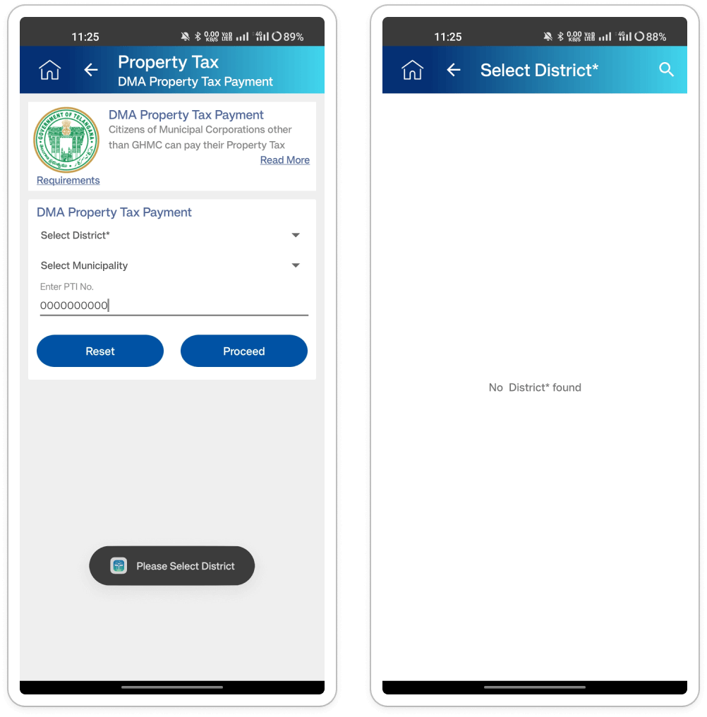
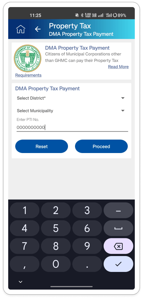
Dropdown Misbehavior: Selecting the "select district" dropdown navigates the user to a new
page (with the heading of Select District*) instead of displaying the options within a
dropdown menu on the same page. Users who are trying to select their district for property
tax payment are surprised and inconvenienced when clicking on the "select district"
dropdown. Instead of displaying options, it takes them to a new page, disrupting the flow
and requiring an additional click to make the selection.
(Match between system and the real world)
Fix the dropdown functionality: The dropdown should display its options within the same page when clicked, not navigate to a separate page. This aligns with user expectations for dropdown menus.
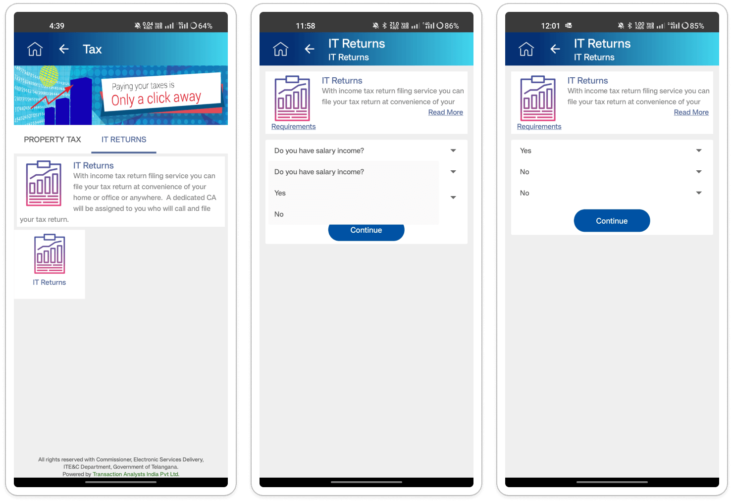
- Redundant Headings: The "IT Returns" text appears twice - once in the header bar and
again as
a heading on the page itself. Users who navigate to the "IT Returns" section are
presented
with redundant information. This repetition creates unnecessary clutter and reduces the
clarity of the page.
(Clarity and transparency) - Missing Dropdown Label Clarity: After selecting items from the dropdown menus, there's
no clear way to identify which option was chosen due to the absence of labels. Users who
make selections from the dropdown menus are unsure which options they've chosen because
the selected items lack labels. This creates confusion and makes it difficult to confirm
choices or make changes.
(Visibility of system status )
- Simplify Header Bar Text for Improved Clarity: Remove one instance of "IT Returns" from the header bar, ideally removing the text altogether. As users navigate to the "IT Returns" section, it's redundant to display this text in the header, as their current location is evident from the navigation path. This reduction in redundancy enhances clarity and reduces visual clutter in the interface
- Implement a dynamic layout adjustment: When the dropdown opens, the page content should shift or resize to ensure the options remain visible below.
- Consider alternative dropdown placements: If adjusting the layout isn't feasible, explore alternative positions for the dropdown menu (e.g., opening upwards instead of downwards) to minimize overlap with other elements.
- Improving Dropdown Menu Interaction and Selection Visibility: Display the selected item's label next to the dropdown menu for immediate confirmation of the chosen option. Additionally, for lengthy selections, truncate the text with an ellipsis (...) and provide a "See More" option to reveal full details. This approach enhances user confidence and maintains clarity, particularly with longer selection labels.
Section: Others
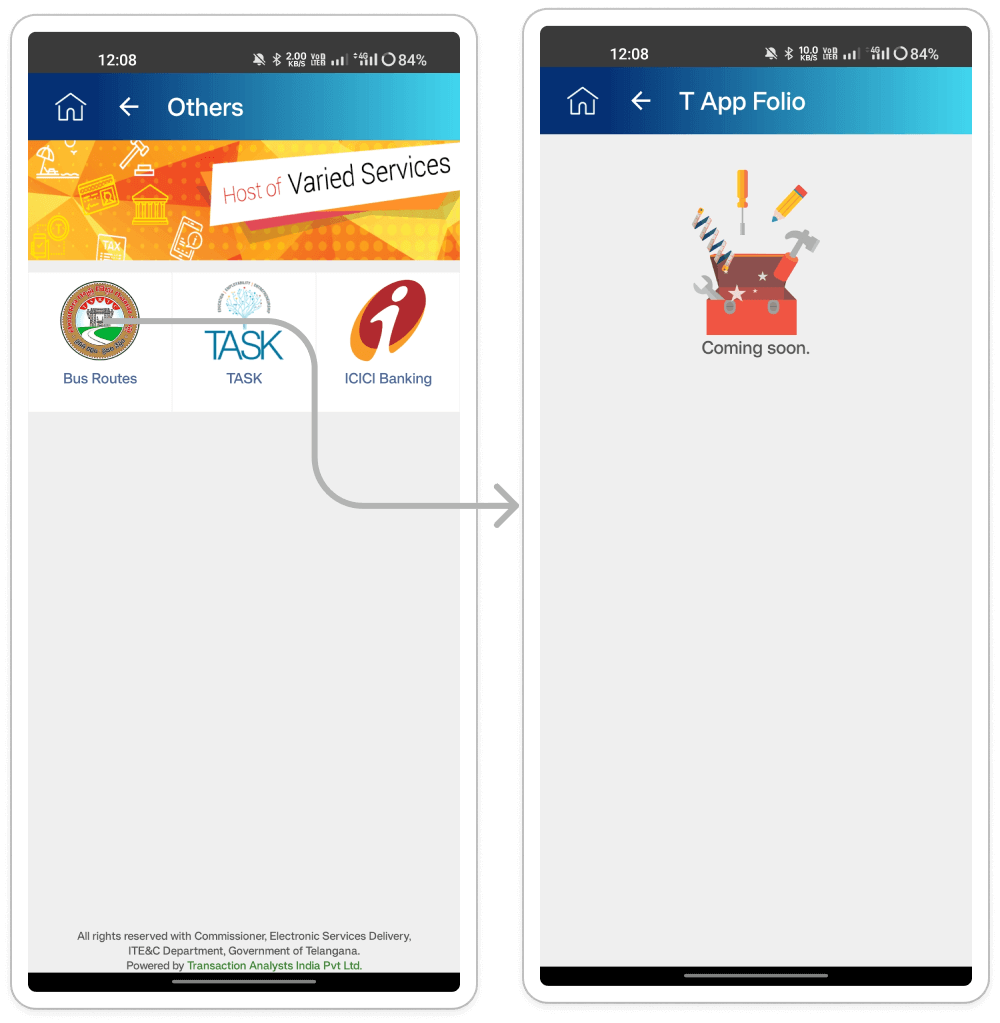
- Inaccurate Header on "Bus Routes" Page: The app header displays "T App Folio" on the
"Bus Routes" page, even though the user has specifically navigated to the "Bus Routes"
section. Users who navigate to the "Bus Routes" page are misled by the generic "T App
Folio" header. This inconsistency creates confusion and makes it difficult for users to
understand their current location within the app.
(Match between system and the real world) - Uninformative "Coming Soon" Page: Clicking on "Bus Routes" leads to a page with an
illustration and the text "Coming Soon," offering no further information or alternative
options. Users who are interested in using the bus route functionality are disappointed
and frustrated to encounter a generic "Coming Soon" message. It provides no clear
indication of when the feature will be available or what functionalities it might offer.
( User centered design )
- Improving App Header Clarity on the "Bus Routes" Page: Update the app header on the "Bus Routes" page to display "Bus Routes." This adjustment accurately reflects the user's current location and provides a clear mental model of the app's hierarchy.
- Improving the "Coming Soon" Page : Enhance the "Coming Soon" page by providing a more informative message about the bus route functionality, such as "The bus route feature is currently under development and will be available soon." Include an estimated launch date, if possible, to manage user expectations. Additionally, offer alternative options within the app for users to explore while waiting for the bus route feature, if applicable.
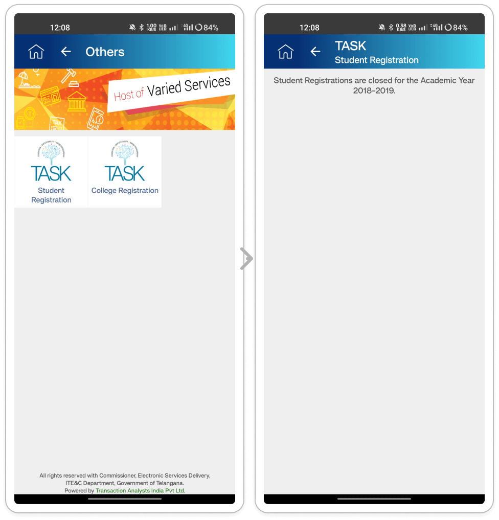
- Text Inconsistency: The text for "Student Registration" and "College Registration" is
displayed inconsistently. "Student Registration" breaks across two lines, while "College
Registration" fits on one line. Users who navigate to the "TASK" page encounter visually
inconsistent text formatting. This creates a cluttered and unprofessional appearance,
potentially reducing user trust and confidence in the application.
(Aesthetic and minimalist design) - Outdated Information and Lack of Guidance: Clicking on either registration option leads
to a message stating, "Students Registrations are closed for the Academic Year
2018-2019." This information is outdated, and there's no indication of when
registrations will open again. Users who attempt to register are met with irrelevant and
outdated information, leaving them frustrated and without any guidance on when
registrations might resume.
(Error prevention)
- Standardize text presentation: Choose a consistent formatting style for both "Student Registration" and "College Registration." This could involve adjusting font size, line spacing, or alignment to ensure both entries fit on a single line or break identically across lines.
- Consider using a grid system: Implementing a grid system within the design can help ensure consistent spacing and alignment of text elements throughout the application.
- Update registration information: Replace the outdated message with accurate and current information. If registrations are closed, consider displaying the expected reopening date or semester.
- Aiding When Registrations Are Closed: In cases where registrations are closed, offer alternative options to assist users. For example, provide links to relevant resources or websites for registration information. Additionally, consider implementing a notification system to alert users when registrations reopen. These measures ensure users stay informed and engaged, even during registration downtimes.
Section: Police
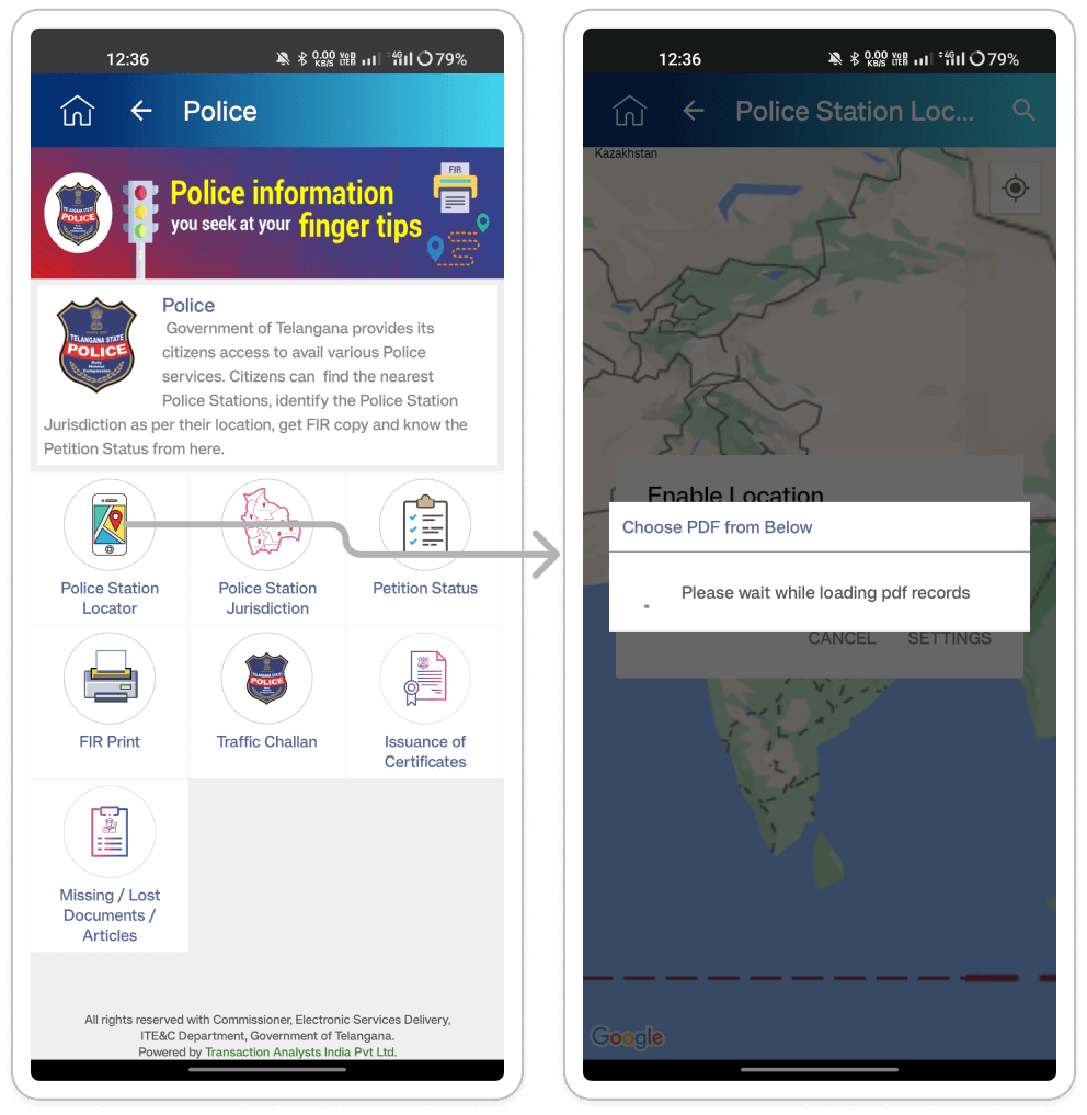
Inconsistent and irrelevant modal popups appearing across multiple services: Users who
navigate to various service pages, such as "Police Station Locator," are interrupted by
unexpected and irrelevant modal popups like "choose PDF from Below" with no PDFs available
for selection. These unnecessary modals disrupt the user flow, create confusion, and hinder
task completion.
(User control and freedom)
- Contextual Modal Usage: Analyze the functionality of each service and eliminate modals that are irrelevant to the specific task. The "Police Station Locator" service has no relation to selecting PDFs, so the "choose PDF from Below" modal should be removed entirely from that context.
- Prioritize User Flow: Modals, if necessary, should be introduced only when essential for completing a task or conveying critical information. They should not impede the primary flow of using the service
- Clear Modal Labeling: Ensure that any remaining modals have clear and concise labels that accurately reflect their purpose. This helps users understand the purpose of the modal and make informed decisions about interacting with it.
- Consider Alternative Approaches: In some cases, modal popups might not be the best solution. Explore alternative methods for conveying information or prompting user actions, such as inline messages or tooltips that appear on hover.
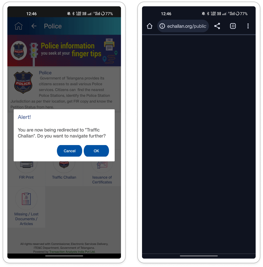
Addressing Inconsistent Navigation in the T App Folio Application: Users experience
inconsistent navigation behavior within the app, particularly with services like CM Relief
Fund and Police (Traffic Challan). Some services open dedicated in-app pages, while others
redirect to external websites. Additionally, certain services trigger a confirmation modal
before redirection. This inconsistency leads to confusion and frustration, hindering users
from accessing specific functionalities seamlessly.
(Consistency and standards)
- In-App Navigation: Enable seamless navigation to dedicated pages for services with native functionalities within the app. Avoid website redirection or confirmation modals to enhance user experience.
- Website Redirection: For services reliant on external websites, inform users clearly before redirecting them. Minimize website redirection whenever possible and prioritize offering functionalities within the app itself for a smoother user journey.
- User Transparency: Regardless of the navigation approach, be transparent with users about where they're going. For in-app navigation, the user flow should be clear and intuitive. For website redirections, display a clear and concise message informing users they'll be leaving the app and provide context about the external website.
- Reduce Confirmation Modals: The confirmation modal for "Traffic Challan" can be confusing. If the decision is to redirect users to a website, eliminate the confirmation and simply redirect with a clear message. If "Traffic Challan" has functionalities within the app, remove redirection altogether and allow users to access them directly within the T app folio application.
section: Information services
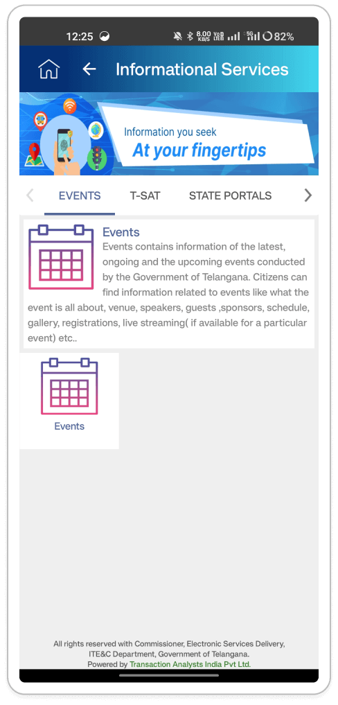
- Addressing Redundant Navigation Elements in Information Service Pages: Within the header
section of all internal Information Service pages, redundant navigation elements are
present, both a home icon and a back arrow. However, these icons serve different
navigation functions. The home icon navigates users back to the home screen, while the
back arrow takes them to the previous page. This redundancy can clutter the interface
and confuse users, who may be unsure which icon to use or why both are present.
(Clarity and Efficiency) - Text and Icon Alignment Issues on Event Page: The text on the event page wraps
awkwardly around some part of the icons, creating a visually unappealing and potentially
confusing layout. Poor text and icon alignment can make the content difficult to read
and scan.
(Aesthetics and Minimalism) - Inconsistent Card Design for Event Tab: The clickable event tab resembles a card design
visually, but it lacks proper spacing from the corner of the screen and appears separate
from the Event Information card. This inconsistency in card design can disrupt the
user's visual flow and create confusion about how to interact with the event tab.
(Consistency and Standards)
- Streamlining Navigation Elements in Information Service Pages: To streamline navigation and reduce confusion, consider removing one of the navigation elements. The back arrow alone should suffice for navigating within the Information Service hierarchy. Users can access the home screen from any point within the app using either the hamburger menu or the system-level back button on mobile devices.
- Improve Visual Consistency of Event Tab Design: To enhance the clarity of the event tab, ensure it maintains a distinct appearance from other card elements on the page. Consider using different background colors, borders, or subtle shadows to differentiate it. Additionally, adjust spacing to create a clear separation between the event tab and surrounding content.
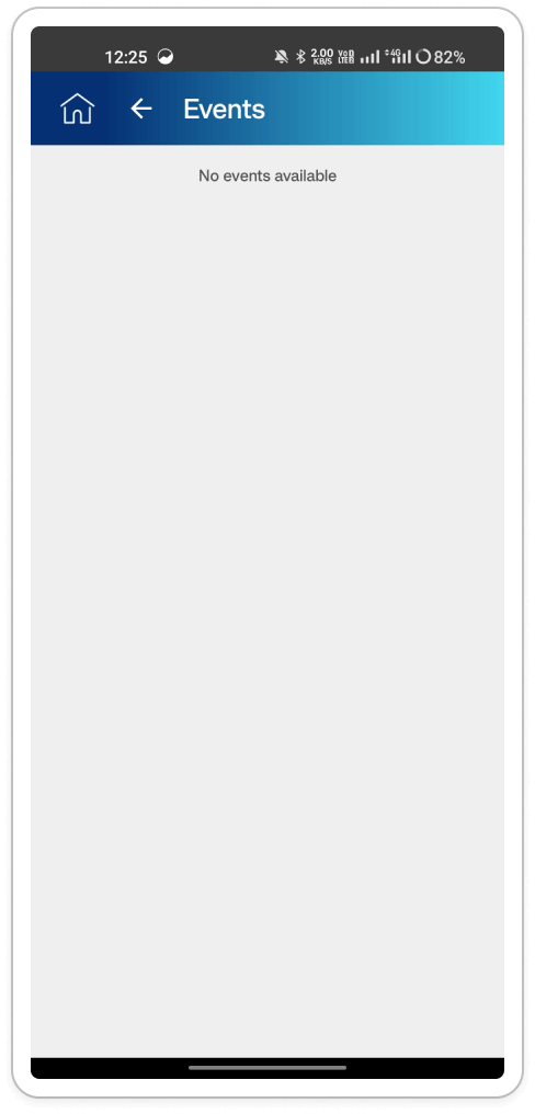
Empty Event Page: Clicking the Event tab within Information Services might result in a blank
screen displaying the message "No event is available." This empty screen can frustrate users
and leave them uncertain whether there are genuinely no events or if there's an issue with
the app.
(Visibility of System Status)
- Informative Empty State: When no events are available, present users with a helpful message apologizing for the inconvenience and explaining the situation (e.g., "There are currently no upcoming events. Please check back later for updates.").
- Alternative Actions (Optional): Explore additional options on the empty state screen, such as allowing users to subscribe for notifications when new events are added or providing a link to a calendar of past events (if applicable).
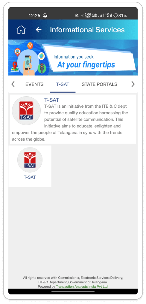
T-SAT Tab Design: Clicking on a chip with horizontal scroll functionality, possibly featuring
a call-to-action button, directs users to a T-SAT tab designed to resemble a card element.
This inconsistency in visual design may cause confusion regarding its interactivity. The
unclear design of the T-SAT tab impedes user comprehension and diminishes user engagement.
(Match Between System and the Real World)
Distinguish T-SAT Tab: Ensure the T-SAT tab has a clear visual distinction from surrounding card elements. This could involve using different colors, borders, or subtle hover effects to indicate its clickable nature.
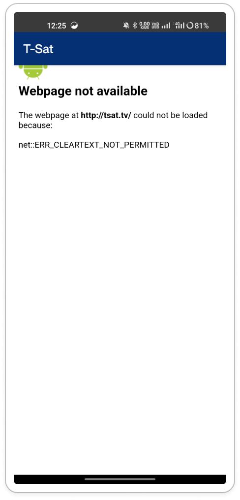
T-SAT Unavailability: Clicking the T-SAT tab results in a "webpage not available" error message within the app. The generic "webpage not available" error message is unhelpful and leaves users frustrated. It doesn't explain the situation or offer alternative solutions.
Recommendations:Clear T-SAT Unavailability Message: Replace the generic error message with a clear and informative one when the T-SAT feature is unavailable. This message should explain the current unavailability of the T-SAT functionality within the app and provide alternative solutions or explanations. For example, "The T-SAT feature is not available now." Stay tuned for updates on its availability!" or "To access T-SAT, please visit the official T App Folio website."
Section: Aadhaar Slot Booking
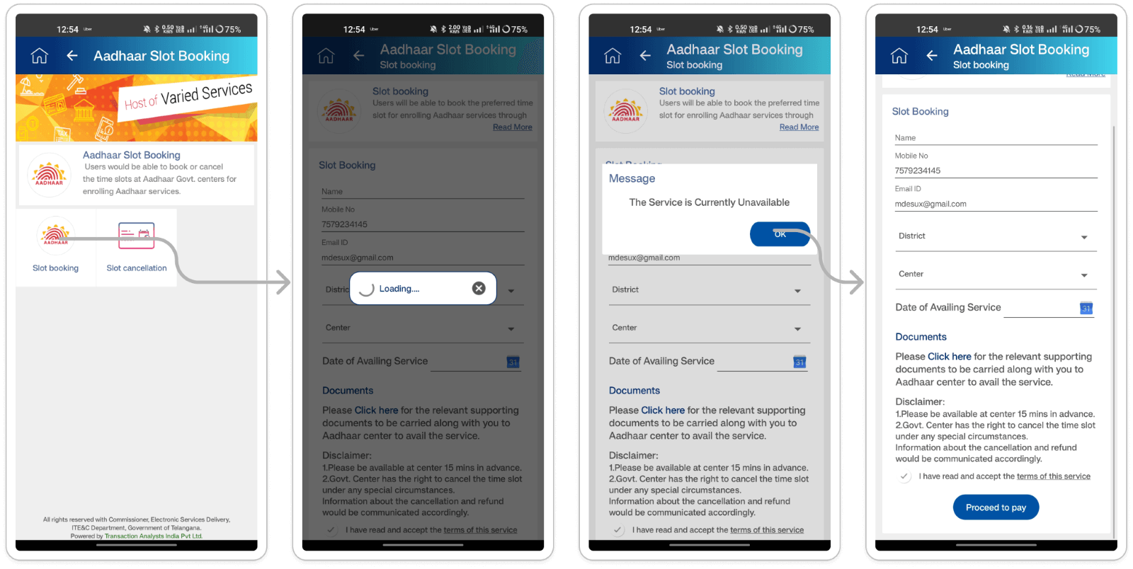
- Redundant Headings: The app header displays two headings on the "Aadhaar Slot Booking"
page. Users who navigate to the "Aadhaar Slot Booking" page encounter redundant
information in the app header. This creates visual clutter and reduces the clarity of
the page.
(Clarity and transparency) - Unnecessary Modals: The user encounters two consecutive modals ("loading" and "message")
before reaching the slot booking page, even though the service is unavailable. Users are
unnecessarily interrupted by a loading modal and then a message modal informing them the
service is unavailable. This creates frustration and disrupts the user flow.
(Efficiency of use)
- Combine or eliminate modals: If the loading modal serves no purpose other than indicating the page is loading, it might be redundant. Consider combining it with the message modal or displaying a progress indicator directly on the page.
- Prioritize the message: Display the "service currently unavailable" message prominently on the page itself without requiring users to go through a loading modal first. This provides immediate information and reduces unnecessary steps.
Section: Pensioner Life Authentication
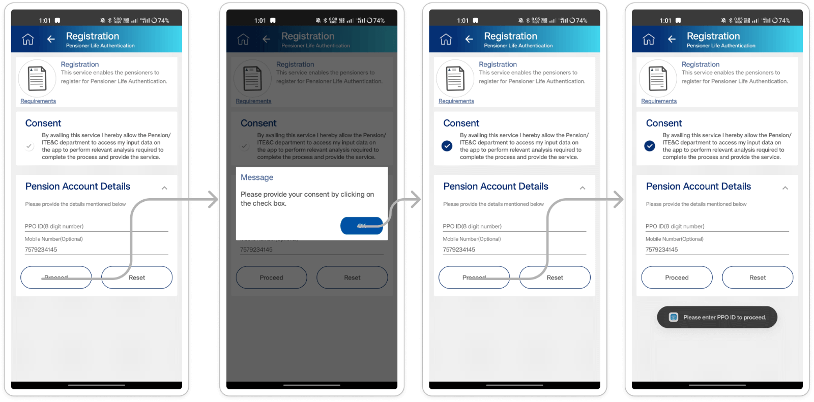
- Unclear Consent Checkbox: The consent checkbox appears pre-checked and lacks visual
clarity, making it difficult for users to understand its purpose and whether it's
already selected. Users who encounter the registration page might miss the consent
checkbox entirely or be unsure of its state (checked or unchecked). This can lead to
accidental non-consensual registration or confusion about the user's agreement.
(Visibility of system status) - Inconsistent Error Messaging: The app uses different methods to display error messages
for missing information. In some cases, a modal appears, while for others, a snack bar
notification is used. This inconsistency creates confusion for users. They might miss
important error messages displayed in snack bars, especially if they're not actively
looking for them.
(Consistency and standards)
- Implement a clear and visible checkbox: Use a design that clearly indicates whether the checkbox is checked or unchecked. Consider using a square checkbox that visually changes state (e.g., empty or filled) upon clicking.
- Add a label to the checkbox: Include a concise label next to the checkbox that explains its purpose (e.g., "I agree to the terms and conditions"). This provides context and helps users understand the implications of checking the box.
- Standardize error message presentation: Choose a consistent approach for displaying error messages throughout the registration process. Modals might be more suitable for critical errors that prevent progress (e.g., missing consent), while snackbars could be used for less critical information (e.g., optional fields).
- Consider severity of errors: Prioritize the use of modals for errors that block progress and snackbars for optional information or minor inconsistencies.
Section: Payments
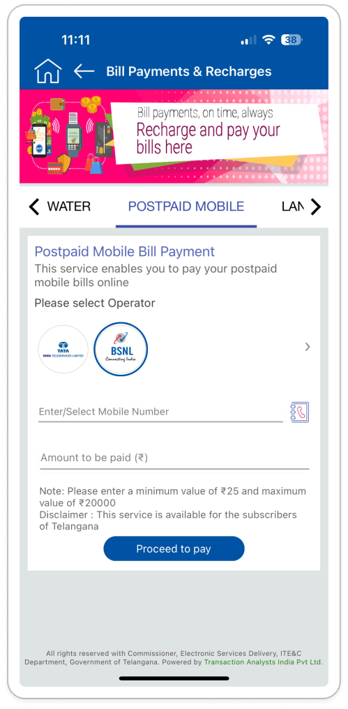
Oversized Input Field for Bill Payment Numbers: The input field for unique bill payment numbers allows users to enter up to 21-23 digits, surpassing the typical limit of 13 digits for most bills. This lack of restriction poses risks:
- User Error: Excessive digits may lead to failed payments.
- System Disruption: Extra digits could disrupt system validation processes for bill
payment numbers.
(Match Between System and the Real World, Error prevention.)
- Input Mask or Placeholder Text: Implement an input mask or placeholder text within the field that displays the expected number format (e.g., "XX-XXXX-XXXXXX" or "13-digit Unique Number"). This visually guides users towards entering the correct number of digits.
- Enforce Input Validation: Disable entry of extra digits beyond the expected length (typically 13 digits) and provide clear error messages for any attempts exceeding this limit.
- Utilize Max Length Attribute: Set the "max-length" attribute to 13 characters in the input field to enforce the desired length limit and prevent users from entering more digits than necessary.
-
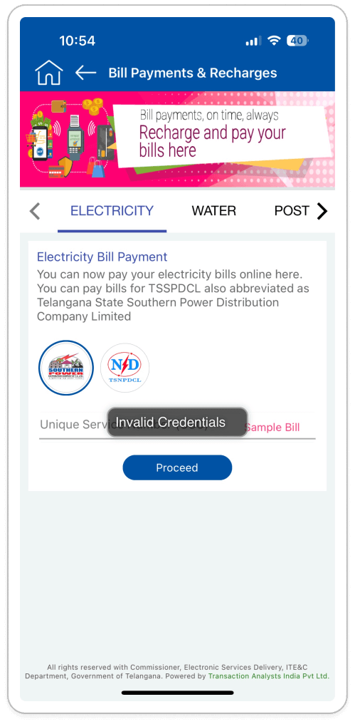
Unclear Tab Visibility for Payment Options: Tab buttons for switching between different
payment options within the same service lack clear visual prominence. Users might not be
aware of the currently selected payment option. Poor tab visibility can lead to
confusion and accidental selection of the wrong payment option. Users might not
understand the available options or struggle to identify their current selection.
(Visibility of System Status, User Control and Freedom) -
Confusing Error Message on Tab Switch Issue: Clicking a tab to switch payment options
sometimes triggers a temporary "invalid credential" snack bar error message that
disappears quickly. This fleeting error message is confusing and disrupts the user's
flow. It doesn't provide clear context or allow users to understand the issue or take
corrective action.
(Visibility of System Status, User Control and Freedom)
- Improving Tab Button Visibility by Enhancing Visual Design: Use bolder colors, distinct borders, or identifiable icons to make tab buttons more visually prominent and easier to distinguish from each other.
- Highlight Selected Tab: Implement a different visual style for the currently selected tab to provide clarity and indicate the active state to users.
- Revise Error Messages: Refrain from showing irrelevant "invalid credential" alerts during tab switching. Instead, reserve such messages for genuine credential issues.
- Enhance User Guidance: Implement persistent and informative error messages that explain the problem and offer actionable solutions, such as prompting users to log in again or update their credentials.
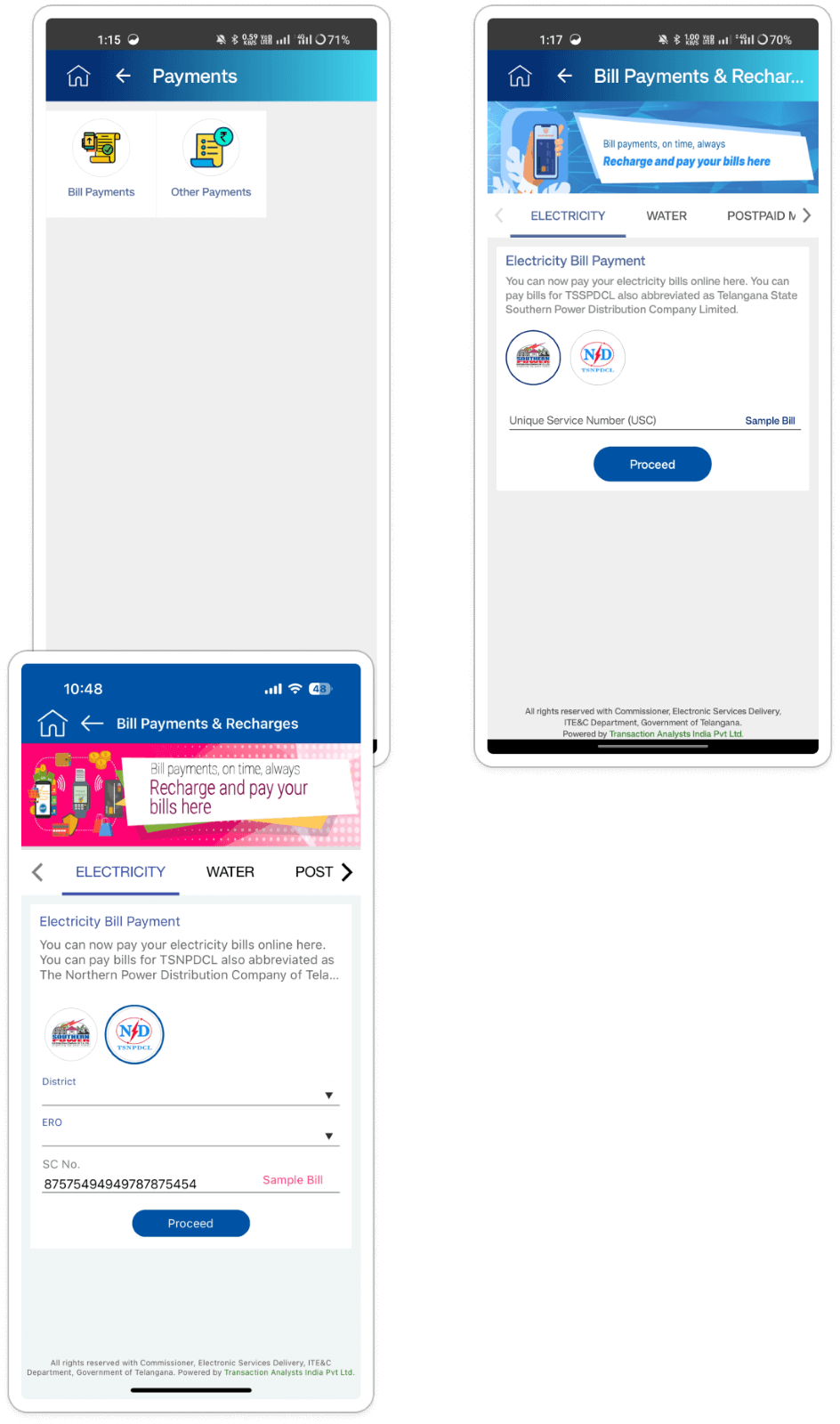
Electricity Bill Dropdown Navigation Issue: Electricity Bill Dropdown Navigation: Clicking on
the electricity District and ERO label within the bill payment page doesn't activate a
traditional dropdown menu. Instead, it navigates users to a separate page for option
selection, disrupting the expected flow. This unconventional behavior may confuse users,
requiring them to navigate back and forth for selection.
(Match Between System and the Real World)
Implement a Standard Dropdown Menu: Replace the current behavior with a traditional dropdown menu that expands or collapses within the electricity bill page itself. Clicking the label should reveal the list of available electricity boards directly within the same page.
-
Unnecessary Arrow Icons in Mobile Operator Selection: Some mobile operator payment
options feature arrow icons despite lacking additional sub-options. The presence of
these misleading icons can confuse users, who may anticipate further choices upon
clicking them. This discrepancy between expectation and functionality may lead to user
frustration.
(Match Between System and the Real World) - Low Contrast Ratio in Contact Directory Navigation Icons: The navigation icons (close
button and potentially others) within the contact directory lack sufficient contrast
with the background, making them difficult to see. Users might not be able to locate and
interact with the icons, hindering their ability to navigate the contact list or close
the directory entirely.
(Visibility of System Status)
- Consistent Arrow Icon Usage in Mobile Operator Options: Remove arrow icons from mobile operator options lacking subcategories. Reserve the arrow icon for options genuinely leading to additional choices. Consistency in icon usage clarifies when further selection is available, enhancing user understanding.
- Enhancing Contact Directory Navigation Icons' Visibility t: Evaluate and adjust the color scheme of contact directory navigation icons to ensure a high contrast ratio against the background. Utilize WCAG handbook to test and improve visibility, accommodating users with varying visual abilities.
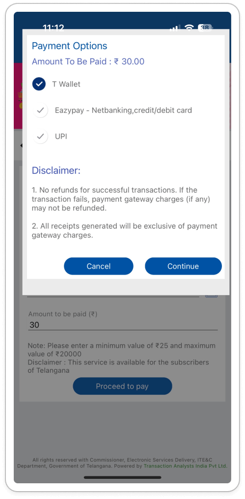
Misaligned CTA Buttons: The "Cancel" and "Continue" buttons on the payment option page are
not positioned centrally at the bottom of the payment option card. This misalignment can
create a visually cluttered and confusing layout. Users might struggle to locate the
intended button, especially if the misalignment is significant. Inconsistent button
placement can disrupt the user's flow and make the interface appear less polished.
(Aesthetics and Minimalism)
- Center-Align CTA Buttons: Ensure the "Cancel" and "Continue" buttons are horizontally centered at the bottom of the payment option card. This creates a visually balanced layout and aligns with user expectations for button placement.
- Consistent Spacing: Maintain consistent spacing between the buttons and the edge of the card for a clean and organized appearance.
Section: Dost Authentications
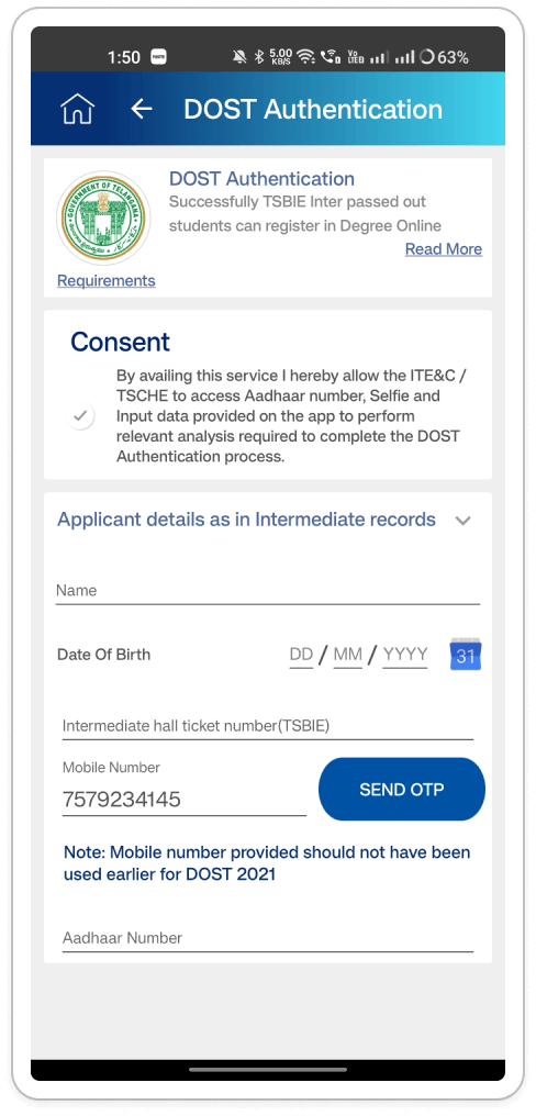
- Content Overwhelm and Layout Issues: The current layout of the DOST Authentication
service page feels overwhelming with content. This information overload can be visually
unappealing and make it difficult for users to find the information they need.
(Aesthetics and Minimalism) - Inconsistency in Input Field Help Text Recommendations: Android platforms display
helpful text within DOST Authentication service input fields, while iOS platforms lack
this information. Inconsistency across platforms can be confusing for users who might
expect the same level of guidance on both devices.
(Consistency and Standards)
- Content Audit and Organization Recommendations: Conduct a content audit to distinguish essential from non-essential information. Prioritize and organize the remaining content for clarity and ease of scanning. This includes utilizing headings, subheadings, bullet points, whitespace, and visual aids like icons or illustrations to enhance readability and comprehension.
- Consistent Input Field Behavior and Progressive Disclosure: Ensure consistent behavior across Android and iOS platforms by providing the same helpful text within input fields. This promotes a uniform user experience. Additionally, consider implementing a progressive disclosure approach, where essential information is initially displayed, and users can reveal more details as needed through collapsible sections or expandable content.
Transport Department
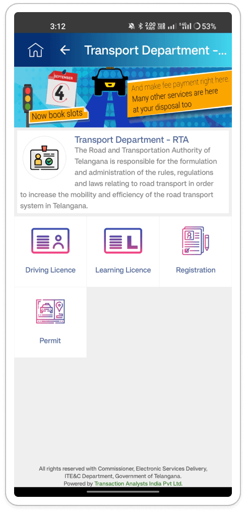
Transport Department (RTA) Service: The logos displayed on the RTA service page lack
consistency. Some appear bold, while others have lighter strokes. Additionally, the overall
UI feels more like a web layout than a mobile app interface. Inconsistency in logo design
can make the interface appear unprofessional and cluttered. A web-like layout might not
translate well to the smaller screen size of mobile devices, hindering usability and
creating navigation difficulties.
Consistency and Standards
- Logo Consistency: Implement a style guide for logos within the RTA service page. Ensure all logos have a consistent weight (stroke thickness) and visual style. Consider using monochrome versions of logos for a cleaner look.
- Mobile-Friendly Design: Evaluate the current layout to ensure its optimized for mobile devices. Increasing the size of tappable elements (buttons, icons) for easier interaction with fingers. Simplifying the layout to reduce clutter and improve readability on smaller screens. Utilizing white space effectively to create breathing room between elements.
Inconsistent Loader Behavior: The loader behavior within the Transport Department service is
inconsistent. Sometimes it appears late after the page content loads, while other times it
delays the entire page from appearing. This inconsistency can be confusing for users. They
might be unsure if the page is loading or if something went wrong. A delayed loader creates
unnecessary waiting time, hindering user experience.
(Visibility of System Status)
- Consistent Loader Display: Ensure the loader appears immediately after the user selects a service, regardless of the actual page load time. This informs users that an action is being taken and prepares them for a potential wait.
- Consistent Loader Display: Ensure the loader appears immediately after the user selects a service, regardless of the actual page load time. This informs users that an action is being taken and prepares them for a potential wait.
- Optimize Page Load Time: While the loader provides feedback, focus on optimizing the underlying page load process to minimize waiting times. This could involve; Caching data, code optimization and Server-side improvements.
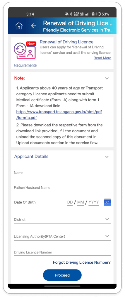
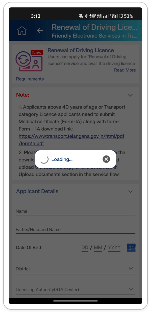
- Web-like UI Design: The driving license renewal page feels like a mobile adaptation of a
web layout rather than a native app experience. This web-like design might not be
optimized for touch interaction on mobile devices and could lead to a clunky user
experience.
(Consistency and Standards) -
Web Link as CTA: The page uses a web link instead of a CTA button or chip for driving
license renewal. Users might not readily recognize a web link as the primary action
point. CTA buttons are more visually distinct and encourage user interaction.
(Match Between System and the Real World) - Outdated Input Fields: The input fields for application details appear outdated and
lack user-friendly design elements. This can make data entry tedious and potentially
lead to user errors.
(Aesthetics and Minimalism)
- Enhancing Mobile Usability: Reassess the layout to enhance mobile usability by increasing the size of tappable elements for easier interaction, simplifying the layout to reduce clutter and improve readability on smaller screens, and ensuring proper spacing between elements to prevent accidental touches.
- Improved Call to Action for License Renewal: Instead of a plain web link, enhance the user experience by replacing it with a prominent CTA button or chip labeled "Renew Driving License" or similar. This modification clearly communicates the action's purpose and aligns with user expectations for mobile app interfaces.
- Enhancing Input Field Design: Revamp the input fields with a modern and user-friendly design by incorporating clear labels and placeholder text to guide users on the required information. Additionally, implement input validation to prevent users from entering invalid data, such as incorrect date formats or exceeding character limits.
Synthesizing Phase
With the insights gathered during the research phase, we have gained valuable understanding of the users' interactions and challenges while using the application of T App Folio, Government of Telangana. Building on this knowledge, we have now entered the Defining phase, where our aim is to deepen our comprehension and transform the research findings into practical design solutions.
User Personas Persona 1:Name: Ravi Kumar
Age: 32
Occupation: Software Engineer
Location: Hyderabad, Telangana
Technology Proficiency: Advanced
Ravi Kumar, a resident of Hyderabad, frequently needs to access various government services offered through the T App Folio for personal and professional purposes.
Goal:- Efficiently navigate T App Folio to obtain Residence Certificates and make online payments for utility bills.
- Modern and intuitive user experience
- Smooth navigation for making payments.
Name: Priya Reddy
Age: 55
Occupation: Homemaker
Location: Hyderabad, Telangana
Location: Warangal, Telangana
Technology Proficiency: Basic
Priya Reddy, a homemaker residing in Warangal, relies on the T App Folio to access government services conveniently from her home.
Goal:- Easily acquire Birth Certificates for family members
- User-friendly interface with clear instructions and minimal complexity
Ideation and Exploration Phase
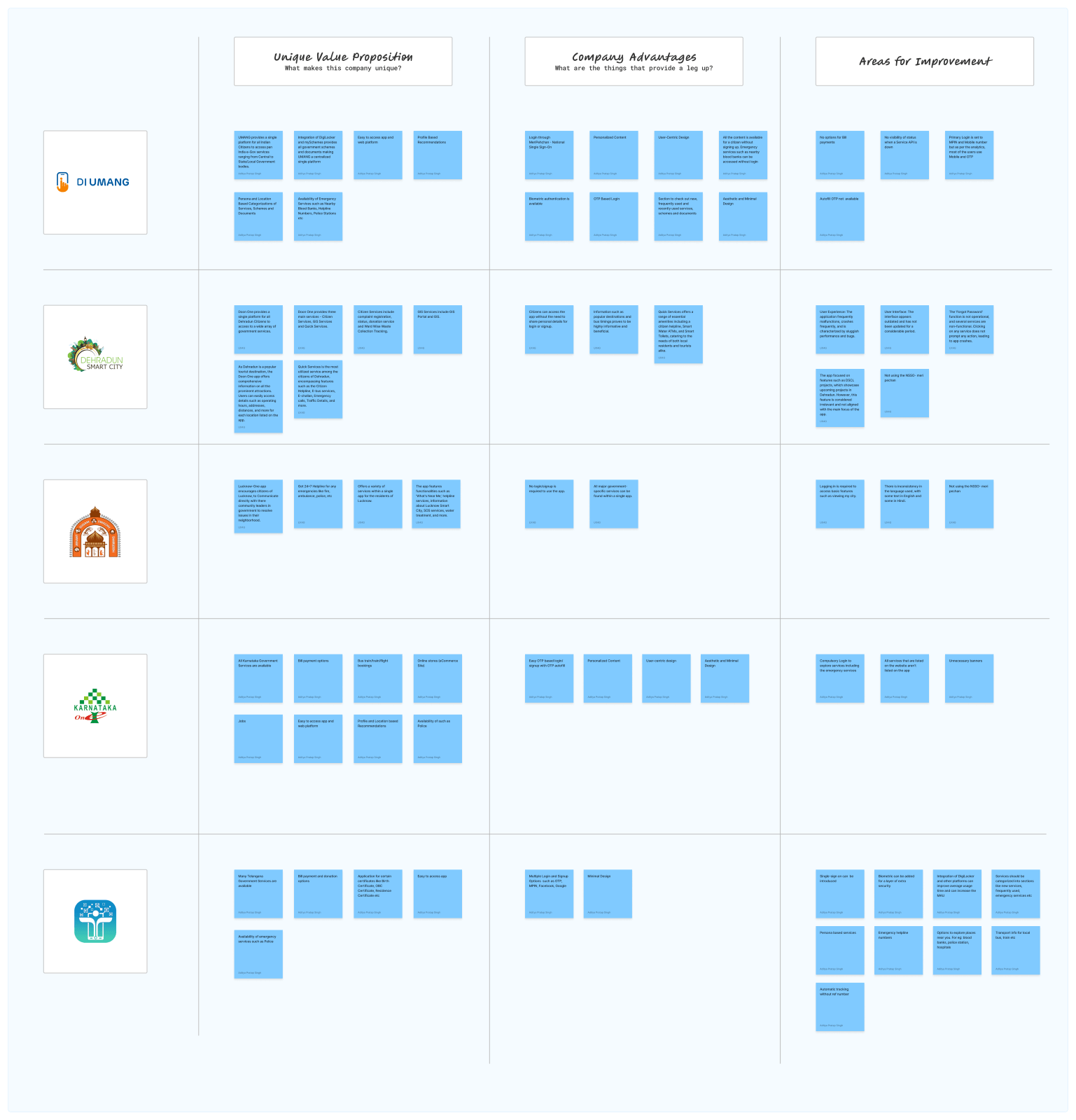
Competitive Analysis 1:| Criteria | T App Folio | Doon One | Lucknow-One | Karnataka Govt Services | Telangana Govt Services |
|---|---|---|---|---|---|
| Unique Value Proposition | Single platform for pan-India e-Gov services | Single platform for Dehradun citizens | Communicate with community leaders in Lucknow | All Karnataka Govt services available | All Telangana Govt services available |
| Company Advantages | Integration of DigiLocker and mySchemes | Wide array of citizen, GIS, and quick services | 24/7 helpline for emergencies in Lucknow | Bill payment options, easy OTP-based login | Bill payment and donation options, multiple login/signup options |
| Company Disadvantages | No bill payment options, lack of service API visibility | App malfunctions, sluggish performance | Inconsistencies in language usage, login required for basic features | Compulsory login, incomplete service listings | Integration of DigiLocker, single-sign-on and biometric authentication could enhance user experience |
| User-Centric Features | Profile-based recommendations, personalized content | No login/signup required for app usage | Various services within a single app | Easy OTP-based login/signup personalized content | Multiple login/signup options, persona-based services |
| Design & Accessibility | Minimal design, biometric authentication | Outdated UI, frequent app malfunctions | Inconsistencies in language usage, no login/signup required | Compulsory login, unnecessary banners | Minimal design, integration of DigiLocker and single-sign-on could improve user engagement |
| Notable Features | Emergency services without login, user-centric design | Quick Services offering essential amenities | 'What's Near Me', SOS services in Lucknow | Comprehensive availability of services | Availability of emergency services, persona-based services |
- T App Folio provides e-Government services with DigiLocker integration and a user-centric design.
- Doon One offers a wide range of services to residents of Dehradun, but the app frequently malfunctions.
- Lucknow-One focuses on emergency services but faces language barriers.
- Karnataka Government Services lack comprehensive listings, while Telangana Government Services strive for greater integration.
During our brainstorming sessions, we identified several core issues with the existing T App Folio design through user surveys, observations, and research. Key problems include a cumbersome onboarding process, where users must remember an MPIN for login and face difficulties switching Google accounts or receiving OTPs. There is inconsistency in the onboarding experience across different operating systems, with Android lacking terms and conditions. Users also encounter high cognitive load and struggle to recognize and differentiate service icons due to their uniformity. Application status tracking is problematic, with users often unable to find records of their applications or receive updates, leading to offline visits.
Additionally, users face challenges uploading photos and frequently encounter confusing error messages. To address these issues, we proposed solutions such as enabling services without mandatory sign-up, implementing biometric and OTP-based login, integrating a multi-account feature, and developing a unified onboarding experience. We also suggested improving icon design, introducing a personalized service recommendation algorithm, and implementing a notification system for real-time application updates. Further recommendations include establishing a dedicated customer support team, integrating DigiLocker for verified documents, and creating a user-friendly interface with clear service categories and descriptions. By addressing these concerns, we aim to enhance the overall user experience, increase monthly active users, and improve service delivery for both citizens and tourists.
Solutions and Implementation
Problem StatementHere is the list of challenges identified during the research:
OnboardingTo access any service within the app, users must first log in or sign up. When registering for the first time, users receive an MPIN, which they must remember for future logins. Additionally, users face the inconvenience of not being able to switch their Google accounts after signing up once.
Exploring ServicesUsers face difficulties scanning through the services due to a high cognitive load. They find the service icons hard to recognize and differentiate, and there is confusion caused by the same icons being used for different services.
Availing ServicesUsers become disappointed when they find out that the documents they uploaded for verification are not valid. This issue results in frustration and a lack of trust in the service.
Application Status & TrackingUsers encounter issues within the app when they apply for a service but cannot find any record of it in their history. Furthermore, they are unsure how to check the status of their application. The lack of application updates often causes users to visit offline offices, only to face complications with pending online applications. Users are also left without information about their application status, frequently seeing messages like "yet to be processed" due to RTA officers not approving applications.
User Interface (UI)There is inconsistency in displaying information within the application, with some messages shown in modals and others in snack bars. The alignment of certain elements varies significantly between Android and iOS, leading to an inconsistent user experience. Additionally, the homepage contains numerous uncategorized services, violating UX principles such as Hick's Law and Miller's Law.
Interaction Design (IXD)When users click on dropdown menus in the app, they are redirected to new pages instead of seeing a list of options. This inconsistency extends to service presentation, with some services having dedicated pages, others redirecting to external websites, and some displaying websites within the app.
Uploading PhotosUsers find it difficult to upload photos due to non-functional buttons. Even after allowing all necessary permissions, they are unable to upload photos, particularly for license renewals, causing significant inconvenience.
ErrorsUsers encounter AWS error messages when attempting to submit LLR renewals. These error messages are unclear, leaving users unsure of how to proceed. Additionally, some services stop working entirely, displaying "Unknown Error" messages without providing further information or solutions.
Help & FeedbackUsers face significant challenges with the support team, as response times are excessively long, and in some cases, queries go unanswered. Despite sending numerous follow-up emails, sometimes up to a hundred times, users do not receive the assistance they need, leading to frustration and dissatisfaction.
Recommended solutionsTo address the challenges of onboarding, exploring, availing services, application status tracking, user interface consistency, interaction design, error handling, help and feedback and increasing Monthly Active Users (MAU), here are the specific solutions:
OnboardingAccessible Services Without Signing Up:
- Implement a "skip option" on the login/signup screen to allow users to browse services without signing up.
- Enable users to directly land on the homepage and explore services without restrictions.
- Prompt users to log in only when they try to access services requiring authentication.
- Ensure emergency services can be accessed without login.
- Integrate National Single Sign-On for simplified login.
- Introduce biometric login using fingerprint or facial recognition technology to eliminate the need for MPIN.
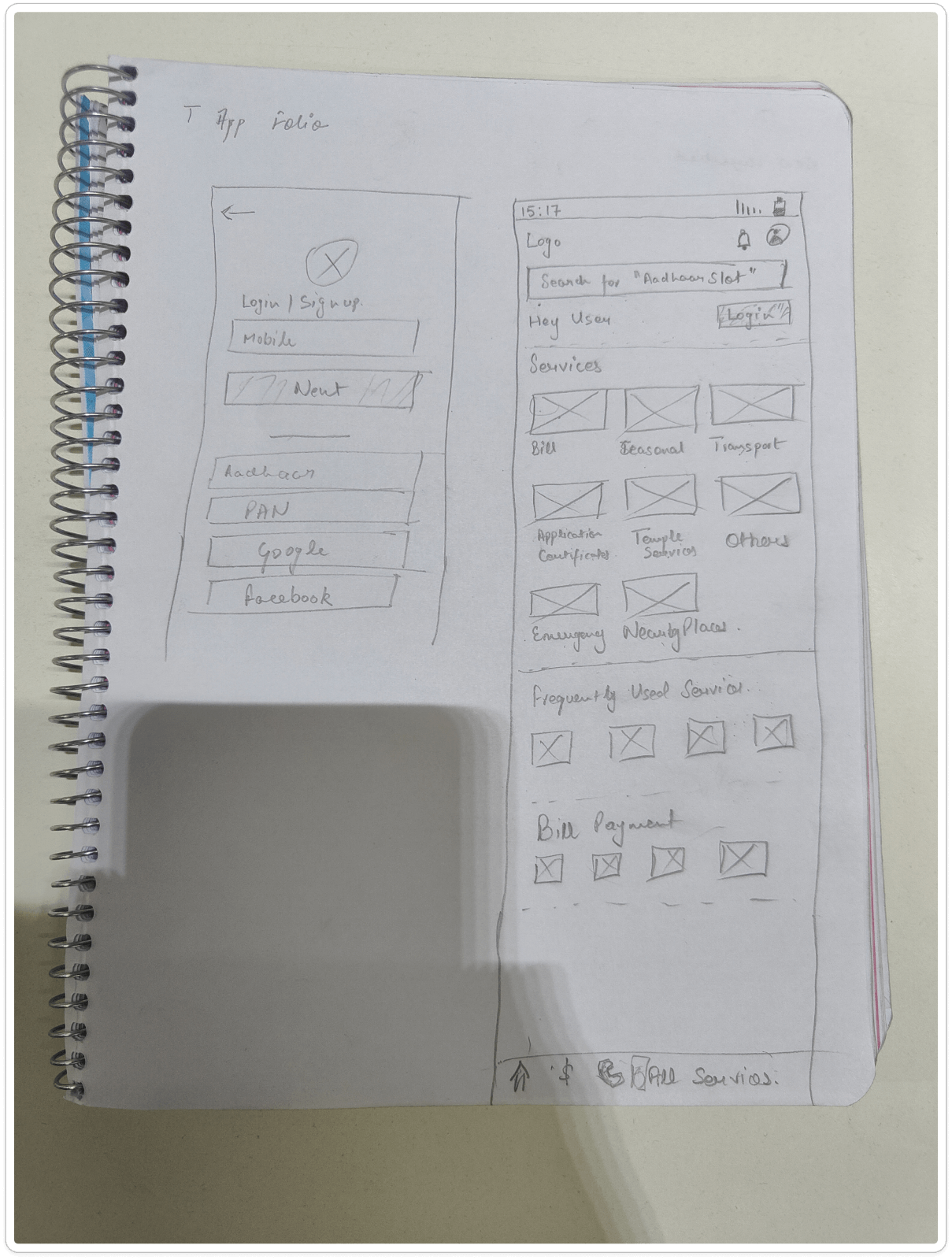
- Streamline the user interface for onboarding with clear instructions and minimal steps.
- Provide visual cues and progress indicators during the onboarding process.
Easily Scannable Services:
- Implement a personalized service recommendation algorithm based on user preferences.
- Design a user-friendly interface with clear service categories and descriptions.
- Introduce a voice-activated search feature for easier service browsing.
- Develop a chatbot assistant to guide users in finding relevant services.
- Improve icon design for better recognition and differentiation.
- Use distinct colors for each service icon to enhance visual differentiation.
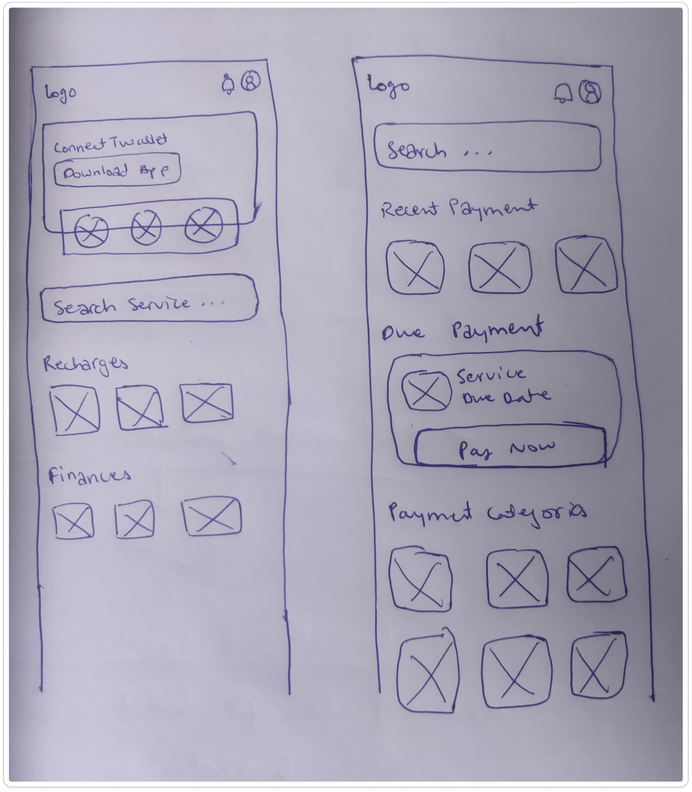
Increasing Document Upload Success Rate:
- Inform users about the required documents before starting the application process.
- Integrate DigiLocker for authentic and verified documents, significantly increasing the success rate.
- Implement a notification system for real-time status updates.
- Create a dedicated "Application History" section within the app.
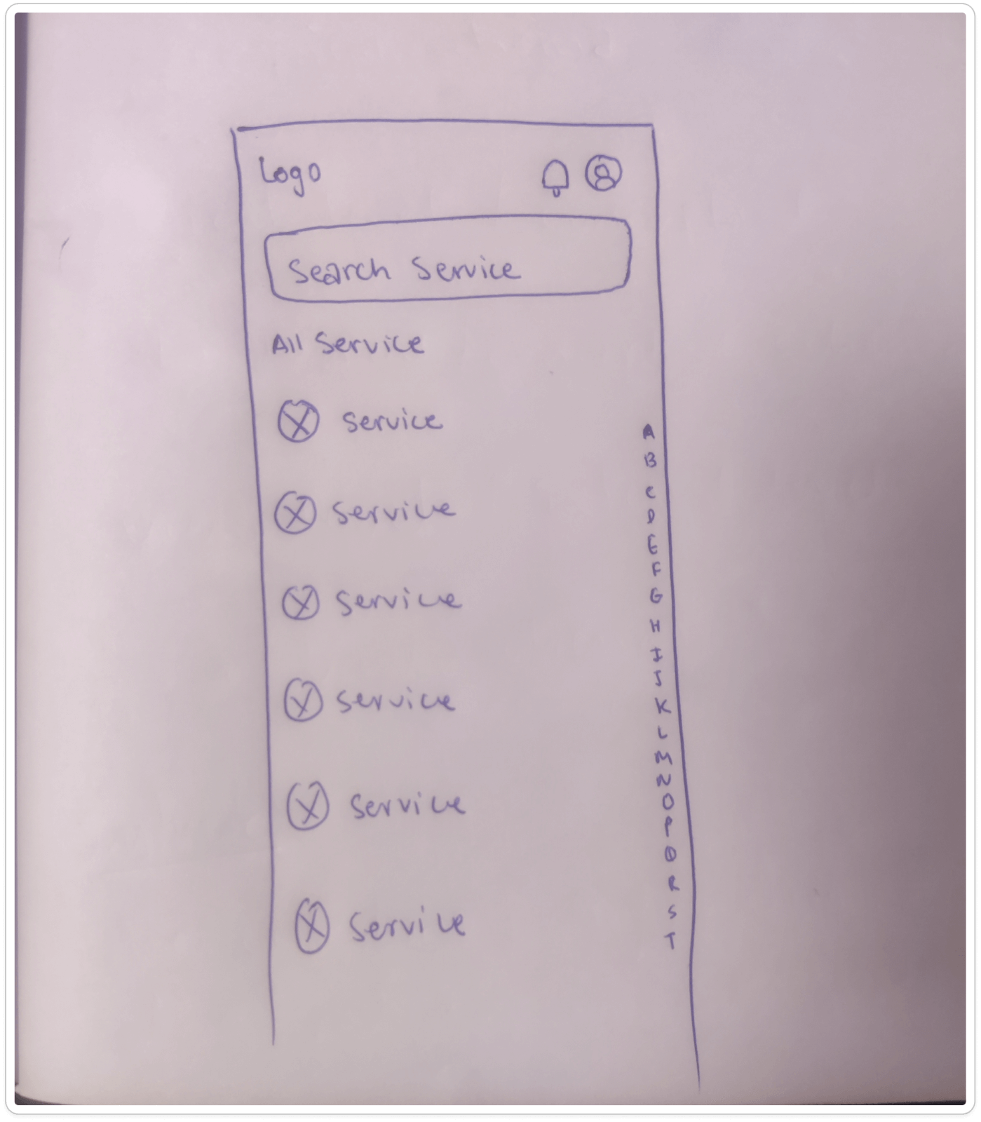
- Develop an in-app tutorial or help guide on checking application status and troubleshooting issues.
- Add a search function to locate specific services and applications.
- Introduce a chatbot feature for status checking and issue resolution.
- Establish a dedicated customer support team for timely updates and query resolution.
- Implement a unified messaging system for consistent information display.
- Develop a comprehensive style guide for message display.
- Show error messages below the input field instead of using a snackbar.
- Use a cross-platform user interface framework to ensure consistency between Android and iOS.
Intuitive Interactions:
- Implement a floating dropdown menu that opens on the current page layout.
- Use sliding animations to reveal dropdown options without page redirection.
- Create a dynamic dropdown that expands and collapses without redirecting.
- Integrate a search bar within the dropdown for quick option filtering.
- Create a unified interface for all services within the app to avoid redirection or external website views
Improved Error Messages:
- Simplify error messages and provide clear resolution instructions.
- Include links to troubleshooting guides or FAQ pages explaining common errors and solutions.
- Implement a chatbot or virtual assistant to guide users through error resolution.
- Highlight possible user actions in a user-friendly interface when encountering errors.
- Offer live support to connect users with technical experts for personalized assistance.
Reducing Query Response Time:
- Implement an automated response system to acknowledge user queries and provide estimated response times.
- Create a customer feedback portal for users to rate their experience and identify areas for improvement.
- Offer a comprehensive FAQ section on the website to address common questions and reduce direct interaction needs.
- Develop an AI chatbot for basic assistance and information while waiting for a human response.
Enhancing App Features:
- Include all emergency services within the app.
- Offer benefits to tourists by providing information on nearby places, bus timings/routes, food options, restrooms, police stations, hospitals, and language translation for easier local communication.
- Allow tourists to use services without logging in.
- Integrate DigiLocker for citizens to access authentic documents for government-related services.
Our Thoughts and Next steps
In conclusion, the T App Folio platform aims to enhance user experience by addressing several key challenges. To improve onboarding, users will be able to explore services without signing up through a "skip option," direct access to the homepage, and emergency services available without login. Simplified login through National Single Sign-On and biometric options will further streamline the process.
Enhancing service exploration includes personalized service recommendations, a user-friendly interface, voice-activated search, a chatbot assistant, improved icon design, and distinct color coding. To ensure seamless service availing, informing users about required documents and integrating DigiLocker for verified documents are essential steps. Application status tracking will be improved with real-time notifications, a dedicated "Application History" section, in-app tutorials, and a chatbot for status checking. Consistency in the user interface will be maintained through a unified messaging system, a comprehensive style guide, and cross-platform frameworks.
Lastly, intuitive interaction design will be achieved through floating dropdown menus, sliding animations, and a unified interface, ensuring a cohesive and user-friendly experience across all services.