introduction
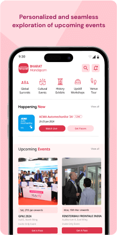
The Bharat Mandapam application serves as the official mobile companion for the premier convention and exhibition center situated in New Delhi, India. Offering an extensive array of information, users can delve into the facility's particulars, including convention halls, exhibition spaces, auditoriums, and an outdoor amphitheater.
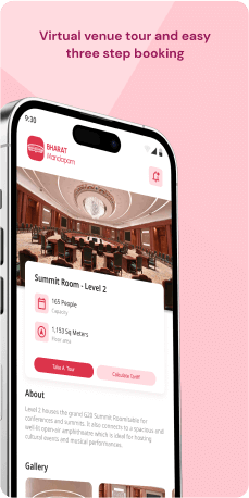
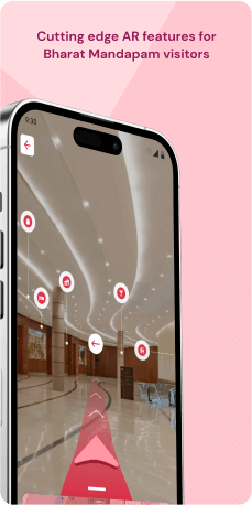
The application's features encompass a dynamic calendar showcasing upcoming events, a comprehensive directory of vendors and service providers, and an interactive map for easy navigation within the Bharat Mandapam complex. Users also benefit from the convenience of purchasing event tickets through the app, staying informed with timely news and updates. Going beyond these essentials, the application boasts a virtual tour for an immersive exploration of the complex, a dedicated section addressing frequently asked questions, and a user-friendly feedback channel for valuable input and suggestions.
With its diverse features, the Bharat Mandapam application aims to enrich the experience of visitors and event attendees, solidifying its role as an indispensable tool for those connected to this distinguished convention and exhibition center.
Objective
The audit for the Bharat Mandapam application project aims to assess alignment with stated objectives and identify areas for improvement. The primary areas of focus are seamless event experiences, accessibility, comprehensive event information, venue navigation, engagement features, ticketing processes, virtual participation options, user feedback mechanisms, and data security measures.
Target Audience
The Bharat Mandapam application is tailored to serve a broad audience engaged in or attending events at the Bharat Mandapam Complex. Its primary focus is on-
- Event Organizers-The application provides a comprehensive suite of tools for event organizers involved in planning and executing exhibitions, conferences, cultural gatherings, and various events at Bharat Mandapam. It facilitates efficient event management, attendee engagement, and real-time communication.
- Exhibitors- Companies and individuals participating in trade exhibitions can leverage the application to access crucial event information, manage booth details, and connect with fellow exhibitors and attendees. It streamlines the exhibition experience, enhancing the showcasing of products and innovations.
- Attendees-Designed for professionals, delegates, and the general public attending events, the application offers a user-friendly interface for accessing event schedules, venue maps, and essential information, ultimately enriching the overall event experience.
- VIP Guests-Distinguished guests and VIPs benefit from the application's features, including access to VIP lounges, special event notifications, and personalized services. The application aims to elevate the comfort and luxury experience for these individuals.
- Virtual Participants- For events with virtual components, the application caters to a global audience participating remotely. Virtual attendees can access live streams, presentations, and exclusive content through the app, ensuring a broader reach for conferences and exhibitions.
- Event Sponsors and partners- The application offers visibility and engagement opportunities for sponsors and partners associated with events at Bharat Mandapam. Sponsors can utilize the application for branding, networking, and accessing relevant event data.
- Accessibility Advocates- With a focus on inclusivity, the application addresses the needs of specially abled persons and senior citizens, ensuring a user-friendly experience for attendees with diverse accessibility requirements.
- General Public-Individuals interested in staying informed about upcoming events, cultural performances, and exhibitions at Bharat Mandapam can use the application to explore event details, schedules, and actively participate in public gatherings.
The Challenge
The application’s user experience entails addressing a variety of challenges that users may encounter. These challenges include optimizing the search process, increasing search flexibility, providing ample feedback and information, ensuring data accuracy and consistency, improving mobile responsiveness, prioritizing accessibility, and fine-tuning the intuitive interface. By addressing these key challenges, the goal is to create an application that provides a smooth and user-friendly experience, allowing visitors to navigate easily and access the information they need with efficiency and satisfaction.
Usability Study Findings
The usability study revealed key insights into user behavior, pain points, and preferences. Users expressed concerns about the application's web-like design on mobile, impacting overall usability. The key highlights are-
Home Screen- Web-like Design in Mobile Application-The Bharat Mandapam application's design exhibits web-centric features in a mobile application, raising concerns about usability and user experience consistency. This discrepancy could impact the application's overall effectiveness. (Issue: Consistency & Standards)
- Absence of Mobile-Friendly Navigation Bar-The current home screen lacks a mobile-centric navigation bar, hindering seamless user navigation. This absence diminishes intuitive accessibility, impeding efficient exploration of key functionalities. (Issue: Visibility of System Status)
- Lack of Information Availability in 'Upcoming Events' Section-The 'What's New' section lacks notification messages about information availability. This absence impacts user expectations and experience, causing uncertainty when tabs reveal no new content. (Issue: Clarity and Feedback)
- Inappropriate Placement of 'About ITPO' Card-The 'About ITPO' card is inappropriately placed on the main home screen as an actionable card, potentially causing user confusion. Placing it in the hamburger menu aligns better with users' primary interaction needs. (Issue: Organization and Hierarchy)
- Inappropriate Placement of 'About Bharat Mandapam' Card-The 'About Bharat Mandapam' card is inappropriately placed on the main home screen, potentially creating inconsistency and detracting from more user-centric actions. Moving it to menu options would be more suitable. (Issue: Consistency and Prioritization)
- Unstructured Presentation of Video Cards in 'What's New' Delegation Experience Section- The 'What's New' Delegation Experience section presents video cards without clear organization or categorization, resulting in a disorganized and overwhelming user experience. Improvements to visual appeal and user engagement are needed. (Issue: Organization and Hierarchy)
- Limited Language Accessibility and Absence of Initial Language Preference Setting in the Accessibility Tab-The 'Accessibility' tab has limited language selection options, hindering comprehensive accessibility experience. The absence of an initial language preference setting diminishes personalized language choices. (Issue: Inclusivity and Personalization)
- Inadequate User Assistance and Poor UI in Route Map Navigation-The route map card lacks essential features, including real-time updates and live user location tracking. The UI design needs improvement for enhanced navigation, especially for users with disabilities. (Issue: Accessibility and Real-Time Feedback)
- Upcoming events are only visible in a Calendar Form-Hiding upcoming events within the broad "ITPO calendar" makes it challenging to find and categorize, potentially frustrating users. A dedicated "Upcoming Events" section with filters could significantly improve user experience. (Issue: Visibility and Feedback)
- Misinterpretation and Lack of Functionality in ITPO Bulletin on Home Screen-The ITPO Bulletin contains PDF documents, potentially causing confusion. Lack of filters hampers users' ability to navigate efficiently, diminishing the usability and effectiveness of the ITPO Bulletin. (Issue: Clarity and User Control)
- Misinterpretation and Lack of Functionality in ITPO Bulletin on Home Screen (Venue Tour)- Clicking on the Venue Tour card results in an unresponsive page without feedback or error prevention messaging, causing uncertainty. A proactive error message indicating unavailability would enhance user experience. (Issue: Feedback and Error Prevention)
- Uncontrolled Automatic Scroll and Lack of Clarity in 'Explore India' Page-The 'Explore India' page's automatic scroll banners create a disorienting experience. Lack of user control and clarity in headings and CTAs make it challenging for users to understand information. (Issue: User Control and Information Clarity)
- Misleading Video Content Display and Poor UI Design in 'Digital India' Card- Clicking on the 'Digital India' card results in misleading video content due to poor UI design. Lack of clear category hierarchy creates confusion between video and reading content. (Issue: Information Hierarchy and Clear Differentiation)
- Book an Event" Feature Gap-The absence of a "Book an Event" feature is a significant gap, impacting user engagement and event discovery. Optimizing the existing event discovery experience can highlight the need for this feature, influencing discussions and development. (Issue: Progressive Disclosure and Prioritization)
In conclusion, the usability study identifies important areas for improvement in the application's design and functionality. Addressing issues with navigation, information availability, and language accessibility will significantly improve the overall user experience. Incorporating user feedback and implementing suggested improvements will undoubtedly result in a more usable and effective Bharat Mandapam app.
Synthesizing Phase
With the insights gathered during the research phase, we have gained valuable understanding of the users' interactions and challenges while using the application of Bharat Mandapam, Government of India. Building on this knowledge, we have now entered the Defining phase, where our aim is to deepen our comprehension and transform the research findings into practical design solutions. To maintain a user-centric approach, we have created personas that embody essential user archetypes-
User Personas User Persona 1-Event OrganizerAanya, an experienced event organizer who relies on the Bharat Mandapam application to seamlessly plan and execute diverse events at the prestigious convention center in New Delhi.
Goals-Aanya's primary goal is to achieve efficient event management through the application's suite of tools, ensuring exhibitions, conferences, and cultural gatherings run smoothly. She aims to enhance attendee engagement, leveraging the application for effective communication during events.
Pain Points-However, Aanya faces challenges navigating the application due to its web-like design on mobile. The absence of a mobile-friendly navigation bar impedes her seamless exploration of key functionalities. Additionally, ensuring readily available event information in the 'What's New' section is a crucial challenge, as user uncertainties need to be addressed for a successful event execution.
User Persona 2-General Public Interested in Cultural EventsRaj, an individual from the public deeply interested in cultural events showcased at Bharat Mandapam.
Goals-Raj's primary goal is to stay informed about upcoming cultural performances, exhibitions, and public gatherings using the Bharat Mandapam app. He aims for easy access to event details, schedules, and venue maps, enhancing his overall event experience. Raj actively participates in public gatherings and cultural events and seeks a user-friendly app.
Pain Points-However, challenges arise as Raj navigates the application due to concerns about its web-like design and mobile navigation issues. Clarity and feedback in the 'Upcoming Events' section are critical for Raj to have a better user experience. Ensuring the application is inclusive and user-friendly for individuals with diverse accessibility requirements is another challenge that Raj prioritizes.
Mapping User Journeys and Extracting InsightsWe have selected Ananya, a seasoned event organizer who heavily relies on the Bharat Mandapam application to flawlessly plan and execute various events, including exhibitions, conferences, and cultural gatherings
Ananya's perspective provides valuable insights into the challenges she encounters during event planning and execution, aiding us in identifying areas for improvement within the app. These insights will serve as a guiding force for our efforts to enhance Ananya's overall experience, ensuring seamless event management and coordination at the premier convention center in New Delhi.
User JourneyAnanya's journey begins with accessing the Bharat Mandapam application to plan an upcoming conference. She navigates through the application to find tools for event management, engaging with attendees, and utilizing real-time communication features. However, she encounters challenges due to the web-like design on mobile, leading to difficulties in efficient navigation and tool utilization. During the event, Ananya faces uncertainties about information availability in the 'What's New' section, affecting the overall coordination and execution of the event.
User StoryAs Ananya, a dedicated event organizer in her early 30s, I depend on the Bharat Mandapam application to ensure the success of conferences and cultural gatherings. I wish for a seamless experience in managing events, engaging attendees, and utilizing real-time communication features. Unfortunately, the application's web-like design on mobile poses challenges in navigation, impacting my efficiency during crucial moments. The absence of timely information notifications in the 'What's New' section adds to the complexity, hindering my ability to coordinate events seamlessly. As Ananya, a dedicated event organizer in her early 30s, I depend on the Bharat Mandapam application to ensure the success of conferences and cultural gatherings. I wish for a seamless experience in managing events, engaging attendees, and utilizing real-time communication features. Unfortunately, the application's web-like design on mobile poses challenges in navigation, impacting my efficiency during crucial moments. The absence of timely information notifications in the 'What's New' section adds to the complexity, hindering my ability to coordinate events seamlessly.
User StatementI am Ananya, a devoted event organizer, relying on the Bharat Mandapam application for successful event management. I desire an application with an intuitive interface, enabling seamless navigation and effective communication during events. However, the web-like design and information availability challenges hinder my efforts, impacting the overall success of the events I organize.
Framing challenges and hypothesis Problem StatementAnanya, utilizing the Bharat Mandapam app, encounters challenges related to its web-like design on mobile, impacting her ability to navigate seamlessly during event planning and execution. The absence of timely information notifications in the 'What's New' section further complicates her coordination efforts, affecting the overall success of the events she organizes.
Hypothesis StatementIf we address the web-like design challenges in the Bharat Mandapam application by implementing a more user-friendly interface and ensuring timely information notifications in the 'What's New' section, then Ananya's event management experience will become more efficient and effective. This enhancement aims to streamline Ananya's ability to navigate the application, ensuring a smoother event planning and execution process.


