introduction
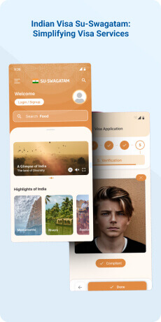
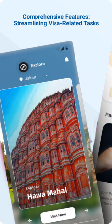
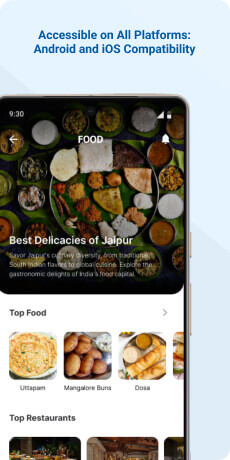
Su-Swagatam is a mobile application serving as a centralized platform for all visa-related services offered by the Government of India. This user-friendly application is specifically designed to streamline the visa application process for foreign nationals planning to visit India. From obtaining an Indian visa to exploring diverse aspects of Indian culture, heritage, business opportunities, medical facilities, educational institutions, emergency services and the rich offerings in yoga and spirituality, Su-Swagatam aims to provide a seamless and efficient experience for travelers.
Objective
The primary aim of the application is to streamline the process for individuals seeking Indian visas while abroad and to provide visa-related services within India during their stay. This application is designed to simplify the dissemination of information related to Indian visas for the target users. It takes a comprehensive approach to assist visitors at every stage, from acquiring an Indian visa to exploring various facets such as Indian culture, heritage, business opportunities, medical services, education, emergency support and the realms of yoga and spirituality in India.
Target Audience
The Su-Swagatam mobile application primarily targets foreign nationals intending to visit India, offering a centralized platform for visa services and information on Indian culture.
The Challenge
The Su-Swagatam application faces a primary UI/UX challenge- striking a delicate balance between offering comprehensive functionality and maintaining user-friendly simplicity. With its role as a central hub for various visa-related services and a repository of information on Indian culture, business, healthcare, education and emergencies, the key task is presenting this extensive information in an intuitive and easily navigable manner. The design must prioritize clarity, enabling users, even those unfamiliar with visa processes, to effortlessly initiate and track applications. Furthermore, the application should smoothly transition between visa services and immersive cultural exploration, catering to the diverse needs of foreign visitors. It is crucial to maintain a cohesive and visually appealing interface while accommodating the wide array of features to ensure an engaging and efficient user experience. The challenge lies in creating an interface that not only serves its functional purposes but also resonates with the rich ethos of India's diverse offerings, ensuring users feel welcomed and guided throughout their journey within the application.
Usability Study Findings
The usability study exposed issues, including unclear language selection, inconsistent designs and disruptive pop-ups.
Here’s the summarized key points -
Sign Up/In Flow- Language Selection Visibility- The absence of a prominently displayed language selection option upon opening the application creates confusion for users. Clear communication is essential for users to set their preferred language and the current design overlooks this critical aspect, leading to potential friction and a compromised initial user experience.
- Ambiguous Credential Error Messaging- The general "invalid credential" message lacks specificity regarding which credential (username or password) is incorrect. This ambiguity makes it challenging for users to identify and resolve login issues promptly. Providing clear and specific error messages is crucial for user guidance and a positive login experience.
- Inadequate Data Validation Feedback During Sign-Up- Users encounter data validation issues during the sign-up process without receiving clear guidance on the specific areas requiring correction. This lack of specific feedback hinders users' ability to understand and rectify errors efficiently, resulting in frustration and a negative initial experience with the app.
- Obscured Password Policy Information- The password policy information is not prominently displayed during the password creation process. This lack of visibility complicates users' ability to create a password that aligns with the app's requirements, potentially leading to multiple failed attempts, user frustration and a suboptimal user experience.
- Inconsistent Button Styles- Variations in the design, size, color, or placement of buttons within the application introduce inconsistency. This lack of uniformity disrupts the visual harmony and predictability of the user interface, potentially causing users to hesitate or make errors in their interactions. Consistency in button styles is vital for a cohesive and user-friendly interface.
- Inconsistent Question Response Mechanism- The additional question page uses a toggle switch with an "On" state for straightforward "Yes" or "No" responses, introducing ambiguity. This unclear toggle switch creates confusion and potential misinterpretation of user intent, leading to inaccuracies in data collection and a suboptimal user experience.
- Suboptimal Label Representation- The design and representation of labels within the application could be improved for better clarity, readability and aesthetic appeal. Inadequate label representation may hinder users' comprehension of content, reduce visual appeal and potentially introduce usability challenges, detracting from the overall user experience.
- Ambiguous CTA Button Options-The presence of two Call-to-Action (CTA) buttons with identical states causes user confusion about which action to select. Introducing a distinct selection mechanism, such as a radio button, could enhance clarity. Ambiguous CTA button options create uncertainty and decision-making challenges for users, potentially leading to errors, delays, or unintended actions, undermining the user experience and flow.
- Lack of Share Option for QR Code- The absence of a share option for the QR code limits user flexibility and overall functionality. Users cannot easily share or transfer the QR code, potentially hindering collaborative or integrative activities and diminishing user convenience. Including a share option for the QR code is essential for enhancing user flexibility and promoting seamless collaboration.
- Lack of Share Option for QR Code- Design elements on the Explore India page deviate significantly from the established design system of the app, introducing inconsistencies in fonts, buttons and input fields. This deviation results in a lack of visual coherence and a disjointed user experience, potentially causing confusion. Additionally, the absence of a share option for the QR code on this page restricts users from easily sharing or transferring it to other platforms or individuals, hindering collaborative activities and diminishing user convenience.
- Disruptive Pop-Up Placement on Navigation Map- A pop-up screen appearing in the top-right corner of the navigation map view obstructs the user's view, potentially hindering navigation and exploration. Additionally, the use of input fields instead of more streamlined chips for displaying places may introduce unnecessary complexity. The intrusive pop-up placement disrupts the user's visual focus and interaction with the map, potentially leading to navigation difficulties and a less immersive experience. Moreover, the use of input fields instead of chips for displaying places may diminish clarity and ease of selection, thereby complicating user interactions. This disruption in the navigation map experience requires attention to optimize visual focus, streamline interactions and enhance overall user satisfaction.
The usability study reveals significant issues in various aspects of the app, including navigation, design consistency, error messaging and the absence of essential features like language selection visibility and QR code sharing options. Users express frustration due to unclear communication, inconsistency and disruptions in the user interface, emphasizing the need for improvements to enhance the overall user experience. Addressing these issues will contribute to a more user-friendly and cohesive application design.
Synthesizing Phase
With the insights gathered during the research phase, we have gained valuable understanding of the users' interactions and challenges while using the application of Indian Visa - Su Swagatam, Government of India. Building on this knowledge, we have now entered the Defining phase, where our aim is to deepen our comprehension and transform the research findings into practical design solutions.
To maintain a user-centric approach, we have created personas that embody essential user archetypes-
User Personas Persona 1-Olivia, the Adventurous ExplorerOlivia is a 30-year-old travel enthusiast from Slovenia, an avid lover of diverse cultures and an explorer seeking new experiences.
Goals-Her goal is to visit India to immerse herself in its rich cultural heritage, try authentic cuisine and embrace the spiritual aspects of the country. Having used the Su-Swagatam application previously, she appreciates its streamlined visa application process, quick payment options and the inclusion of Slovenian nationality as an option.
Challenges-Olivia encountered challenges during registration due to OTP issues and faced confusion caused by unclear error messages. Her primary goal is to have a hassle-free application process and to access comprehensive information about Indian culture, heritage and travel essentials. Olivia desires an improved registration process and hopes for the application to provide more clarity and guidance to enhance her overall experience as she embarks on her Indian journey.
Persona 2- Alex, the Business TravelerAlex is a 40-year-old entrepreneur from the United States with a keen interest in exploring business opportunities in India.
Goals-His goal is to efficiently navigate the visa application process, understand the business landscape and establish connections with Indian counterparts. Alex appreciates the user-friendly interface of the Su-Swagatam app, recognizing its accessibility for travelers from various countries.
Challenges-He faced challenges during registration due to nationality limitations and he expressed frustration with the lack of available options for his nationality. Alex's primary goal is to seamlessly apply for his visa, access information on business opportunities and feel supported throughout the process. He desires an improved user registration experience that caters to a wider range of nationalities and hopes the application will provide more options tailored to his specific needs as a business traveler exploring India.
Mapping User Journeys and Extracting InsightsWe have selected Olivia, a 30-year-old adventurous explorer hailing from Slovenia, as she navigates the Su-Swagatam application. Olivia's journey becomes a pivotal lens through which we aim to comprehend her needs, challenges and behaviors, shedding light on opportunities for refinement in the application. Our goal is to provide Olivia and users like her with a more seamless and gratifying experience as they embark on their cultural journeys within India through the Su-Swagatam app.
Olivia's User Story"As an adventurous explorer, I am thrilled to embark on a journey to India, fueled by my passion for discovering diverse cultures and immersing myself in new experiences. In my quest for a seamless travel experience, I have chosen the Su-Swagatam application as my companion. My goal is not only to obtain a visa efficiently but also to indulge into the rich tapestry of Indian culture and heritage.
In the discovery phase, I eagerly downloaded the Su-Swagatam app, envisioning it as the key to unlocking the doors to India's wonders. However, my excitement faced a hurdle during onboarding. The OTP issues during registration momentarily dampened my enthusiasm. I seek a hassle-free and quick registration process, desiring an entry into the application that mirrors the excitement and anticipation I feel for my upcoming Indian adventure.
Navigating through the app's visa application process, I appreciate the streamlined procedures and quick payment options that make my journey smoother. Yet, there's a brief pause caused by unclear error messages, introducing a moment of confusion. My primary goal remains a seamless visa application, ensuring stress -free travel preparation.
Beyond the visa process, I eagerly explore the app's cultural insights in India. I desire a comprehensive repository of information that aids in planning my cultural journey, fostering a deeper connection with the heart and soul of India.
As I provide feedback on the app, I express my gratitude for the streamlined visa application but voice challenges during registration and the confusion caused by unclear error messages. I emphasize the importance of a smooth and transparent user experience, aligning with the richness of India's ethos.
Framing challenges and hypothesis ChallengesOlivia, the adventurous explorer, encountered several challenges during her interaction with the Su-Swagatam application. The primary hurdle emerged during the onboarding process, where Olivia faced difficulties with OTP issues during registration. These obstacles disrupted the seamless initiation of her journey within the app, causing a momentary setback. The frustration stemming from these challenges not only impacted the efficiency of her registration but also momentarily dampened the excitement and anticipation she felt for her upcoming adventure in India. These challenges underline the importance of refining the onboarding experience to ensure that users like Olivia can smoothly transition into the app, aligning with their eagerness to explore and engage with the rich cultural offerings of India. Addressing these issues is crucial to fostering a positive and hassle-free user experience for Olivia and other travelers seeking a seamless interaction with the Su-Swagatam app.
Problem StatementOlivia encounters challenges during the onboarding phase, particularly with OTP issues that hinder the registration process. This interruption in the initial interaction disrupts the seamless entry into the Su-Swagatam app, impacting her overall excitement and anticipation for her upcoming journey to India. There is a need to address these onboarding challenges to ensure a smoother and more gratifying user experience for adventurous explorers like Olivia.
Hypothesis StatementIf we optimize the onboarding process by addressing OTP issues, streamlining the registration and ensuring a hassle-free entry into the Su-Swagatam app, then Olivia's experience will become more user-friendly. A seamless onboarding experience will not only align with Olivia's excitement for her upcoming Indian adventure but also enhance the overall accessibility and satisfaction for users navigating through the application.


