introduction
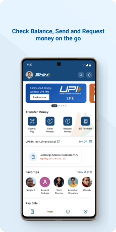
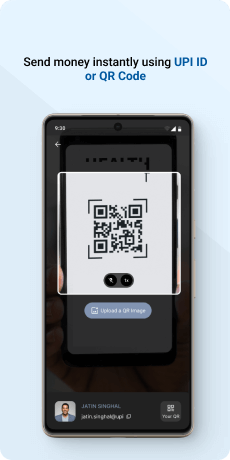
BHIM (Bharat Interface for Money) is a payment application that facilitates straightforward, convenient, and rapid transactions through the Unified Payments Interface (UPI). The BHIM app enables users to make direct bank payments to individuals on UPI by either utilizing their UPI ID or scanning their QR code. Moreover, the application offers the functionality to request funds from a UPI ID, thereby enhancing the overall convenience of financial transactions.
Objective
The primary objective of the BHIM (Bharat Interface for Money) application is to provide a seamless and efficient platform for users to conduct financial transactions using the Unified Payments Interface (UPI). BHIM aims to facilitate straightforward, convenient, and rapid money transfers between individuals through direct bank payments, utilizing UPI IDs or QR codes. The application seeks to enhance the overall convenience of financial transactions, offering users a user-friendly interface for easy navigation and quick access to various payment features. BHIM also strives to promote digital financial inclusion and empower users to make secure and hassle-free transactions in the evolving landscape of digital payments in India.
Target Audience
The BHIM app is designed for a diverse range of users in India who seek a reliable and user-friendly digital payment solution. Its targeted users include individuals who want a convenient method for making direct bank payments using the UPI infrastructure. BHIM caters to those who value simplicity and efficiency in financial transactions, providing a platform for quick and secure money transfers. The application is especially relevant for users who prefer using UPI IDs or QR codes for payments and those looking for a tool that streamlines the process of requesting funds from others. BHIM aims to be inclusive, appealing to a broad demographic across various age groups and backgrounds, contributing to the vision of a digitally empowered and financially inclusive India
The Challenge
The user faces several challenges while using the app, including slow biometric unlock and transaction speeds. The interface is perceived as laggy, with a lack of smoothness and unnecessary information, making it feel disorganized. Important notifications, such as pending payments, are not readily visible on the Home Page, and the small font size adds difficulty to reading. Additionally, the absence of an option to share transaction screenshots with third parties is noted. The user desires the ability to download transaction records in Excel and PDF formats, alongside a transaction trail and communication service with other users for enhanced trust and visibility into recorded transaction history. Dissatisfaction extends to customer support, where the user experiences slow replies and wishes for a live chat option. Vague error messages contribute to confusion, and the placement of the profile is perceived as non-intuitive. Furthermore, the app seems to offer fewer promotions and incentives compared to other applications.
Usability Study Findings
The usability study uncovered multiple sides of the BHIM app, revealing strengths and areas for improvement. Users commend the streamlined confirmation process but face challenges with inconsistent UI elements. Clear error messages are appreciated, yet concerns arise with disruptive information during payments. The lack of invoice download options and non-intuitive profile placement are identified pain points. Users desire a more competitive rewards system. Overall, the study emphasizes the need for BHIM to prioritize interface consistency, streamline information presentation, and enhance user engagement through improved features and incentives.
Onboarding- Flexibility of Use- BHIM's streamlined confirmation process eliminates redundancy, making transactions more efficient and user-friendly. This flexibility enhances the overall usability of the application, prioritizing user convenience.
- Visibility of System Status- Displaying phone numbers during registration provides users with clear information, ensuring accuracy. This transparency fosters a sense of control, awareness, and trust in BHIM's system status, enhancing the user experience.
- Recognize, Diagnose, and Recover from Errors- BHIM's emphasis on clear and informative error messages guides users through troubleshooting. This proactive approach reduces confusion and frustration, contributing to a more positive and user-friendly experience.
- Consistent UI- Maintaining uniform card heights in BHIM improves visual aesthetics, creating a polished and cohesive interface. This consistency contributes to a more professional and appealing user experience.
- Visibility of System Status- Implementing a service count feature on the dashboard enhances user awareness of the breadth of BHIM services. This visibility ensures users are engaged with the full spectrum of offerings, contributing to a more informed user base.
- Recognition Rather Than Recall- Repositioning critical functions like "Send" and "Scan" for easy recognition minimizes the cognitive load on users. This adjustment reduces the need for users to recall the location of these features, enhancing overall usability.
- Heatmap Analysis- Conducting a heatmap analysis on BHIM's dashboard identifies and rectifies attention distribution issues. This ensures a balanced visual hierarchy, highlighting primary functionalities and optimizing overall user engagement.
- Disruptive Information During Payment- BHIM's avoidance of displaying unrelated information during transactions ensures a seamless payment flow. This enhancement contributes to a more intuitive and distraction-free user experience.
- Repetitive Feedback Popups- Optimizing BHIM's feedback mechanism by reducing redundant popups minimizes interruptions. This improvement allows users to navigate smoothly during and after transactions, enhancing the overall usability of the application.
- Invoice Download and Sharing Options- Incorporating functionality for users to download and share transaction invoices aligns BHIM with real-world needs. This practical usability enhancement ensures users can easily access and manage their financial records.
- Profile Picture Option- Allowing users to add profile pictures in BHIM improves user recognition. This visual familiarity enhances intuitive interaction, aligning the application more closely with real-world expectations and user habits.
- Lack of Pending Payment Indicator- Implementing a visible indicator for pending payments on BHIM's home screen ensures users are promptly informed. This enhancement improves the visibility of the system status, contributing to a more transparent user experience.
- Suboptimal CTA Representation for QR- Improving the representation of Call-to-Action (CTA) buttons related to QR code functionality enhances user engagement. This intuitive design adjustment leads to increased interaction and smoother navigation within BHIM.
- Option to Switch to User's QR-Providing an option for users to switch to their own QR code aligns with the principle of recognition rather than recall. This improvement makes it easier for users to navigate and access their personal QR code, enhancing overall usability.
- Suboptimal Positioning and Naming of Icons- Refining the positioning and labels of icons in BHIM improves user guidance. This adjustment facilitates smoother interaction, reducing the cognitive load on users to recall the functions of each icon.
- Lack of Visibility for Bank Name and Account Number- Displaying bank details prominently in BHIM aids quick user recognition and confirmation. This enhancement aligns with the principle of recognition rather than recall, contributing to a more user-friendly interface.
- Size of Copy Icon- Enlarging the copy icon in BHIM improves accessibility, especially for users with visual impairments or those using devices with smaller screens. This adjustment ensures a more inclusive and user-friendly design.
- Non-Intuitive Placement of Profile-Optimizing the placement of the profile in BHIM's navigation enhances intuitiveness. Aligning with user expectations by placing the profile in a more conventional location contributes to a smoother and more user-friendly experience.
- Busy Listing Design- Simplifying BHIM's transaction history design with line dividers and negative space enhances aesthetics. This improvement creates a more visually appealing and minimalistic experience, improving overall user engagement.
- Download and Share Options for Invoices- Introducing options for users to download and share transaction invoices in BHIM bridges the gap between the digital system and real-world needs. This practical enhancement aligns the application more closely with users' expectations for managing transaction records.
- Ambiguity in Icon Representations for Sorting- Ensuring clarity in iconography or providing clear labels for sorting functions in BHIM reduces user confusion. This improvement enhances user understanding, contributing to a more intuitive interface.
- Undefined Error Message- Providing specific and informative error messages in BHIM enhances the visibility of system status. Actionable information helps users understand and address issues promptly, contributing to a more positive user experience.
- Useful Error Messages- Prioritizing clear and actionable error messages in BHIM aids users in recognizing, diagnosing, and recovering from errors effectively. Insightful messages guide users towards resolution, enhancing overall user satisfaction.
- Speed- Addressing performance issues, such as slow biometric unlock and transaction speeds, is crucial for mitigating user frustration. Enhancements in speed contribute to a more convenient and seamless navigation experience within BHIM.
- User Interface- Streamlining BHIM's interface by decluttering unnecessary information and improving critical notification visibility addresses user concerns. Enhancements in readability, such as adjusting font sizes, contribute to an improved overall user experience.
- Transaction Sharing- Incorporating features for capturing transaction screenshots, downloading records in various formats, and improving communication among users addresses specific user needs. These enhancements aim to foster trust and provide comprehensive visibility into BHIM's transaction history.
- Help and Support- Enhancing support responsiveness in BHIM, including faster replies and the inclusion of a live chat option, is crucial for a more satisfactory user experience. Improved customer support contributes to overall user satisfaction.
- Error Handling- Improving the clarity of error messages in BHIM addresses user dissatisfaction with vague messages. Clear and informative error communication is essential for users to identify and address issues effectively.
- Profile- Optimizing the placement of the profile within BHIM's interface addresses user concerns about non-intuitiveness. Aligning with user expectations enhances navigation and contributes to a more user-friendly design.
- Offers- Introducing more promotions and incentives in BHIM addresses user perceptions of a lack compared to other applications. A more competitive rewards system fosters user engagement and satisfaction.
Therefore, the study revealed strengths in user-friendly onboarding and error handling. Addressing interface inconsistencies and enhancing engagement features will lead to a more polished and user-centric application.
Synthesizing Phase
With the insights gathered during the research phase, we have gained valuable understanding of the users' interactions and challenges while using the application of BHIM APP, Government of India. Building on this knowledge, we have now entered the Defining phase, where our aim is to deepen our comprehension and transform the research findings into practical design solutions. To maintain a user-centric approach, we have created personas that embody essential user archetypes-
User Personas Persona 1-Rajesh, the Efficient EntrepreneurRajesh, a 35-year-old entrepreneur based in Mumbai, is a tech-savvy individual with a keen interest in adopting digital solutions for financial transactions.
Goals-His primary goal with using the BHIM app is to streamline the payment process for his business transactions. Rajesh aims to make rapid and hassle-free payments to suppliers and clients through UPI IDs or QR codes. He values efficiency and simplicity in his financial interactions, seeking a user-friendly interface that allows him to conduct transactions swiftly.
Pain Points-However, Rajesh faces challenges with the app's slow biometric unlock and transaction speeds, which hamper his efficiency. The laggy interface and disorganized display also contribute to a less-than-optimal user experience for him. Rajesh desires improved communication services within the app for enhanced trust and visibility into his recorded transaction history, as well as more responsive customer support.
Persona 2- Ananya, the Tech-Savvy StudentAnanya, a 22-year-old student studying in Delhi, represents the younger demographic seeking digital payment solutions for their everyday needs.
Goals-Her primary goal with the BHIM app is to manage her expenses and split bills with friends seamlessly. Ananya appreciates the convenience of using UPI IDs and QR codes for transactions, aligning with her tech-savvy lifestyle.
Pain Points-However, she faces challenges with the app's user interface, including the lack of readily visible notifications on the Home Page and the small font size, making it difficult for her to track pending payments. Ananya wishes for additional features like the ability to share transaction screenshots and download records in Excel and PDF formats. She also desires a more intuitive placement of the profile within the app. Ananya looks for promotions and incentives to enhance her overall experience, feeling that BHIM could offer more in this regard compared to other applications.
Mapping User Journeys and Extracting InsightsWe focus our exploration on Ananya, a 22-year-old student in Delhi, to gain a nuanced understanding of her experiences while utilizing the BHIM app for digital payments. Ananya's journey unfolds chronologically, unveiling her needs, challenges, and expectations. This examination provides valuable insights that can guide the development of user-centric solutions to enhance Ananya's overall satisfaction and usability within the BHIM app.
Ananya’s User Story"As a tech-savvy student in Delhi, I seek a seamless digital payment experience with the BHIM app. I want efficient navigation through the application's features, including a well-organized interface and visible notifications for pending payments. Additionally, I wish for quicker biometric unlock and transaction speeds to ensure rapid and hassle-free money transfers. Desiring features such as the ability to share transaction screenshots, download records in various formats, and an intuitively placed profile, I aim for a comprehensive and user-friendly platform. Moreover, I am keen on enhanced communication services within the app for improved trust and visibility into my transaction history. Incentives like promotions would motivate me further, as I currently perceive a lack of such offerings. Lastly, a more responsive customer support system with a live chat option and clearer error messages would contribute to an overall positive user experience."
Framing Challenges and Hypothesis for Ananya's BHIM App Experience Problem StatementAnanya, a tech-savvy student utilizing the BHIM app for digital payments, encounters challenges in navigating the application efficiently. She faces issues with the organization of features, experiences a lack of visible notifications for pending payments, and struggles with slow biometric unlock and transaction speeds. Additionally, the absence of desired features such as the ability to share transaction screenshots, download records in various formats, and an intuitive profile placement poses hindrances to her seamless user experience. Hypothesis Statement
Hypothesis StatementIf we enhance the BHIM app's interface, providing a more organized and user-friendly navigation experience, address the challenges related to slow biometric unlock and transaction speeds, and introduce desired features like transaction sharing and versatile record downloads, Ananya's digital payment journey will become more efficient and enjoyable. By implementing these user-centric solutions, we aim to improve Ananya's satisfaction with the BHIM app and enhance her overall user experience. We believe that these enhancements will align with Ananya's expectations, resulting in increased efficiency and engagement during her digital transactions. In the subsequent sections, we will delve into specific design solutions to address these challenges and elevate Ananya's overall user journey with the BHIM app.
Ideation and Exploration Phase
Building upon the insights gained from the defining and synthesizing phase, we entered the ideation and exploration phase with a burst of creativity. Utilizing exercises such as Crazy 8, our team sketched numerous ideas on paper, delving into different possibilities and refining our design concepts. The "How Might We" (HMW) exercise proved invaluable in exploring various possibilities, framing problem statements in the form of open-ended questions.
During the 'How might we' exercise, our focus was directed toward specific areas of the BHIM Payment App, including the registration process, dashboard experience, homepage design, and navigation. We fostered team collaboration, encouraging the generation of numerous ideas to address the identified pain points and enhance the overall usability and functionality of the app.
In the realm of speed optimization, one promising idea emerged: the implementation of background loading for biometric unlock, drawing inspiration from successful implementations such as Gpay. Additionally, we explored the concept of displaying the PIN screen only if biometric authentication fails, streamlining the unlocking process. To further enhance user experience, subtle animations and skeleton loading were proposed for smoother transitions within the app's interface.
Turning our attention to the user interface, we brainstormed ideas to organize and minimize the interface effectively. Suggestions included prioritizing Scan QR and Send Money with larger tiles, implementing better categorization and headings, and considering alternative placements such as adding Scan QR to the bottom navigation or as a Floating Action Button (FAB). Attention to detail was emphasized, including the clear naming of icons for improved user understanding.
Turning our attention to the user interface, we brainstormed ideas to organize and minimize the interface effectively. Suggestions included prioritizing Scan QR and Send Money with larger tiles, implementing better categorization and headings, and considering alternative placements such as adding Scan QR to the bottom navigation or as a Floating Action Button (FAB). Attention to detail was emphasized, including the clear naming of icons for improved user understanding.
In the transaction sharing domain, concepts were explored to allow users to download and share transaction details seamlessly. The idea of enabling users to export selected data as Excel or PDF format was discussed, with potential integration of a checkbox selection feature for enhanced control.
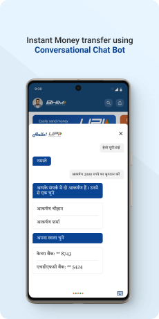
Addressing help and support, our team proposed the integration of an AI Chat Bot capable of answering queries, filtering problems, and presenting solutions from a comprehensive database. Live chat with support agents and in-app FAQs were also considered, aiming to streamline user assistance within the app itself.
In error handling, the focus was on providing transparent and informative error messages, avoiding vagueness. The introduction of messages of uncertainty was explored, empowering users to make informed decisions in scenarios of potential transaction failures.
For profile placement, the ideation phase suggested a more intuitive design by integrating the profile menu into the top header alongside the user's profile picture, aligning with successful practices in other applications.
Looking into new features, our exploration phase introduced innovative concepts such as a BHIM Payment Widget, Share Receipt functionality, a Chat feature for communication around transactions, and gamification elements for payment categorization and organization. Future-oriented features like conversational payments, split payments with friends, and self-transfer options were also explored, along with the possibility of expanding to KaiOS.
The ideation and exploration phase set the stage for a wealth of possibilities, emphasizing user-centric improvements, intuitive designs, and innovative features to elevate the BHIM Payment App's overall user experience and functionality.
Solutions and Implementation
Home Page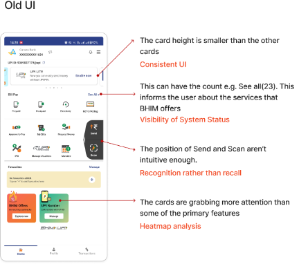
In the previous version of the UI, there was a noticeable inconsistency in the card height, with one card appearing smaller than the others, disrupting the visual harmony. Additionally, the lack of a consistent UI element such as a count indicator, e.g., "See all (23)," failed to effectively communicate the breadth of services offered by BHIM to users. Furthermore, the visibility of the system status was compromised, as users might not readily discern critical information due to the unintuitive positioning of essential features like "Send" and "Scan." Another issue was the imbalance in attention-grabbing elements, with secondary elements such as cards overshadowing primary features. To address these concerns, a heatmap analysis could be employed to identify user interaction patterns, allowing for targeted adjustments to enhance consistency, visibility, and user recognition of key functionalities within the interface.
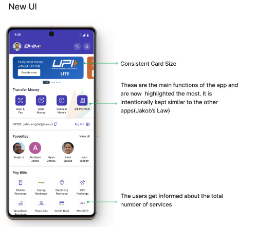
Now, all cards feature a consistent size, ensuring visual uniformity and adherence to Jakob's Law by aligning with users' expectations from similar applications. Moreover, the main functions of the app are now prominently highlighted, following the principle of recognition rather than recall. This intentional design ensures that users can easily identify and access the core features without unnecessary effort. Additionally, users are now informed about the total number of services offered by BHIM, enhancing transparency and providing valuable insight into the breadth of available functionalities. This improvement fosters a more informed and empowered user experience, aligning with best practices in interface design.
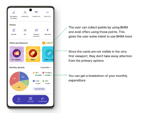
Users are incentivized to engage with BHIM through a points-based reward system, enabling them to unlock offers and benefits. This strategic gamification encourages increased usage of the app. By strategically placing cards outside the initial viewport, the primary options remain the focal point, ensuring users' attention is directed towards core functionalities. Additionally, users can now access a detailed breakdown of their monthly expenditure, enhancing their understanding of their financial habits and empowering them to make informed decisions. These enhancements collectively contribute to a more engaging and user-centric BHIM experience.
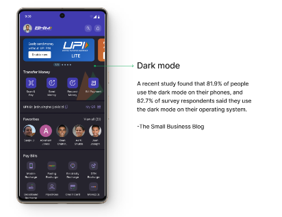
The majority of users prefer dark mode, which reduces eye strain and saves battery life. Integrating it into BHIM improves the user experience by providing comfort and flexibility in a variety of lighting conditions, reflecting the app's dedication to user satisfaction and current usability trends.

