introduction
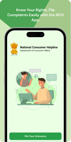
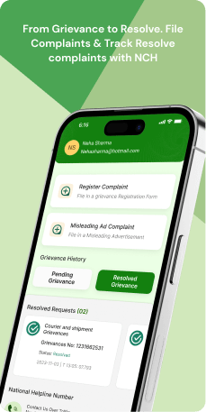
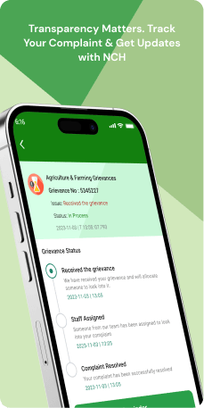
The National Consumer Helpline Mobile Application (N. C.H.) provides consumers with an accessible platform to report grievances related to consumer affairs. Users can initiate the process via a toll-free number or online registration, receiving a unique docket number for tracking. The application streamlines grievance resolution by forwarding issues to relevant authorities and offering real-time updates. Features include a "Track your complaint" function, consumer awareness materials and essential contacts. The design prioritizes clarity, security and user-friendliness, aligning with the Department of Consumer Affairs' commitment to awareness, advice and grievance redressal.
Objective of the application
The primary goal of the Consumer Helpline Mobile Application is to offer consumers a convenient and effective platform for registering and monitoring grievances related to consumer affairs. The application aims to simplify the grievance resolution process through features like one-time registration, easy form submission and real-time updates on actions taken by relevant agencies. It seeks to empower users with a user-friendly interface to track the status of their complaints and facilitate communication with various Consumer Commissions.
Moreover, the application serves as an educational tool, providing a Consumer Knowledge Base and important links to enhance users' awareness of their rights and responsibilities. By harnessing technology, the application endeavors to ensure swift and accessible resolution of consumer grievances, all while promoting consumer education and engagement.
Target Audience
The Consumer Helpline Mobile Application is designed for a diverse audience, including general consumers looking for an easy-to-use platform to register and monitor grievances related to consumer affairs. This target audience includes both tech-savvy individuals comfortable with mobile applications and those with limited internet access who can utilize the toll-free number. The application also caters to users interested in consumer awareness and those seeking direct communication with Consumer Commissions. Its primary goal is to offer a simplified process for dispute resolution while educating users about their rights and responsibilities.
The Challenge
Users of the National Consumer Helpline application encounter significant challenges in their interaction with the platform. From splash screens with illegible fonts and unclear CTAs to login pages plagued by undefined button designs and poor layout, the application's usability is compromised. Ambiguous UX writing, inefficient service placement and suboptimal designs in profile editing further hinder the user experience. Navigation issues, lack of notifications and ineffective document upload functionality contribute to a less-than-optimal interface. These challenges collectively underscore the need for comprehensive improvements to enhance user satisfaction and streamline the application's usability.
Usability Study Findings
Usability study findings for the National Consumer Helpline application reveal issues like undefined CTAs, inconsistent UX writing and spacing problems. Inefficient service placement and lack of user notification impact navigation and user control. Suboptimal designs in profile editing, document uploads and contact information further hinder the app's overall user experience.
Here is a summary of the insights-
- Inadequate Splash Screen Design and Functionality-The initial splash screen faces usability challenges due to subpar banner image quality and illegible font size. The absence of clear indications on the page scroller and the undefined CTA button contribute to user confusion. The compromised visibility of the system status impacts users' understanding of the application's purpose.
- Login Splash Screen - Undefined CTA Design and Poor Layout- Issues with the "Done" button on the login splash screen, including undefined borders and poor placement, hinder visual clarity and user recognition. The lack of responsiveness in the design further impacts user understanding and engagement.
- Ambiguous Button Design in Signup and Login Pages- The design of login and signup buttons introduces ambiguity, with poor banner image quality affecting the visibility of the system status. Users struggle to discern the primary actions, leading to potential confusion about the application's purpose.
- Inconsistent UX Writing in Sign-In Page Password Field- Inconsistency in UX writing in the password field causes confusion as it deviates from the sign-in context. Users may struggle to align their mental model with the term "Create Password," affecting the overall user experience.
- Lack of User-Centric Design and Information on Home Screen- The home screen lacks user-centric design elements, quick navigation options and a clear presentation of core services. The absence of quick navigation limits user control and freedom, impacting the efficiency of user interactions.
- Inefficient Service Placement in Hamburger Menu- Essential services placed in the hamburger menu create a suboptimal navigation experience, requiring users to recall critical functionalities. Direct access to essential services without additional steps is crucial for enhancing user control and adhering to design standards.
- Lack of User Notification and Direct Application Redirection for E-DAAKIL CTA- Selecting the E-DAAKIL CTA in the hamburger menu lacks user communication and redirects without notification. The absence of a clear CTA and permission requests hinders visibility and user control.
- Suboptimal Design of Document Upload Functionality- Issues with the document upload functionality, such as the lack of an effective CTA button and inconsistent button sizes, impact user clarity and experience. A seamless and user-friendly document upload process is essential for registration.
- Spacing and Visual Design Issues on Important Links Page- Spacing issues on the Important Links page affect visual coherence and user comprehension. Aesthetic and minimalist design principles should be employed to improve the overall user experience.
- Lack of Profile Picture Editing Functionality- The absence of profile picture editing functionality limits user customization. Users should have control over customizing their profiles, including the ability to edit or upload profile pictures.
- Non-responsive Edit Icons for Email and Phone Number- Edit icons lacking responsiveness cause user confusion and impact the visibility of the system status. Ensuring appropriate responsiveness enhances user understanding and engagement.
- Direct Accessibility of Dropdown Fields- Dropdown fields without a proper CTA button may lead to unintentional interactions. Implementing a clear CTA action is crucial for preventing accidental selections and promoting user freedom.
- Ineffective Handling of Toll-Free Helpline Number on Contact Page- The toll-free helpline number lacking CTA functionality creates an additional step for users. Enhancing it as a CTA would improve user experience, providing direct access to initiate a call and enhancing user control. The current non-CTA status may hinder system status visibility.
These insights highlight key usability issues across different screens, emphasizing the importance of addressing these issues to enhance the overall user experience and satisfaction with the application.
Synthesizing Phase
With the insights gathered during the research phase, we have gained valuable understanding of the users' interactions and challenges while using the application of National Consumer Helpline, Government of India. Building on this knowledge, we have now entered the Defining phase, where our aim is to deepen our comprehension and transform the research findings into practical design solutions. To maintain a user-centric approach, we have created personas that embody essential user archetypes-
User Personas Persona 1- Tech-Savvy SamanthaSamantha is a 30-year-old professional with a busy lifestyle. She values convenience and efficiency in all aspects of her life, including grievance resolution.
Goals-Samantha's primary goal in using the National Consumer Helpline Mobile Application is to quickly and effortlessly register and monitor grievances related to consumer affairs. She expects seamless user experience, with a straightforward registration process, intuitive navigation and real-time updates on the status of her complaints. Samantha is also interested in staying informed about her consumer rights and responsibilities through the app's educational features.
Pain Points-Despite being tech-savvy, Samantha faces challenges with the app's usability. The illegible fonts on splash screens, unclear calls-to-action and undefined button designs during the login process frustrate her. Navigating through the application is a hassle due to suboptimal designs and she often finds it difficult to locate essential services, such as profile editing. The lack of notifications and inefficient document upload functionality adds to her frustration, making her overall experience less than optimal. Samantha's challenge is to have a smoother and more user-friendly experience that aligns with her expectations of efficiency and convenience.
Persona 2- Limited Internet Access LarryLarry, a 55-year-old retiree with limited internet access, seeks a user-friendly platform for registering and monitoring grievances related to consumer affairs.
Goals-His primary goal is to use the National Consumer Helpline Mobile Application to easily submit complaints using the toll-free number, eliminating the need for extensive online interactions. Larry also values simplicity and wants the application to provide clear instructions and guidance on the grievance resolution process. He is interested in the educational materials offered by the application to enhance his awareness of consumer rights and responsibilities.
Pain Points-Larry faces challenges related to the app's usability, particularly due to his limited internet access. The unclear CTAs on splash screens and poorly designed login pages make it challenging for him to navigate through the initial steps. Ambiguous UX writing and inefficient service placement further confused Larry during the complaint registration process. Additionally, suboptimal designs in profile editing make it difficult for him to update his information as needed. Larry's challenge is to have a more accessible and straightforward interface that accommodates his limited internet access while providing clear guidance for registering and monitoring grievances.
Mapping User Journeys and Extracting InsightsWe have chosen to focus on Tech-Savvy Samantha, a 30-year-old professional, to gain comprehensive insights into her needs, pain points and behaviors while using the National Consumer Helpline Mobile App. Her journey illuminates the challenges she faces and highlights potential areas for improvement in the application to enhance her overall experience in registering and monitoring grievances related to consumer affairs.
User Story"As a busy professional aiming for efficiency in all aspects of my life, I want a seamless experience on the National Consumer Helpline Mobile Application to register and monitor grievances effortlessly. Additionally, I hope to stay informed about my consumer rights and responsibilities through the app's educational features."
Framing challenges and hypothesis Problem StatementSamantha faces challenges related to the National Consumer Helpline Mobile App's usability, including illegible fonts, unclear calls-to-action and suboptimal designs that hinder her ability to navigate and efficiently use the application. The lack of notifications and inefficient document upload functionality further adds to her frustration, impacting the overall convenience and efficiency she seeks.
Hypothesis StatementIf we enhance the app's user interface by improving font legibility, clarifying calls-to-action and optimizing designs for intuitive navigation, while also implementing effective notifications and streamlining the document upload functionality, then Samantha's experience on the National Consumer Helpline Mobile Application will become smoother, more user-friendly and aligned with her expectations of efficiency and convenience.


