introduction
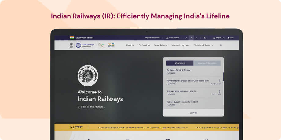
The official online platform of Indian Railways, accessible at "https://indianrailways.gov.in", stands as a comprehensive digital gateway to India's expansive and intricate railway network. Renowned as one of the world's largest railway systems, Indian Railways holds a crucial position in facilitating the transportation of passengers, goods, and essential services throughout the nation. This website serves as an indispensable tool for passengers, travelers, job seekers, and businesses, providing a diverse array of services and information.
Objective
- Information Dissemination- The website serves as a comprehensive source of information about the Indian Railway system, offering details such as train schedules, ticket booking procedures, station information, and more. It acts as a central platform for passengers to access essential travel-related information.
- News and Announcements- The website features updates and announcements pertaining to Indian Railways, covering areas such as new train launches, policy changes, and other significant developments.
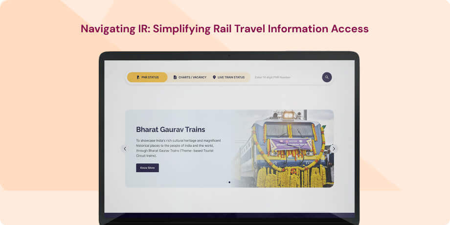
- Passenger Services-Providing essential services, the website allows users to check PNR status, track train running status, and access information about passenger amenities and facilities available at railway stations.
Target Audience
This diverse website caters to a broad user base, including passengers for bookings and real-time train information, job seekers, businesses for freight services, news enthusiasts, differently abled individuals seeking accessibility information, the public for travel handbook, government officials for policymaking data, tourism professionals for tour packages, and passengers providing feedback. Its pivotal role lies in connecting millions, addressing diverse needs, and ensuring efficient railway operations across India.
The Challenge
The challenge is to enhance the user experience of the website by tackling potential obstacles that users might face. These challenges encompass a complex search process, limited search flexibility, insufficient feedback and information, issues related to data accuracy and consistency, mobile responsiveness concerns, accessibility issues, and the need for an intuitive user interface.
Usability Study Findings
The usability study of the website's homepage revealed several critical issues that impact user experience and may lead to confusion, frustration, and a negative perception of the site. The key insights include-
Homepage- Date and Time in Accessibility Bar- The inclusion of redundant date and time information in the accessibility bar can confuse users, potentially detracting from its primary purpose.
- Complex Navigation- The extensive navigation menu and numerous links on the homepage may overwhelm users, making it challenging for them to quickly find the required information or service.
- Inappropriate Placement of Logos- Placing the Indian Railways logo on the left and the national emblem on the right disrupts conventional design flow, affecting visual alignment.
- Pixelated Logo Images- Pixelated images diminish the website's overall professionalism and aesthetics, potentially making it appear outdated and unpolished.
- Limited Language Options- The accessibility bar offers only Hindi and English language options, posing a significant usability concern for users more comfortable in other languages or with limited proficiency in Hindi or English.
- Red Error Message Regarding Form Security- The red error message regarding form security may raise trust issues, and the lack of indicator dots in the banner section poses a usability problem.
- Inconsistent Layout- The mix of vertical and horizontal sections introduces inconsistency in the layout, affecting the overall visual appeal and cohesiveness. .
- Inappropriate Placement of Social Media Icons- Placing social media icons in the left corner below the banner may cause usability issues and disrupt the site's content flow.
- Improper Latest Headlines Section- The Latest Headlines section has usability and design issues that can impact the user experience negatively.
- Parallel Moving Text Lines- The presence of two text lines moving parallelly can create visual disbalance and confusion for users, leading to usability and design problems.
- Use of Red Color in "What's New" Section- The inappropriate use of red color in the "What's New" section poses a significant usability and design issue.
- Suboptimal Design of "What's New" Section- The design of the "What's New" section falls short in delivering an exciting and engaging user experience.
- Lack of Section Name for Indian Railways Services- The absence of a clear section name for the area displaying Indian Railways services can lead to usability and user experience issues.
- Cards Lack Clickability Visual Cues- Services cards do not provide clear visual cues for clickability, creating a usability issue and potentially confusing users.
- Inefficient Design of Services Section Empty Cards- The design of the services section presents inefficiency with empty cards, causing a less-than-optimal user experience.
- Congested Display of Sections- Displaying "Important Information," "Facebook Feed," and "Twitter Feed" sections together can result in a congested and confusing user experience.
- Outdated UI- The website's outdated user interface contributes to usability problems that negatively impact the overall user experience.
- Absence of Section Describing Motive- The lack of a dedicated section communicating the primary motive of the website can lead to usability and user engagement issues.
- Poorly Designed Footer- The website's footer suffers from poor design, negatively impacting usability and overall aesthetics.
- Lack of Mobile Responsiveness- The website lacks responsiveness on mobile devices, resulting in unreadable text, stretched images, and an overall unusable mobile experience.
Addressing these issues is crucial for improving the website's usability, enhancing user experience, and fostering a positive perception among visitors.
Lighthouse Report - WebsiteThe website's overall performance, as indicated by a Lighthouse report, is rated at a concerning 16 percent, reflecting a very poor performance. Specific performance metrics further highlight significant issues. The First Contentful Paint takes 3.5 seconds, the Largest Contentful Paint registers at a sluggish 9.7 seconds, and the Total Blocking Time is alarmingly high at 6,850 milliseconds, all falling into the "very bad" category. The Speed Index, measuring 7.8 seconds, also falls within the "very bad" range. While the Cumulative Layout Shift is deemed okay at 0.194 seconds, there is room for improvement. These performance metrics collectively underscore a critical need for optimization measures to enhance the website's speed, loading times, and overall user experience.
Lighthouse Report - MobileThe Lighthouse report for the mobile version of the website reveals an overall performance rating of 40 percent, signaling a very poor performance. Specific performance metrics further highlight significant issues. The First Contentful Paint takes 4.7 seconds, the Largest Contentful Paint registers at a sluggish 5.4 seconds, and the Total Blocking Time is alarmingly high at 910 milliseconds, all categorizing as "very bad." The Speed Index, measuring 12.5 seconds, also falls within the "very bad" range. Surprisingly, the Cumulative Layout Shift stands out as a positive metric, marked as "very good" at 0.059 seconds. Despite this, the overall performance metrics underscore a crucial need for optimization measures to enhance the mobile website's speed, loading times, and overall user experience.
Synthesizing Phase
With the insights gathered during the research phase, we have gained valuable understanding of the users' interactions and challenges while using the website of Indian Railways, Government of India. Building on this knowledge, we have now entered the Defining phase, where our aim is to deepen our comprehension and transform the research findings into practical design solutions. To maintain a user-centric approach, we have created personas that embody essential user archetypes-
User Personas Persona 1- Ananya, the Frequent TravelerAnanya, a 28-year-old business professional, is a frequent traveler who relies heavily on the Indian Railways website for her commute.
Goals-Her primary goal is to efficiently plan her journeys, book tickets hassle-free, and stay updated on train schedules. ess to the latest data and statistics about the Indian economy and market trends.
Challenges-Ananya often finds the current website's search process complex and time-consuming. Ananya wishes for a more intuitive interface that allows her to quickly find the information she needs, whether it's related to train availability, ticket prices, or seat preferences. Additionally, as a mobile user, she faces challenges with the website's responsiveness on her smartphone, making the booking process inconvenient. Ananya's pain points include the need for a simplified and streamlined search experience, improved mobile responsiveness, and a user-friendly interface for smoother transactions.
Persona 2- Rajesh, the Business OwnerRajesh, a 35-year-old entrepreneur, relies on Indian Railways for freight services to transport goods for his business. His primary goal is to efficiently manage logistics, track shipments, and ensure timely deliveries.
Goals-Rajesh often encounters challenges related to data accuracy and consistency on the website. He finds discrepancies in freight rates, schedules, and sometimes faces difficulties in obtaining real-time information about the location and status of his shipments. Additionally, Rajesh is interested in receiving timely updates on policy changes and new services that might impact his business operations.
Challenges-His pain points include the need for reliable and accurate freight information, real-time tracking capabilities, and a dedicated section for business-related announcements. Rajesh also seeks a platform that can easily adapt to different screen sizes for convenient access on various devices.
Mapping User Journeys and Extracting InsightsWe have chosen to focus on Ananya, a frequent traveler, to understand her specific needs, pain points, and behaviors while navigating the Indian Railways website. By mapping Ananya's user journey, we aim to gain insights that will help us enhance her experience and address challenges effectively.
Mapping the journey to a “user story”Analyzing Ananya's user journey on the Indian Railways website has provided us with valuable insights into her actions, emotions, and pain points. We have tailored this journey map to Ananya's goals as a frequent traveler, highlighting critical touchpoints where she encountered difficulties and opportunities for improvement.
Ananya's User Story"As a frequent traveler relying on Indian Railways, I want a user-friendly website that allows me to efficiently plan my journeys, book tickets seamlessly, and stay updated on train schedules. The website should provide a simplified search process, improved mobile responsiveness, and an intuitive interface for smoother transactions."
Framing challenges and hypothesisWith a deeper understanding of Ananya's user journey, we can now formulate a problem statement that encapsulates the challenges she faces when using the Indian Railways website.
Problem Statement"Ananya, a frequent traveler, requires an enhanced website with a simplified search process, improved mobile responsiveness, and a user-friendly interface. The current complexities in navigation hinder Ananya's efficiency in planning journeys and booking tickets seamlessly."
This problem statement will guide our design efforts, ensuring that our solutions directly address Ananya's needs and enhance her overall experience on the Indian Railways website. Building upon this problem statement, we can formulate a hypothesis.
Hypothesis Statement"If we redesign the Indian Railways website to provide a simplified search process, improve mobile responsiveness, and offer a user-friendly interface, Ananya's experience will become more efficient and satisfying. This will lead to increased user satisfaction, smoother transactions, and a positive impact on the overall travel experience for frequent passengers."
We believe that by addressing the identified challenges and implementing user-centric solutions, Ananya will have a more productive and positive experience while relying on the Indian Railways website for her frequent travel needs.


