introduction
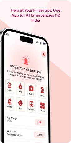
The 112 SOS Mobile Application stands as a crucial component of India's Emergency Response Support System (ERSS), with a widespread presence in 36 locations across various states and union territories. This application plays a vital role in providing immediate assistance during emergencies. Users can dispatch detailed alerts, including their profile and location, to the State Emergency Control Room and nearby volunteers. These volunteers receive audible and visual notifications, enabling them to swiftly extend assistance.
One of the notable features of the application is its seamless integration with existing emergency systems, ensuring the efficient deployment of resources. Beyond its immediate response capabilities, the application places a strong emphasis on citizen profile management, feedback mechanisms, and incident tracking. This holistic approach aims to revolutionize the landscape of emergency response nationwide, creating a more responsive and interconnected system.
Objective
The objective of 112 SOS Mobile Application is to identify and address design inconsistencies and challenges impacting user experience. Through a comprehensive UX/UI redesign, the aim is to enhance button affordances, implement consistent design patterns, and improve visual cues. This effort seeks to optimize the app's effectiveness, user trust, and overall reliability in delivering swift and intuitive emergency assistance
Key Features
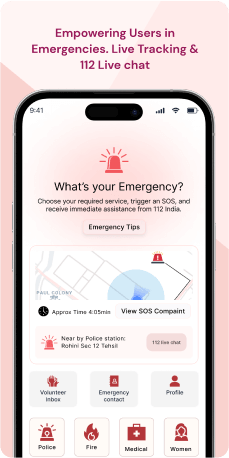
The Emergency Alert System empowers users to swiftly send alerts during crises, sharing vital profile details and their precise location. Seamlessly integrated with the '112' Helpline, these alerts automatically initiate a direct communication link with emergency services. Engaging nearby online volunteers, the application ensures prompt on-ground assistance.
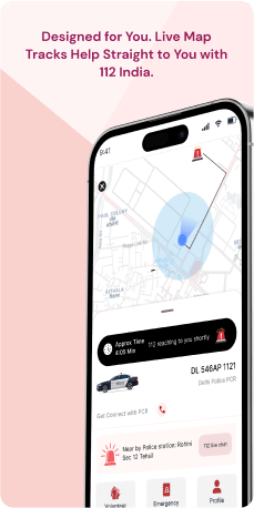
Utilizing location-based services, the application accurately pinpoints the user's location, expediting the dispatch of local emergency services. The Citizen Profile Management feature enables users to maintain and update their information, ensuring accurate dissemination during emergencies. To enhance service quality, the application incorporates a Feedback Mechanism, providing users with avenues to share their thoughts on the assistance received. Furthermore, the Incident Tracking functionality allows both users and emergency services to monitor the real-time progress and resolution of incidents. With 24x7 availability, the application ensures round-the-clock support, allowing users to seek help anytime and anywhere, reinforcing its role as a reliable emergency response tool.
Target Audience
The emergency response system's diverse user base can be divided into four primary categories. First, the public, across all demographics, seeks immediate assistance during emergencies, despite living in areas with varying access to emergency services. Second, vulnerable groups, such as the elderly, children, and those with medical conditions, prioritize preventive safety measures. Third, frequent travellers and commuters, such as those who use public transport, place a high value on travel safety and seek immediate assistance in unfamiliar areas. Finally, local emergency services and volunteers, as well as organizations and institutions, actively participate in community service, emergency response, and safety initiatives, which help to improve the system's overall effectiveness.
The Challenge
The 112 SOS Mobile Application plays a crucial role in its mission, as it grapples with several challenges that impact both its effectiveness and user experience. Notably, inconsistencies in the design of call-to-action (CTA) buttons across different screens introduce ambiguity and hinder intuitive interactions. The absence of clear visual distinctions, such as bounding boxes, further complicates user navigation, especially during critical moments. Design oversights, such as redundant contact number fetching, contribute to diminished user trust and compromise the overall reliability of the app.
To address these challenges and enhance the user experience, a comprehensive UX/UI redesign is essential. This redesign should focus on implementing consistent design patterns, improving button affordances, and incorporating clear visual cues to enhance user comprehension and streamline interactions. Additionally, integrating user feedback loops and conducting rigorous usability testing will play a crucial role in refining the app's design. By undertaking these measures, the goal is to ensure that the 112 SOS Mobile Application remains a reliable and user-friendly beacon of hope and assistance during emergencies.
Usability Study Findings
The usability study highlights critical issues in the application's interface, including inconsistent button designs, ambiguous call-to-action elements and visibility challenges.
The summarized usability study findings are-
Sign-In Screen- Unintuitive Button Design on the Pop-Up Notification-Users may struggle to interact with the pop-up notification due to the lack of visually distinct buttons, potentially causing confusion in decision-making. Users need clear visibility of the system status to make informed choices.
- Inconsistent Visual Presentation on Sector Pages-Inconsistent alignment of images with their respective headings disrupts the overall harmony of the visual representation on sector pages.
- Inconsistent Text Alignment in Pop-up Notification- The varying text alignment within the pop-up notification disrupts the visual flow, leading to a disjointed user experience and potential difficulty in information processing. Consistency and adherence to established standards are crucial for a seamless user experience.
- Inconspicuous "Done" CTA Button-The subtle appearance of the "Done" button on the home screen may lead users to overlook its functionality, potentially resulting in an incomplete or misunderstood action.
- Disabled Fields in One-time Registration-Erroneously presenting essential registration fields as disabled may frustrate users, impeding progress and hindering the overall registration experience.
- Ambiguous Call-to-Action Buttons in Interface-The lack of differentiation between primary and disabled CTAs within the registration interface may confuse users, affecting the visibility of the system status during the registration process.
- Suboptimal Layout and Inefficiencies of the Checkbox- Suboptimal layout and spacing around checkboxes may pose usability challenges, affecting the intuitive interaction with these elements.
- Ambiguous CTA Buttons and Inconsistent Action Buttons on Add Page-Design inconsistencies in the "Add" page interface may confuse users regarding primary and secondary actions, impacting their ability to discern consequences.
- Redundant Contact Number Retrieval in Contact Addition Functionality- Displaying the same contact number multiple times during the contact addition process may clutter the interface, causing unnecessary confusion for users.
- Inconsistent Button Design and Misleading Visual Hierarchy- Design inconsistencies within the Information Tab interface may create ambiguity, as elements like the "OK" button may be mistaken for disabled states, impacting user comprehension.
- Absence of Icon-Name Association Compromising CTA Recognition on Home Screen- Lack of clear associations between icons and their functions on the home screen may hinder users' understanding of the app's intended actions.
- Obscured Accessibility and Management of SOS Messages on Home Screen- Challenges in locating or managing SOS messages due to unclear visibility and controls may hinder user interaction with critical information.
- Unreliable SOS Emergency Functionality- Inconsistencies in the app's SOS emergency functionality raise concerns about user safety and trust in the application's reliability.
- Inconsistent CTA Button Design and Priority in SOS Pop-up Notifications- The lack of clear distinction between primary and secondary actions in SOS pop-up notifications may result in unintended signals or user confusion.
- Design Inconsistency in CTA Buttons of Emergency Message Pop-up Screen- Inconsistencies in button design within the emergency message pop-up screen create ambiguity, making it challenging for users to discern primary and secondary actions.
- Incomplete Information Display on Application Info Page- The absence of comprehensive information on the Application Info page deprives users of essential insights, hindering their ability to make informed decisions or troubleshoot issues.
Therefore, addressing these concerns is essential to enhance user experience, emphasizing clarity, consistency, and efficient information presentation. Ongoing testing and iterative improvements are crucial for creating an intuitive and reliable platform.
Synthesizing Phase
With the insights gathered during the research phase, we have gained valuable understanding of the users' interactions and challenges while using the application of 112 (Emergency Response Support System) , Government of India. Building on this knowledge, we have now entered the Defining phase, where our aim is to deepen our comprehension and transform the research findings into practical design solutions. To maintain a user-centric approach, we have created personas that embody essential user archetypes-
User Personas User Persona 1Priya, a 28-year-old professional who resides in a bustling urban area. Priya, representing the public demographic, seeks immediate assistance during emergencies, regardless of her location's access to emergency services.
Goals-Her primary goal is to efficiently use the 112 SOS Mobile Application to dispatch detailed alerts, including her profile and precise location, ensuring swift assistance during crises. Priya values travel safety and seeks immediate assistance in unfamiliar areas, making the app's accurate location-based services crucial for her peace of mind.
Pain Points-Priya faces challenges in the app's inconsistent button designs and ambiguous call-to-action elements, hindering her intuitive interactions during critical moments.
User Persona 2Ravi, a 45-year-old father and frequent commuter who relies on public transport. As part of the demographic prioritizing preventive safety measures.
Goals-Ravi's primary goal is to ensure the safety of his family, especially during emergencies. He depends on the 112 SOS Mobile Application for immediate assistance.
Pain Points-Ravi faces challenges related to the app's design inconsistencies, particularly the lack of clear visual distinctions such as bounding boxes, which complicates user navigation, impacting his ability to efficiently use the application during crucial moments. Despite his active involvement in community service initiatives, Ravi seeks a more user-friendly interface to enhance his effectiveness in emergency response scenarios.
Mapping User Journeys and Extracting InsightsWe have selected Ravi, a 45-year-old frequent commuter and father, to gain insights into his needs, pain points, and behaviors while using the 112 SOS Mobile App. Ravi's journey provides valuable perspectives on the challenges he faces, helping us identify areas for improvement within the application. These insights will guide efforts to enhance Ravi's overall experience in seeking immediate assistance during emergencies.
User Story"As Ravi, a 45-year-old father and frequent commuter, I rely on the 112 SOS Mobile Application for immediate assistance during emergencies to ensure the safety of my family. I want a straightforward and efficient experience to dispatch alerts and receive prompt on-ground assistance. However, I face challenges due to inconsistent button designs and ambiguous call-to-action elements within the app, making it challenging to navigate and efficiently utilize its features during crucial moments."
User Statement"I am Ravi, a frequent commuter and father, seeking reliable experience with the 112 SOS Mobile App. I desire an intuitive interface for dispatching alerts and receiving on-ground assistance during emergencies. The app's design inconsistencies, particularly in button designs and call-to-action elements, pose challenges and hinder my ability to navigate seamlessly. An improved application with clear visual cues and consistent design patterns would greatly enhance my effectiveness in responding to emergencies."
Framing challenges and hypothesis Problem StatementRavi, using the 112 SOS Mobile App, encounters difficulties related to inconsistent button designs and ambiguous call-to-action elements, impacting his ability to efficiently dispatch alerts and receive on-ground assistance during emergencies.
Hypothesis StatementIf we address the design inconsistencies in the 112 SOS Mobile Application by implementing consistent button designs and improving the clarity of call-to-action elements, then Ravi's experience will become more intuitive and user-friendly. This enhancement aims to streamline Ravi's ability to navigate the application during emergencies, ensuring a more effective and reliable emergency response.


