introduction
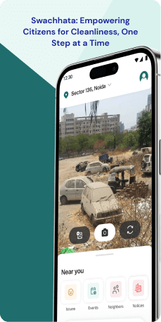
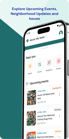
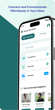
The Swachhata Mobile Application serves as the official mobile application of the Ministry of Housing and Urban Affairs (MoHUA) in the Government of India. Its purpose is to engage citizens in actively contributing to the enhancement of cleanliness and sanitation conditions in their respective cities and towns. Aligned with the "Swachh Bharat Abhiyan" initiative, the application is designed to streamline grievance redressal processes and encourage citizen participation in addressing urban sanitation issues.
Objective
The Swachhata Mobile Application strives to bridge the gap between citizens and authorities through a streamlined grievance redressal process, fostering active citizen involvement in sanitation initiatives. Utilizing technology, the application empowers citizens to contribute to cleaner and healthier urban environments. The features are-
- Complaint Registration- Users can report various sanitation issues, such as overflowing garbage bins or clogged drains, by uploading pictures and geo-tagging the location.
- Complaint Tracking- Users can monitor the real-time progress of their registered complaints, receiving updates on the assigned officer and resolution status.
- Voting and Feedback- Users can upvote relevant complaints and provide feedback on the resolution of their own complaints, enhancing community engagement.
- Public Toilet Locator- The application helps users find the nearest public toilets, offering information on accessibility and amenities.
- Awareness Initiatives- Access to educational content and awareness campaigns on sanitation practices and waste management promotes informed citizenry.
Target Audience
The Swachhata Mobile Application is designed for urban residents keen on actively improving sanitation. Target users include those reporting issues like overflowing bins or unclean public toilets through Complaint Registration. The application's Complaint Tracking caters to users interested in real-time updates on issue resolution. Voting and Feedback features engage the community, while the Public Toilet Locator assists individuals seeking nearby facilities. The application's educational content appeals to those wanting to stay informed on sanitation practices. In essence, the application targets residents committed to fostering cleaner and healthier urban environments through direct participation and awareness.
The Challenge
The Swachhata application, aimed at empowering citizens in urban sanitation, currently faces challenges in both functionality and engagement. The interface's complexity hinders intuitive navigation and efficient complaint registration, while unclear progress tracking and limited feedback options disconnect user actions from outcomes, discouraging sustained engagement. Despite the presence of awareness initiatives, they have yet to transition from informational delivery to impactful behavioral change. Recognizing this gap, our design reinvention seeks to overhaul the UX, ensuring the Swachhata application fully realizes its potential as a powerful tool for citizen empowerment and transformative change in urban sanitation.
Usability Study Findings
Usability insights for the Swachhata application reveal challenges in branding consistency, animation complexity and user onboarding. Addressing these issues is crucial for an enhanced user experience and greater engagement with the application's initiatives.
The summarized usability points are as follows-
OnboardingThe onboarding process of the application presents notable challenges in maintaining brand identity and user clarity. The splash screen's animation and graphic deviate from the established Swachhata initiative's color palette, leading to confusion and a lack of brand consistency. The unnecessary complexity introduced by the animation during application launch raises concerns about its impact on usability and the user's journey. A mystery element, represented by a graphic post-animation, lacks replication elsewhere, potentially weakening the application's message and causing confusion about its focus. The splash screen misses an opportunity for emotional engagement by not aligning with the Swachhata initiative's core values.
Key Highlights are-
- Inconsistent Branding-Animation deviates from Swachhata initiative's color palette, causing confusion.
- Unnecessary Complexity-Animation introduces unnecessary complexity, potentially delaying access to core functionalities.
- Mystery Element- Post-animation graphic lacks replication, creating uncertainty about its significance.
- Missed Brand Storytelling- Splash screen misses the chance to engage users with core values and emotional impact.
- Unidentifiable App-Initial mobile number input lacks application's name and logo, causing confusion.
- Hidden Language Selection- Poorly visible language selection risks excluding non-Hindi speakers.
- Prolonged Onboarding- Current process feels lengthy, risking user impatience.
- Pixelated Visuals- Instructional screens appear pixelated, hindering user understanding.
The home screen design exhibits visual homogeneity, making it challenging for users to differentiate between cards and prioritize their focus. Inconsistencies in ed text add to the visual clutter and may pose readability challenges for users with certain impairments. The inclusion of crucial actions within carousel risk being overlooked by users, as carousels often suffer from low engagement when important information is buried within them.
Key Highlights-
- Visual Homogeneity- Cards lack distinct design elements, causing visual monotony.
- ed Text Inconsistencies- Inconsistent use of ed text may distract users and hinder readability.
- Overlooked Carousel Actions- Crucial actions within carousel risk being overlooked.
The events section introduces an unnecessary categorization step, forcing users to choose a category before viewing events. This adds complexity to the user flow and potentially delays access to desired information. The lack of event visibility at first glance, requiring users to select a category before displaying actual events, creates an additional hurdle for quick information retrieval. Inconsistent color usage for buttons within this section further contributes to visual clutter, potentially weakening brand recognition.
Key Highlights-
- Unnecessary Categorization- Grid forces users to choose a category before viewing events, adding an unnecessary step.
- Lack of Event Visibility- Initial screen doesn't display events, requiring users to select a category first.
- Inconsistent Color Palette- Different button colors create visual clutter, potentially weakening brand recognition.
The complaints section reveals issues of inconsistent card design, creating confusion about the functionalities represented. The "latest complaints around you" section's misleading information, displaying complaints from five years ago, has the potential to misguide users about the application's activity. Additionally, the non-functional "Directions" button on a dedicated complaint page can lead to frustration and diminish user trust.
Key Highlights-
- Inconsistent Card Design- Same card design for various functionalities causes confusion.
- Misleading Complaint Date- "Latest complaints around you" section displays outdated complaints, potentially misleading users.
- Non-functional "Directions" Button- Clicking "Directions" on a complaint page doesn't lead to directions, diminishing user trust.
The profile page's incomplete and placeholder-heavy UI may hinder user engagement and create a negative first impression. Allowing users to keep the "active citizen" placeholder as their name introduces inconsistency throughout the application and may mislead users. The profile page suffers from unnecessary information overload, presenting a crowded list of unrelated actions and pages at the bottom, impacting both usability and user navigation.
Key Highlights-
- Incomplete UI- Profile page lacks a profile picture and displays "active citizen" as a placeholder name.
- Mandatory Name Input- Allowing the "active citizen" placeholder creates confusion and inconsistency.
- Unnecessary Information Overload- Profile page suffers from information overload, impacting user navigation.
Therefore, the usability study highlights critical issues in maintaining brand identity, clarity and user engagement across various sections of the application. From onboarding challenges to issues within specific sections, addressing these concerns is essential for enhancing the overall user experience.
Synthesizing Phase
With the insights gathered during the research phase, we have gained valuable understanding of the users' interactions and challenges while using the application of Swachhata , Government of India. Building on this knowledge, we have now entered the Defining phase, where our aim is to deepen our comprehension and transform the research findings into practical design solutions. To maintain a user-centric approach, we have created personas that embody essential user archetypes-
User Personas Persona 1- Avid Citizen ContributorPriya, a 32-year-old urban resident passionate about actively contributing to the cleanliness and sanitation of her city.
Goals-Priya's primary goal is to use the Swachhata Mobile Application to report various sanitation issues she encounters, such as overflowing garbage bins or clogged drains. Her commitment to fostering a cleaner and healthier urban environment drives her to engage with the Complaint Registration feature regularly.
Pain Points-Priya faces challenges during the onboarding process, finding the animation and graphic deviation from the Swachhata initiative's color palette confusing. The unnecessary complexity introduced by the animation raises concerns about its impact on usability, potentially hindering quick access to core functionalities. Despite her dedication to the cause, Priya feels disconnected due to the inconsistent branding and is eager for a more straightforward and engaging user experience.
Persona 2- Informed Urban ResidentRaj, a 28-year-old urban resident who values staying informed on sanitation practices and waste management.
Goals-Raj's primary goal in using the Swachhata Mobile Application is to access educational content and awareness campaigns provided by the app. He seeks to enhance his knowledge and contribute to the community's awareness of sanitation issues.
Pain Points-Raj faces challenges with the Events section, where an unnecessary categorization step forces him to choose a category before viewing events. This added complexity disrupts its user flow, potentially delaying access to the desired information. The lack of event visibility at first glance and inconsistent color usage for buttons further contribute to visual clutter, impacting Raj's ability to quickly retrieve valuable information. Despite his commitment to staying informed, Raj finds the current design hurdles discouraging and is looking for a more seamless and user-friendly experience.
Mapping User Journeys and Extracting InsightsWe have chosen Raj, a civic-minded urban resident, to gain a deeper understanding of his needs, pain points, and behaviors while utilizing the Swachhata Mobile Application. His journey sheds light on the challenges he encounters and underscores potential areas for improvement within the application to enhance his overall experience as an engaged participant in urban sanitation initiatives.
User Story"As a civic-minded urban resident, I aim to actively contribute to the cleanliness of my city using the Swachhata Mobile Application. I want a seamless experience to report sanitation issues, track the progress of my complaints, and stay informed about public facilities. However, I face challenges in understanding the application's interface and struggle with unclear progress tracking and limited feedback options."
User Statement"I am Raj, a civic-minded urban resident, eager to actively contribute to the cleanliness of my city through the Swachhata Mobile Application. I desire a user-friendly experience that simplifies the process of reporting sanitation issues, provides clear progress tracking for my complaints, and keeps me informed about public facilities. The current challenges in navigating the application and the lack of clarity in progress tracking and feedback options hinder my effective contribution to urban sanitation initiatives. I envision an improved platform that empowers me to make a meaningful impact on the cleanliness of my city with ease and engagement."
Framing challenges and hypothesis Problem StatementRaj, a civic-minded urban resident using the Swachhata application, encounters difficulties related to the application's usability, progress tracking, and community engagement features. These challenges impact his ability to effectively contribute to the cleanliness of his city.
Hypothesis StatementIf we improve the application's user interface for intuitive navigation, enhance progress tracking and feedback options, and provide clear instructions, then Raj's experience on the Swachhata Mobile Application will become more user-friendly and encourage sustained engagement, addressing his specific challenges.
By focusing on Raj's user journey and addressing the identified challenges, the Swachhata app can better empower civic-minded individuals like him to actively participate in urban sanitation initiatives and contribute to the overall cleanliness of their city.


