introduction
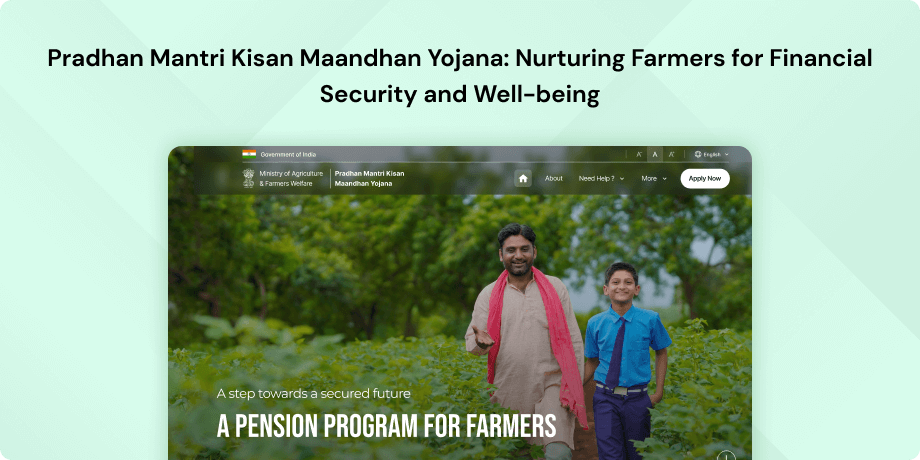
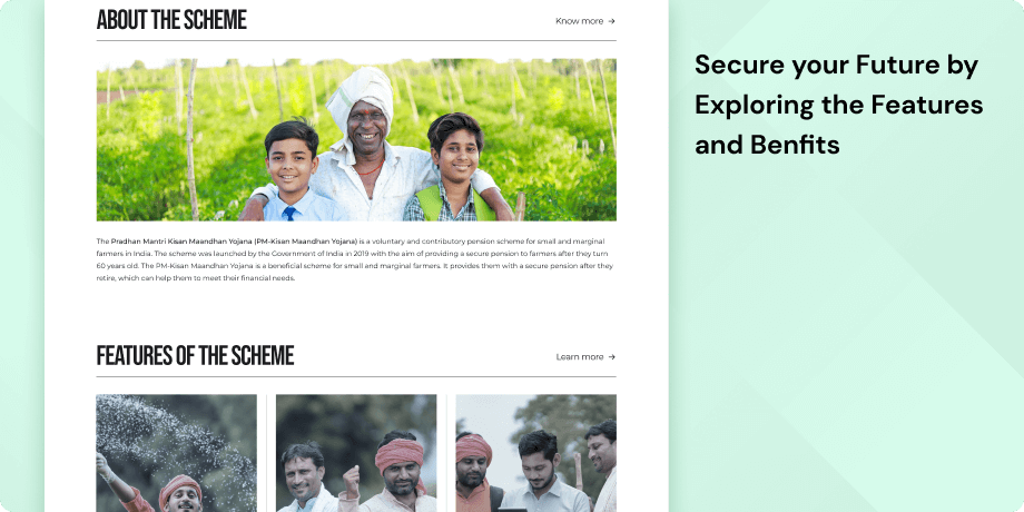
The Pradhan Mantri Kisan Maandhan Yojana (PM-Kisan Maandhan Yojana) website, a government initiative designed to offer a monthly pension of Rs. 3,000 to small and marginal farmers once they reach the age of 60. This program operates on a voluntary and contributory basis, allowing farmers to join by making monthly contributions ranging from Rs. 55 to Rs. 200. Additionally, the government matches the farmer's contributions by contributing an equal amount to the pension fund. The website's primary aim is to offer information to small and marginal farmers about the Pradhan Mantri Kisan Maandhan Yojana.
Objective
The Pradhan Mantri Kisan Maandhan Yojana (PMKMY) website has a twofold mission- to simplify the implementation and enhance accessibility of the PMKMY scheme for small and marginal farmers in India. The website endeavors to achieve the following goals for its users:
- Information Dissemination- The website serves as a comprehensive source of information regarding the PMKMY scheme. It provides in-depth details about the scheme's features, benefits, eligibility criteria, and application process. Users can access up-to-date, detailed information to gain a thorough understanding of the scheme and its prerequisites.
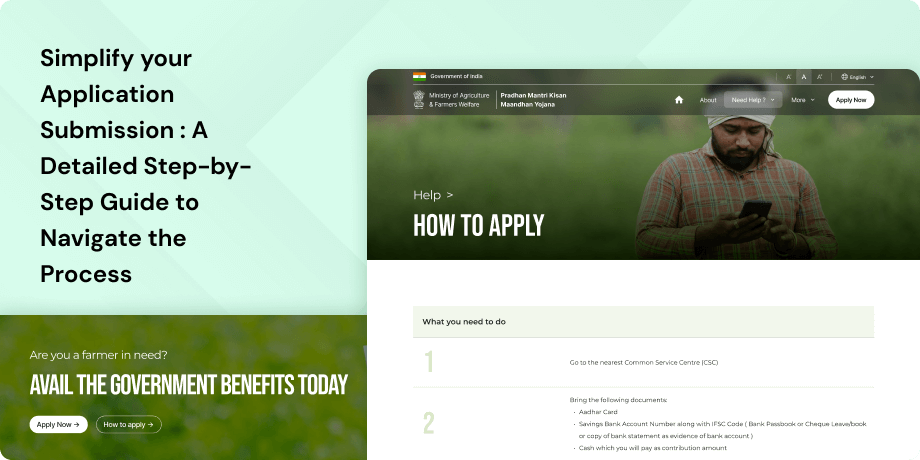
- Enrollment Process- The website offers a streamlined enrollment process, outlining the necessary steps for eligible farmers. Users can easily follow these steps, visit their nearest Common Service Centre (CSC) office, complete the required documentation, and register for the scheme. This simplification of the registration process makes it convenient for farmers to participate in the program.
- User Support and Assistance- The website is committed to providing user support and assistance. It offers various resources, frequently asked questions (FAQs), and contact information for relevant authorities. Users can access guidance and clarification on various aspects of the scheme, empowering them to make informed decisions and seek assistance whenever needed.
Target Audience
The website caters to small and marginal farmers seeking to participate in the scheme, serving as their intended audience.
The Challenge
The website presents usability challenges that hinder user navigation and information retrieval. For instance, numerous inactive navigation buttons create confusion. Furthermore, some links direct users to non-existent pages, causing frustration. The landing page's introduction is oddly placed at the bottom, hindering a quick overview. Lastly, the site lacks full accessibility for individuals with disabilities.
Usability Study Findings
Based on the usability study of the PMKMY website, several issues have been identified that affect the user experience on the website. Here's a summary of the insights gathered from the study-
Here's a summary of the key findings
Homepage- Lack of Clear Introduction and Hero Section- The website lacks a clear and prominent introduction section, and there's no distinct hero section to capture the user's attention. This can lead to user confusion and disengagement, hindering their understanding of the website's purpose and offerings.
- Inadequate Controls and Navigation for Carousel Banner- The controls for the carousel banner are small and poorly positioned, making it challenging for users to interact with it effectively. This can result in a frustrating user experience.
- Non-functional Navigation Bar-Certain Call-to-Action (CTA) buttons in the navigation bar are non-functional, leading to "Page Not Found" errors when clicked. This prevents users from accessing desired content and impacts effective navigation.
- Poor Presentation of Information Card- The information card at the bottom of the landing page lacks effective presentation, making it difficult for users to grasp information easily. The "View More" button is too small and not prominent, resembling a link rather than a CTA.
- Non-functional "Apply" Button and Generic Enrollment Information- The "Apply" button in the enrollment information section is non-functional, and the displayed number of users is generic, lacking personalization. This can lead to a lack of trust and engagement from users.
- Non-functional Navigation Buttons- Navigation buttons related to internal pages, such as the Scheme section, Analytics, and Enrollment Apply, are non-functional and result in "Page Not Found" errors, obstructing users from accessing the intended content.
- Inconsistent Color and Style of Section Headers- On the details page, the color and style of section headers change inconsistently when selected, disrupting the overall layout and appearance of the page.
- Non-Accessibility of Text, Language Preference, and Screen Mode- There are issues related to accessibility, text legibility, and language preference in the header section, which can impact the user experience.
- Inaccessible Links and Inconsistent Logo Placement- Some links in the footer are inaccessible or lead to broken pages. Additionally, there is inconsistency in logo placement between the header and footer. The links in the header have a dull color treatment, reducing visibility and potentially impacting trust in the website's reliability and credibility.
In summary, the usability study highlights various issues that can lead to a subpar user experience on the PMKMY website. Addressing these issues, such as improving website introduction, fixing non-functional buttons, enhancing visual design, and ensuring accessibility, can significantly improve user satisfaction and engagement on the website.
Synthesizing Phase
With the insights gathered during the research phase, we have gained valuable understanding of the users' interactions and challenges while using the website of Pradhan Mantri Kisan Maandhan Yojana, a statutory body of the Government of India. Building on this knowledge, we have now entered the Defining phase, where our aim is to deepen our comprehension and transform the research findings into practical design solutions. To maintain a user-centric approach, we have created personas that embody essential user archetypes-
User Personas Persona 1: Deepak, the Struggling Small FarmerDeepak is a 45-year-old small farmer in a rural village in India. He inherited a small piece of land from his ancestors but has been struggling to make ends meet. With minimal agricultural yields and inconsistent income, he faces financial insecurity. Deepak is the sole breadwinner for his family, which includes his wife and two children. He is aware of the Pradhan Mantri Kisan Maandhan Yojana (PMKMY) and hopes it could provide a stable source of income for his retirement.
Goals-The goal is to provide financial security to farmers during their retirement through the Pradhan Mantri Kisan Maan Dhan Yojana (PMKMY) scheme. Eligible individuals (age 18-40, landholding up to 2 hectares) can enroll to secure a monthly pension. The PMKMY website is designed to offer accessible, clear, and simple information, making it easy to understand, even for those with limited formal education.
Pain Points-The pain points for Deepak in his experience with the PMKMY website are notable. Firstly, the difficulty in navigating the website, primarily attributed to its complex layout and the presence of technical jargon, has made it challenging for him to locate the information he needs. This has caused frustration and time wastage. Additionally, encountering broken links and outdated content on the website has raised doubts about the reliability of the information provided, adding to his frustration. Moreover, the limited accessibility features on the website present a substantial barrier, particularly for someone like Deepak, who may not be tech-savvy or familiar with online resources, making his interaction with the platform less user-friendly and less effective.
User Persona 2: Ayesha, the Concerned Social WorkerAyesha is a dedicated social worker with a local non-profit organization in a rural area. She has been working closely with small and marginalized farmers in her community, assisting them with various government schemes and resources. Ayesha is passionate about helping her community and believes that the PMKMY scheme can significantly improve the lives of many farmers in her region.
Goals-The goal is to gather comprehensive information about the PMKMY scheme to assist clients in understanding and enrolling in it. She also seeks resources and tools on the PMKMY website that can aid her in guiding farmers through the enrollment process. Additionally, it's essential to ensure that the website is user-friendly and accessible for her clients, many of whom may have limited literacy and technical skills.
Pain Points-The pain points in her experience with the PMKMY website are evident. First, she encounters difficulty when trying to navigate the website, especially when seeking specific resources or guidance to assist her clients. This navigation challenge leads to frustration and hinders her ability to provide effective support.
Moreover, the absence of easily digestible, client-friendly information on the website adds to her frustration. This lack of clarity makes it difficult for her to explain the scheme to her clients in a straightforward manner, impacting the quality of service she can offer. She is also concerned about the accessibility of the website for her clients. The website may not be user-friendly for those with limited literacy and digital skills, posing a significant obstacle to her mission of assisting clients effectively.
Mapping User Journey and Extracting Insights for Deepak, the Struggling Small FarmerWe have chosen to focus on Deepak, a small farmer facing financial challenges and looking for information about the Pradhan Mantri Kisan Maandhan Yojana (PMKMY) through the PMKMY website. By mapping Deepak's user journey, we aim to understand his motivations, pain points, and needs when accessing the PMKMY website to gather information about the scheme.
Mapping the journey to a “user story”After analyzing Deepak's user journey map, we've gained insights into the actions, emotions, and pain points he experiences when interacting with the PMKMY website. This journey map has been tailored to Deepak's objectives and requirements as a small farmer. It highlights crucial touchpoints where Deepak encounters difficulties and suggests potential areas for improvement. Based on these observations, we have distilled one of Deepak's key needs into the following user story:
Deepak’s User Story"As a struggling small farmer, I want to easily find and understand information about the PMKMY scheme on the PMKMY website so that I can secure a monthly pension for my retirement."
Framing challenges and hypothesisHaving analyzed Deepak's user journey, we can formulate a problem statement that encapsulates the challenges he faces when using the PMKMY website.
Problem StatementDeepak, a small farmer seeking information on the PMKMY scheme, requires a more straightforward and accessible website structure and a user-friendly interface because the current complex navigation and jargon on the website hinder Deepak's ability to access the essential information he needs to secure his retirement. This problem statement will guide our design efforts, ensuring that our solutions directly address Deepak's needs and improve his overall experience on the PMKMY website. Building upon this problem statement, we aim to address the challenges faced by Deepak and enhance his user journey. Through an in-depth analysis of user insights and pain points, we have formulated a hypothesis.
Hypothesis StatementIf we redesign the PMKMY website with a simplified structure, user-friendly language, and clear navigation, Deepak's experience on the PMKMY website will become more accessible, user-friendly, and valuable for securing his retirement through the scheme.
We believe that by addressing the identified challenges and implementing user-centric solutions, Deepak will have a more productive and satisfying experience while accessing information about the PMKMY scheme on the PMKMY website. In the following sections, we will work on transforming these insights into concrete design solutions, aiming to improve Deepak's experience and help him secure his financial future.


