introduction
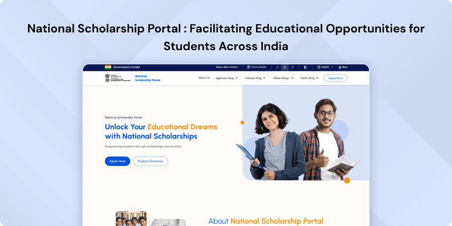
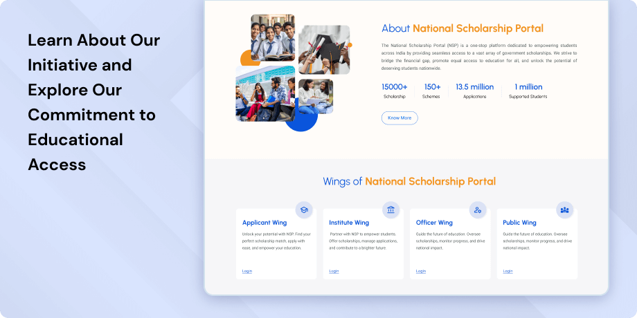
The National Scholarships Portal, designated as a Mission Mode Project under the National e-Governance Plan, serves as a comprehensive solution for student scholarship services. Its vision is to provide a simplified, mission-oriented, accountable, responsive and transparent system for efficient processing and disbursal of scholarships. The mission involves creating a common electronic portal to implement scholarship schemes by the Union Government, State Governments and Union Territories, ensuring direct fund delivery to beneficiaries without leakages.
Objective
The primary objective is to ensure the prompt disbursement of scholarships to students through the establishment of a unified portal encompassing various scholarship schemes from both Central and State Governments. The initiative aims to create a transparent database of scholars, prevent duplication in processing, harmonize diverse scholarship schemes and norms and implement Direct Benefit Transfer.
Objective highlights are as follows-
- Simplified Student Process
- Enhanced Transparency
- Standardization Support
- Decision Support System (DSS)
- Comprehensive Monitoring System
All scholarship information is consolidated under one platform.
Single integrated application for accessing multiple scholarships.
System recommends eligible schemes for students.
Significant reduction in duplicate processing.
Maintenance of master data for institutions and courses at the national level.
Streamlined scholarship processing procedures.
Acts as a DSS for Ministries and departments.
Up-to-date information available on demand.
Implementation of a detailed Management Information System (MIS).
Enables monitoring at every stage of scholarship distribution from student registration to fund delivery.
Target Audience
The National Scholarships Portal targets a diverse set of users, including students seeking information and applying for scholarships, educational institutions managing course data and facilitating scholarship processing, government authorities overseeing schemes and making informed decisions, administrators maintaining scholar databases and ministries accessing real-time monitoring tools. The portal's design aims to serve each stakeholder's specific role within the scholarship ecosystem, ensuring a streamlined and efficient experience for all users involved.
The Challenge
The challenge lies in optimizing the user experience of the website by overcoming various obstacles that users may encounter. Key hurdles include refining the complex search process, enhancing search flexibility, providing more comprehensive feedback and information, ensuring data accuracy and consistency, improving mobile responsiveness, prioritizing accessibility and refining the user interface to be more intuitive and user centric. Successfully addressing these challenges is crucial to creating a seamless and efficient experience for individuals navigating the National Scholarships Portal.
Usability Study Findings
The usability study has shed light on critical insights for both the New Applicant Registration and Applicant Login processes on the National Scholarships Portal-
New Applicant Registration- Visual Alignment- The study identified inconsistencies in the visual alignment of elements within the header, potentially leading to a disjointed user experience. Addressing these alignment issues is crucial for a cohesive and visually pleasing interface.
- Language Options- Limited language choices, restricted to English and Hindi, may pose accessibility challenges for users comfortable with regional languages. Expanding language options can enhance inclusivity and user engagement.
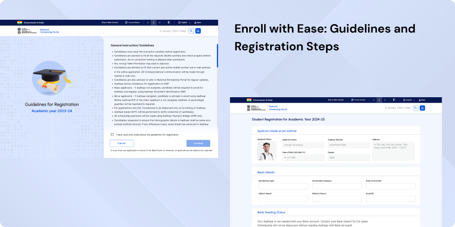
- Aadhaar Query- The redundant Aadhaar query during registration and the absence of guidance for users selecting 'I have Aadhaar' can cause confusion. Clear instructions and a streamlined process for Aadhaar-related queries are recommended.
- Captcha Section- UI issues within the captcha section, including inconsistent placement of elements, compromise the overall user experience. Addressing these issues will contribute to a smoother registration process.
- Aadhaar Consent Checkbox- The suboptimal placement of the Aadhaar consent checkbox disrupts the logical flow during registration. Adjusting its placement can improve the overall user journey and reduce potential user errors.
- Error Messages- Non-intuitive error messages and the lack of field highlighting were identified as obstacles to a seamless form-filling experience. Improving error messages and highlighting fields can enhance user understanding and interaction.
- OTP Timer Placement- The suboptimal placement of the OTP timer below the Aadhaar number may lead to confusion or delays. Revising the placement for better visibility and understanding is recommended.
- Help or Know More Option- The absence of information or guidance for input fields necessitates the inclusion of a Help or Know More option. This addition can assist users in providing accurate information during the registration process.
- Dropdown Clarity- Lack of clarity in scholarship category dropdown options may cause user uncertainty. Providing concise and understandable dropdown options is essential for a more user-friendly experience.
- Registration Confirmation- Unnecessary steps in the registration confirmation process were identified and need elimination for a streamlined user journey. Simplifying the confirmation steps will contribute to an efficient and user-friendly registration process.
- Password Management- Unsecure password management violates cognitive load principles and users should be allowed to set their passwords during registration. Empowering users to manage their passwords securely from the outset is crucial for data protection.
- UI Design Consistency- Inconsistency in UI design between registration and login screens may confuse users. Ensuring a uniform design language across both processes is imperative for a seamless transition.
- Two-Factor Authentication- Redundant two-factor authentication and a lengthy process were identified as hindrances of efficiency and clarity. Streamlining the authentication process will contribute to a more user-friendly login experience.
- Password Change Confusion- The post-login password change process was found to be confusing and introduced unnecessary redundancy. Simplifying the password change process after login is recommended to enhance user understanding.
- Dashboard Interface- The outdated dashboard layout was highlighted as violating modern design standards, potentially leading to user dissatisfaction. Upgrading the dashboard interface to align with contemporary design principles is essential for user satisfaction.
- Dashboard Necessity- The questionable necessity of the dashboard and misaligned functionality may overwhelm users. Reassessing the dashboard's purpose and optimizing its features can improve user engagement.
- Digilocker Integration- Broken Digilocker integration and duplicate data entry were identified as hindrances to efficiency and user effort. Resolving integration issues and minimizing redundant data entry will streamline the user experience.
- Institute Selection- An unintuitive institute selection process and information overload were identified as potential sources of user frustration. Simplifying the institute selection process and providing clear information can enhance user satisfaction.
- Code Search Complexity- Unnecessary code search complexity complicates the interface and contradicts design principles. Simplifying the code search process aligns with design principles and improves user interaction.
- Notification and Error Handling- Lack of notification and error handling in the Digi Locker linking process complicates the user experience. Implementing effective notification and error handling mechanisms will enhance user understanding and responsiveness.
- Document Access- The absence of documents in View Digi Locker Docs and insufficient user guidance create confusion. Ensuring accessible documents and providing adequate user guidance will contribute to a more user-friendly document access experience.
Therefore, addressing these detailed insights is essential to enhance the overall usability, clarity and efficiency of the National Scholarships Portal. Improvements in visual consistency, language options, guidance and streamlining of processes are recommended to create a more user-friendly experience.
Synthesizing Phase
With the insights gathered during the research phase, we have gained valuable understanding of the users' interactions and challenges while using the website of National Scholarship Portal, Government of India. Building on this knowledge, we have now entered the Defining phase, where our aim is to deepen our comprehension and transform the research findings into practical design solutions. To maintain a user-centric approach, we have created personas that embody essential user archetypes-
User Personas Persona 1- Riya, a College Student from a Rural BackgroundRiya, a 20-year-old college student pursuing a degree in Commerce from a rural area, represents a user persona facing unique challenges while navigating the National Scholarships Portal.
Goals-Riya's primary goal is to secure financial assistance for her education through available scholarship schemes.
Pain Points-Her challenges include limited proficiency in English and Hindi, hindering her understanding of the registration process. The complex Aadhaar query and the absence of guidance on selecting 'I have Aadhaar' create confusion for Riya, making the registration process daunting. Additionally, the unclear dropdown options for scholarship categories further complicate her experience. Riya also struggles with the document access feature, finding it challenging to locate and understand the required documents. Enhancing language options, providing clear instructions, simplifying the registration steps and ensuring user-friendly dropdowns are crucial for Riya to seamlessly access and benefit from the National Scholarships Portal.
Persona 2- Ankit, a Tech-Savvy Urban College StudentAnkit, a 22-year-old urban college student majoring in Computer Science, represents a tech-savvy user persona navigating the National Scholarships Portal.
Goals-Ankit's primary goal is to efficiently access and manage various scholarships to support his academic journey.
Pain Points-Ankit faces challenges with the inconsistent UI design between the registration and login screens, leading to confusion. The redundant two-factor authentication and a lengthy login process disrupt Ankit's expectation of a quick and straightforward experience. He finds the post-login password change process confusing and the outdated dashboard interface disappointing. The broken Digilocker integration and duplicate data entry add unnecessary complexity to Ankit's user journey. Ankit desires a streamlined and modernized interface that aligns with contemporary design principles. Improving UI design consistency, streamlining authentication processes, upgrading the dashboard interface and resolving integration issues are crucial for Ankit to have a smooth and efficient experience on the National Scholarships Portal.
Mapping User Journeys and Extracting InsightsWe decided to focus on Riya, a determined college student from a rural background, who sets out on her academic journey using the National Scholarships Portal. As we explore Riya's user journey, we gain insights into her actions, emotions and pain points throughout the scholarship application process.
Riya's User Story"As a college student from a rural background, I need a user-friendly and inclusive platform to access and apply for scholarships to support my education. The current challenges in language options, complex Aadhaar queries and unclear dropdown categories hinder my ability to navigate and complete the registration process effectively."
Framing challenges and hypothesis Problem StatementRiya, a college student from a rural area, faces difficulties in accessing and applying for scholarships due to language limitations, complex Aadhaar queries and unclear dropdown categories on the National Scholarships Portal. These challenges hinder her from seamlessly completing the registration process.
Hypothesis StatementIf we enhance language options, simplify Aadhaar queries and provide clear dropdown categories, Riya's user experience will improve, leading to increased accessibility and efficiency in completing the scholarship registration process. This, in turn, will contribute to higher user satisfaction and successful participation in scholarship programs.


