introduction
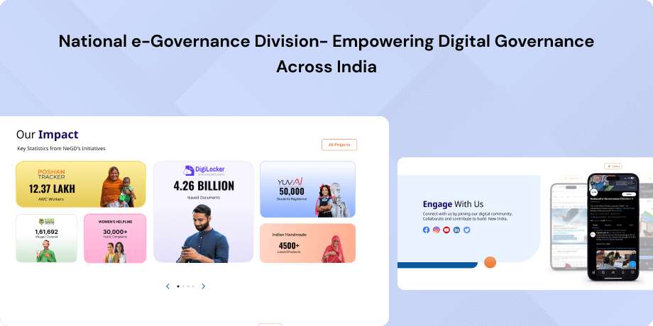
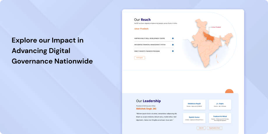
The National e-Governance Division (NeGD) operates under India's Ministry of Electronics and Information Technology (MeitY). Its main job is to be a central place for sharing information and helpful resources about e-Governance in India. NeGD aims to provide insights and support for digital governance to government workers, interested people, and the public. On the NeGD website, you can find information about ongoing projects, policies, education programs, successes, and contact details. It's an important part of India's efforts to go digital.
Objective
The NeGD website serves as a central hub for sharing information and resources related to e-Governance efforts in India. Its main goal is to provide a central source of knowledge, handbook, and successful practices that can be accessed by government employees, interested individuals, and the public who want to learn about and implement digital governance solutions. The website contains information about current projects, policies, training programs, publications, success stories, and contact information, all aimed at promoting collaboration and supporting India's journey towards digital transformation.
Target Audience
The NeGD website caters to a wide range of users, including government officials, policy influencers, technology experts, researchers, industry collaborators, and citizens interested in e-Governance in India.
- Government officials (central and state)
- Policymakers
- Stakeholders in e-Governance
- Local authorities
- Technology professionals
- Researchers
- Industry partners
- Citizens seeking digital government services
The Challenge
The current website design is outdated and falls short of meeting the demands of modern users. Its navigation is difficult, its visual design is unattractive, and there's a notable absence of user-centric design, leading to poor user experience and lack of accessibility.
Usability Study Findings
Homepage- Accessibility Bar Dispersed: Users struggled to find accessibility options, as they were scattered across the interface. Consolidating these options into one easily accessible location was suggested to improve usability.
- Limited Font Size Choices: Users with visual impairments or different preferences for font sizes faced challenges due to the limited font size choices. Providing a broader range of font size options was recommended for better readability.
- Dark Mode Contrast Issues: The dark mode feature had contrast problems, with some areas having high contrast and others low. Users found this uncomfortable to read. Balancing dark mode contrast was suggested for a better user experience.
- Logo Skewing: Distorted logos compromised visual integrity and professionalism. Correcting the misalignment was recommended.
- Header Highlighted Options: Unnecessary highlighting of header options cluttered the interface and confused users. Removing this unnecessary highlighting was suggested for improved clarity.
- What's New Section Visibility: The "What's New" section was not prominent enough and got lost among banners. Enhancing its visibility was recommended for better user recognition.
- New Initiative Aesthetic and Accessibility: Blurry images affected the visual appeal, and the absence of labels made the content inaccessible. Making images clearer and adding labels was suggested, along with providing clickable options for more information.
- NeGD Team Section: Blurry images, a lack of labels, and non-functional links frustrated users and hindered comprehension. Clearer images, labels, and functional links were recommended.
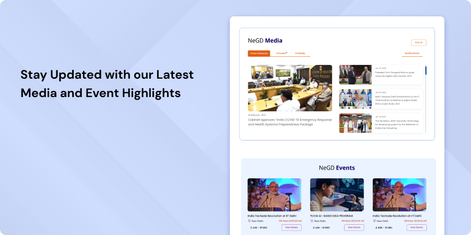
- Events Section Aesthetics and Engagement: The design in the Events section fell short of achieving an aesthetic and minimalistic look. Blurry images and a lack of contextual information reduced user engagement. Improving image quality and providing context was advised.
- Lack of Sitemap: The absence of a sitemap hindered navigation and search engine optimization, which is a crucial component for website usability.
- Mobile Layout Issues: The mobile layout had various issues, including uneven padding on logos, inaccessible promotional banners, non-clickable sections, difficulties with accordion closures, excessive padding around the menu, a requirement for bottom scrolling, un-skippable sections, and a lack of intuitiveness. These issues affected the overall user experience on mobile devices.
Synthesizing Phase
With the insights gathered during the research phase, we have gained valuable understanding of the users' interactions and challenges while using the website of the National e-Governance Division. Building on this knowledge, we have now entered the Defining phase, where our aim is to deepen our comprehension and transform the research findings into practical design solutions. To maintain a user-centric approach, we have created personas that embody essential user archetypes-
User Personas User Personas-1. Government Official - Policy Maker Name- NehaNeha is a high-ranking government official working in the Ministry of Electronics and Information Technology (MeitY) in India. She is responsible for formulating and implementing policies related to e-Governance initiatives in the country. Neha is tech-savvy and understands the importance of digitalization in government services.
Goals-For Neha, the government official, a redesigned NeGD website should prioritize streamlined navigation, robust search functionality, enhanced accessibility options, and secure collaborative platforms to meet her needs effectively.
Pain Points-Neha, the high-ranking government official, is frustrated with the current NeGD website's outdated design and navigation, which hinders her access to critical information, policies, and collaboration opportunities in the e-Governance sector. She needs an efficient and user-friendly website to stay well-informed, facilitate collaborations with government departments, and drive the modernization of government service delivery.
User Person 2: Citizen - Seeking Government Services Name- RajRaj is an average citizen in India who prefers using digital channels to access government services. He is not tech-savvy and relies on user-friendly websites to find information about government programs, educational resources, and contact details for assistance. Raj wants to know how to access various government services online.
Goals-For Raj, the citizen seeking government services, the redesigned website should focus on accessibility, user-friendliness, clear information architecture, mobile responsiveness, and user-friendly guides to provide him with a convenient and informative platform for accessing government services and improving his online government resource interaction experience.
Pain Points-Raj, an average citizen seeking government services, is frustrated by the NeGD website's lack of accessibility features and its confusing design. He struggles to find information about digital government services, educational programs, and contact details for assistance. Raj wants an intuitive and accessible website that allows him to easily access government services, understand their purpose, and enhance his overall online interaction with government resources
Mapping User Journeys and Extracting InsightsRaj embarks on his user journey when the need to access government services or information online arises. This initial discovery leads him to open his web browser and navigate to the NeGD website in search of the required information. As he lands on the website's homepage, he anticipates finding clear and visually appealing information guiding him to the resources he seeks. Regrettably, Raj often encounters a cluttered and confusing homepage with no discernible pathways to his specific needs. His next step involves interacting with the website's navigation menu, where he attempts to locate essential information related to digital government services, educational programs, or contact details for assistance.
Sadly, he frequently faces navigational challenges due to the website's lack of user-centric design and an intuitive structure. These difficulties lead to growing frustration and confusion as he clicks through various sections of the website without clarity on their purpose, compounded by the absence of clear descriptions. Accessibility issues further hinder Raj's journey, as he may struggle with reading small text or prefer dark mode for better visibility, yet these options are not readily available. When Raj realizes he cannot find the information he needs, he begins searching for contact details or assistance options, often hidden or challenging to access on the website. Frustrated and unable to efficiently access government services or resources, Raj might resort to alternative resources, such as search engines or social media, to seek assistance or information about government services.
Mapping the journey to a “user story”After delving into Raj's user journey map, we have gained valuable insights into his actions, emotions, and pain points while interacting with the National e-Governance Division (NeGD) website. This journey map revolves around Raj's quest to access government services and resources efficiently. It has unveiled critical moments where Raj encountered challenges, shedding light on areas ripe for improvement. Based on these findings, we've distilled one of Raj's essential needs into the following user story:
Raj's User Story"As an average citizen seeking government services online, I want a user-friendly and intuitive NeGD website so that I can easily find information about digital government services, educational programs, and contact details for assistance. This will help me access government services conveniently and enhance my overall experience when interacting with government resources online."
Framing challenges and hypothesisHaving dissected Raj's user journey as a citizen seeking government services, we now pivot towards crafting a problem statement encapsulating the hurdles he faces when navigating the NeGD website.
Problem StatementRaj, an everyday citizen searching for government services online, necessitates a seamless and user-centric digital experience due to the current website's convoluted navigation and lack of accessibility features. These obstacles hinder Raj's ability to locate essential information, ultimately impeding his convenience in accessing government services. This problem statement will serve as our guiding compass, ensuring that our solutions align with Raj's needs and enhance his overall NeGD website experience. Drawing from this problem statement, we've formulated a hypothesis.
Hypothesis StatementIf we redesign the NeGD website with a user-centric approach, incorporating intuitive navigation, accessibility options, clear information architecture, and user-friendly guides, then Raj's experience will become more streamlined, accessible, and satisfactory when accessing government services online. We firmly believe that by addressing Raj's challenges and implementing solutions centered around user-friendliness and accessibility, we can significantly enhance his experience while interacting with government resources on the NeGD website.
In the forthcoming sections, we embark on a creative journey to translate these insights into tangible design solutions. Through collaborative ideation, constructive discussions, and engagement with stakeholders, we will endeavor to improve Raj's overall NeGD website experience.


