introduction
The HIM ATITHI website stands as a pioneering solution in the realm of guest house reservations and accommodations management. This online platform, developed by the Himachal Pradesh General Administration Department, signifies a leap towards modernizing the process of reserving government guest houses in multiple key locations. With a commitment to enhancing convenience, transparency, and efficiency, the HIM ATITHI website enables government employees and officials, to seamlessly apply for accommodations at prominent venues such as Himachal Bhawan in Delhi, Himachal Sadan in Delhi, Himachal Bhawan in Chandigarh, Willy's Park in Shimla and PWD Rest Houses. .
By offering real-time reservation requests, status tracking, and unique features like generating Non-Availability Certificates, the website aims to streamline a process that was once complex and time-consuming. This case study aims to identify the issues that hinder a seamless user experience, conduct a thorough design audit, and propose effective design solutions to transform the HIM ATITHI website into a user-friendly and efficient platform.
Objective
- Streamlined Reservations: To simplify the process of booking government guest house accommodations by providing an online platform that allows users to easily submit reservation requests.
- Enhanced Transparency: To increase transparency in the reservation process by offering real-time status tracking of applications, ensuring users are informed about the progress of their requests.
- Efficiency and Accessibility: To offer a user-friendly interface that caters to the needs of government employees, officials, and the general public, facilitating easy access to guest house reservations.
- Optimized Resource Allocation: To improve the allocation of government guest house rooms by enabling efficient management of available accommodations, reducing overbooking and underutilization.
- Non-Availability Certificates: To provide a unique feature of generating Non-Availability Certificates for instances where government accommodations are not available, allowing users to seek alternative options.
- Integration of Government Services: To integrate the website with government departments and agencies for streamlined communication, approval processes, and administrative coordination.
- User Empowerment: To empower users with tools and information, allowing them to make informed decisions regarding their accommodations while on official travel.
- Modernization of Processes: To modernize the traditional approach of reserving guest houses, making it efficient, accessible, and aligned with the digital age.
- Facilitation of Reimbursement: To assist government officials in obtaining the necessary documentation, such as Non-Availability Certificates, to facilitate reimbursement for accommodations during official travel.
- User Education: To provide clear instructions and information about the booking process, eligibility criteria, and any requirements for successful reservations.
- Credibility and Trust: To build trust among users through a user-friendly interface, efficient processing, and the provision of accurate information.
Target Audience
HIM ATITHI is designed to cater to a diverse audience within the government sector. This includes government employees, officials, and agencies responsible for managing accommodations during official travel to key locations such as Himachal Bhawan Delhi, Himachal Sadan Delhi, Himachal Bhawan Chandigarh, and Willy's Park Shimla. Additionally, public servants, administrative staff, travel coordinators, and reimbursement authorities benefit from the streamlined reservation process and real-time status tracking.
The Challenge
The current website has complex navigation due to inconsistent menus and non-functional breadcrumb trails, making the booking process difficult. There's a lack of immediate feedback, leaving users uncertain about the status of their actions, such as form submissions or file uploads. Moreover, the website faces technical issues that disrupt user interactions, undermining the reliability of the platform. The absence of clear guidance compounds the difficulties users face, contributing to confusion and dissatisfaction. Language barriers further impede user engagement, particularly for those not well-versed in the website's language. Addressing these challenges would help improve the usability and efficiency of the website, ensuring a smoother booking process for users.
RESEARCH PHASE
- i. Current Information Architecture
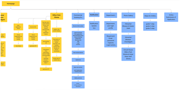
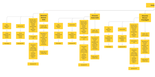
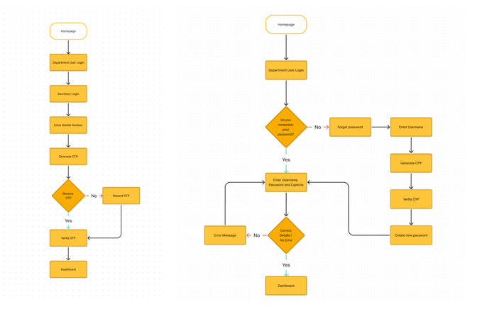
- ii. Understanding Current User Flows
- 1. Department User and Secretary Login
- 2. Booking Request Submission:
- Users navigate to the online submission of Application section of the website.
- They select the desired government guest house location (Shimla, Chandigarh, or New Delhi).
- Users fill out the online application form with necessary details such as arrival/departure dates, purpose of visit, and accommodation preferences
- Generate and Verify OTP.
- Submit Application.
- 3. Application Status Tracking:
- Users can view the status of their booking application at any point in time by entering their Application Number and Mobile Number.
- The system provides real-time updates on the progress of the application, indicating whether it is pending, approved, or rejected.
- 4. Non-Availability Certificate (NAC) Generation (for Government Officials):
- Government officials visiting Shimla, Chandigarh, or New Delhi for official tours can generate a Non-Availability Certificate (NAC) if the room is not available.
- They select the appropriate option within their application or reservation status page to generate the NAC.
- The NAC can be downloaded and used to seek accommodation in other guest houses or hotels for reimbursement purposes.
- 5. Administrative Processing:
- Departmental officials responsible for processing the received applications access the administrative section of the website.
- They review and evaluate the applications based on set criteria.
- The officials can confirm or reject the reservations and update the status of each application accordingly.
- 6. Notification and Communication:
- Users receive updates and notifications regarding their booking application status and NAC generation through SMS or other means of communication.
- The system may provide a download link for the NAC in PDF format.
- 7. Withdraw Application / Cancel Booking:
- Users can withdraw their application or cancel their booking at any point in time by entering their Application Number and Mobile Number.
- iii. Usability Study Findings
We conducted a usability study to gain insights into the experiences and perspectives of users interacting with the website. Due to time constraints, we conducted a usability study with members of our team and individuals from our immediate network.
Key Findings:- Complex Navigation: Users encountered difficulties in navigating the website, mainly due to the absence of a clear and consistent navigation bar. This made it challenging to move between different sections of the reservation process, causing confusion and frustration.
- Unclear Accommodation Selection: Participants struggled to select their preferred accommodation type due to unclear labelling and formatting of the options. This resulted in uncertainty about which option to choose, causing delays in the booking process.
- Limited Availability Information: Users expressed the need for real-time availability information for their desired dates. Without this information readily visible, planning their stay effectively became a challenge.
- Mobile Responsiveness Issues: Users accessing the website on mobile devices faced problems with readability, navigation, and interaction. The lack of optimization for smaller screens hindered their ability to complete the booking process smoothly.
- Confusing Call-to-Action (CTA) Buttons: Some users missed the CTA buttons due to their subtle appearance and inadequate visual cues. This impacted their ability to proceed confidently with the booking process.
- Eligibility Criteria Ambiguity: Users found the eligibility criteria for booking rooms insufficiently explained. This lack of clarity led to confusion about whether they were eligible to proceed with the reservation.
- File Upload Uncertainty: Participants faced uncertainty after uploading files, as there was no clear feedback indicating successful uploads. This lack of feedback left users wondering if their documents were received successfully.
- Non-Intuitive Breadcrumb Navigation: The breadcrumb navigation feature, intended to help users track their progress, was not functional and led to errors when users attempted to use it for navigation.
- Lack of User Feedback: Users expressed the desire for real-time feedback or notifications during different stages of the booking process, such as form submissions and application processing.
- Application Status Check Complexity: Users found it challenging to check the status of their application after submission. The process lacked clarity, and participants had difficulty locating their application status.
- Cancellation Process Ambiguity: Users faced difficulties in understanding how to cancel a booking if necessary. The lack of clear instructions and prominent cancellation options hindered their ability to proceed confidently.
- NAC Generation Uncertainty: Participants were unsure about how to generate a Non-Availability Certificate (NAC) when rooms were not available. The lack of clear guidance and instructions affected their ability to use this feature effectively.
- iv. UX Audit Findings Summarized
- Homepage
These are the issues that have been identified on the current homepage-
- Accessibility Bar Missing- The website lacks an accessibility bar, which hampers users with disabilities from accessing essential features and content.
- Inappropriate Header- The current hero image doesn't effectively grab users' attention or convey the website's story and mission. Enhancements are needed for a visually appealing and engaging header.
- Absence of Navigation Bar- Without a proper navigation bar, users struggle to explore various sections and navigate the website seamlessly.
- Visually Inaccessible CTA Buttons- Call-to-action buttons fail to meet visual accessibility standards, resulting in poor visibility and making it difficult for users to identify and interact with them.
- Alignment and Container Usage Issues- Inconsistent alignment and lack of container usage led to a disjointed and visually inconsistent layout.
- Misaligned Icons- Icons throughout the website are improperly aligned, undermining their professional appearance.
- Inconsistent Icon Sizes- Varying icon sizes create a visual imbalance, potentially causing confusion for users.
- Misleading Application Status Symbol- The symbol representing the "View Application Status" feature lacks clear communication of its purpose.
- Confusing Download Links- Links to download the mobile application from the Play Store and App Store lack intuitiveness, while visuals for app logos appear outdated.
- Absence of User Registration Option- Users are unable to create accounts for a personalized experience, missing out on benefits like streamlined booking and access to reservation history.
- Missing Eligibility Criteria Information- Lack of clear eligibility criteria for room bookings leads to user confusion and potential booking errors.
- Limited Mobile Responsiveness- Inadequate optimization for mobile devices results in an unfavorable user experience on smaller screens, encompassing issues with readability, navigation, and overall usability.
- Homepage - Steps for Reservation
- Lack of a Distinct Call-to-Action (CTA): The webpage is missing a prominent and unequivocal Call-to-Action (CTA) that effectively guides users to the booking page.
- Enhanced Integration of Online Reservations: The form filling screen can be seamlessly fused with the online reservation steps, resulting in a more streamlined and user-friendly experience.
- Homepage - Submission of Application
- Color for Instructions- Using red for instructions can be confusing and misleading, as red is typically associated with warnings or errors.
- Visual Design of OTP Verification Process- The visual design of the OTP verification process can be improved to simplify the user experience and enhance usability.
- Error Message Placement- Error messages should be displayed as headings above the specific fields, rather than directly highlighting the field itself or placing the error prompt beside the field.
- Limited Availability Information- Users may have difficulty accessing information about room availability for their desired dates.
- Inconsistent File Upload Field- The design of the file upload field is inconsistent, with separate "Choose File" and "Upload" buttons, leading to confusion in the user interface.
- Lack of File Upload Feedback- Users don't receive clear feedback after uploading a file, which can lead to uncertainty or difficulties in the upload process.
- Differentiation in Booking Options- The booking process should clearly differentiate between self, family, and others' booking options to eliminate confusion.
- Inefficient Family Member Addition Process-The process of adding multiple members during family booking is inefficient and lacks user-friendliness, with limitations and difficulties in managing family member details.
- Common Observation for All pages
The website has issues with inconsistent design, a non-functional back button, confusing navigation, an incomplete footer, and limited user feedback. These problems affect user experience and adherence to design standards-
- Inconsistent Design-The website lacks consistency in its page structure and design, making it visually disjointed and confusing for users. (Consistency and standards)
- Lack of Back Button Functionality-Users cannot navigate back using the browser's back button, limiting user control and freedom.
- Confusing Navigation- The website lacks a standardized navigation structure, causing confusion and difficulty for users to move between sections and pages. (User control and freedom)
- Incomplete Footer- The website lacks a well-designed and informative footer, which negatively impacts user experience by not providing essential navigation options, links, and contact information. (Consistency and standards)
- Limited User Feedback- Real-time feedback or notifications are missing, leaving users uninformed about the progress of their actions (e.g., submissions or application processing). This affects the visibility of system statuses.
- Guest House Detail Page
The webpage displays significant usability concerns, notably with its navigation bar, which lacks intuitive design, hindering user interaction. Addressing these issues is paramount to enhancing the webpage's effectiveness and user experience.
- Navigation Bar- The navigation bar lacks user-friendly design, making it difficult for users to identify clickable items.
- Lack of Information- Essential details about the guest house, such as amenities, rates, and services, are missing.
- Missing Images- Visual representations of the guest house, both interior and exterior, are absent.
- Lack of Clear Call-to-Action- A prominent call-to-action button for booking or inquiries is not present.
- Minimize Cognitive Load- The inclusion of a large location map is unnecessary and can divert users' attention from crucial information like room details and booking options.
- PWD Rest Houses Booking Page
Addressing these highlighted concerns is essential for enhancing user experience-
- Page Loading Issue- The page is not loading properly, indicating potential problems with slow internet connection, browser compatibility, JavaScript or CSS errors, server issues, or content blocking.
- Unnecessary Duplication of Content- The phrase 'Welcome to Him Atithi' is duplicated, leading to unnecessary content duplication.
- Integration of PWD Rest Houses- The introduction of PWD Rest Houses should be integrated into the hero section for a more concise overview.
- Non-functional Updates Tab- The Updates tab on the website is non-functional and lacks meaningful purpose.
- Visual Element and Size Issue- Image elements lack explicit width and height attributes, causing layout shifts and Cumulative Layout Shift (CLS) problems.
- Lack of Proper Footer- The website lacks a well-designed and informative footer, affecting user experience and accessibility.
- Navigation Highlight Issue- When clicking on navigation buttons, the corresponding pages open, but the highlighted button remains the same, affecting the visibility of system status.
- District/Location and Rest House/Accommodation Selection Fields- These fields appear as normal text input boxes rather than visually indicating that they are dropdown menus, causing confusion in user interaction.
- Duplicate Points- Some points are already discussed earlier in the context of online submission of Guest houses.
- Non-functional Breadcrumb Navigation- The breadcrumb navigation feature is not functioning correctly, leading to errors and hindering users' ability to track their location within the site and navigate back to previous pages.
SYNTHESISING PHASE
User Personas- User Personas
- Mapping User Journeys and Extracting Insights
- Crafting User Stories
- Formulating Problem Statements and Hypothesis Statements
The research phase provided us with valuable insights into the experiences and pain points of users interacting with the HIM ATITHI website. Armed with this knowledge, we embarked on the Defining phase to further refine our understanding and translate the research findings into actionable design solutions. To ensure a user-centered approach, we developed personas that represent key user archetypes.
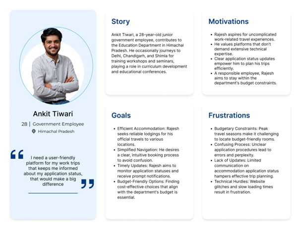
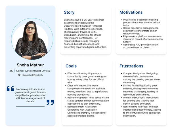
We have chosen to focus primarily on Ankit Tiwari, our user persona who represents a government employee. By concentrating our efforts on Ankit, we believe that we can effectively capture key insights into the pain points, motivations, and behaviors specific to our target user group for the website.
Our user persona, Ankit Tiwari, a government employee, provided valuable insights into the motivations and challenges of users seeking convenient ways to fulfill their tax obligations online. By creating user journey maps, we visualized Ankit's step-by-step experience, capturing his interactions, emotions, and pain points throughout the room booking journey.
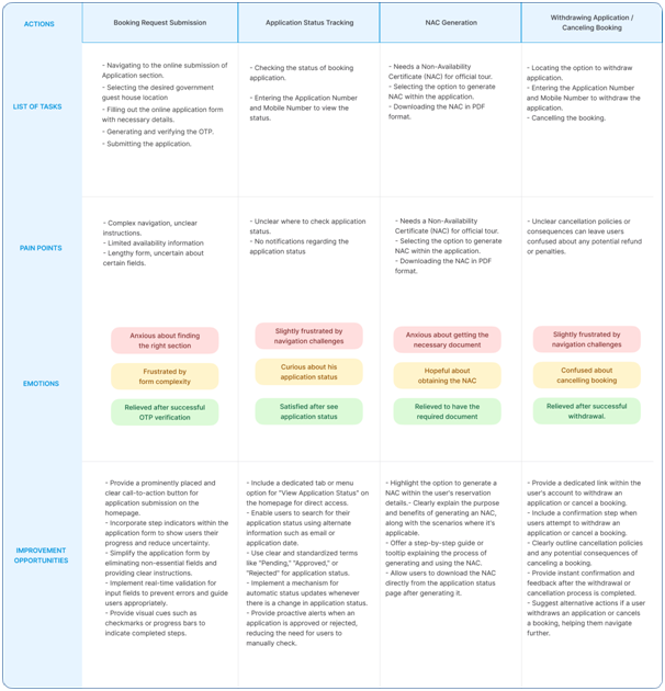
As Ankit Tiwari, a mid-level government official, I want to have a smooth and hassle-free experience while applying for a booking at a government guest house for my official travel. I aim to easily navigate to the HIM ATITHI website, select a suitable guest house, specify my travel dates, and submit my application. Throughout this process, I want clear instructions and a user-friendly interface that minimizes confusion. Additionally, I wish to receive timely updates on my application status so that I can plan my travel accordingly. A seamless and efficient experience would greatly enhance my satisfaction with the website and the booking process.
This user story encapsulates Ankit Tiwari's motivations, needs, and expectations as he engages with the HIM ATITHI website to apply for a guest house booking, considering the insights from his user journey map.
Having identified Ankit's user story, we now turn our attention to formulating a problem statement that encapsulates the challenges he faces when using the HIM ATITHI website.
"Ankit Tiwari, a mid-level government official, faces challenges while using the HIM ATITHI website to book a government guest house for official travel. Navigational complexities, lack of clear eligibility criteria, ambiguous application status updates, and non-intuitive interface design hinder his ability to efficiently complete the booking process, leading to frustration and reduced user satisfaction."
This problem statement will serve as a guiding force in our design process, ensuring that our solutions directly address Ankit's needs and improve his overall experience with the platform
Building upon the problem statement, our aim is to address the challenges faced by Ankit Tiwari and enhance his experience with the HIM ATITHI website. Through a comprehensive analysis of user insights and pain points, we have formulated a hypothesis –
"We propose to redesign the HIM ATITHI website by implementing a user-centric navigation system that intuitively guides users through the booking process. Additionally, we will prominently display eligibility criteria for booking and introduce a simplified and streamlined booking form. These changes are aimed at providing a seamless and frustration-free experience for users like Ankit, ultimately resulting in improved user satisfaction and increased successful booking rates."
In the upcoming sections, we embark on a creative journey to transform our findings into tangible design solutions. Through engaging ideation exercises, collaborative discussions, and insightful meetings with our client, we will breathe life into our insights.
IDEATION/EXPLORATION PHASE
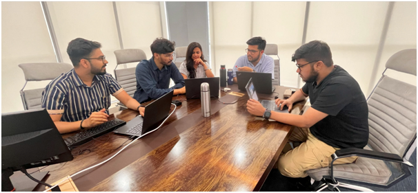
The ideation phase marks a pivotal juncture in our journey towards enhancing the HIM ATITHI website. With a comprehensive understanding of user personas, pain points, and insights, we embark on a creative expedition to devise innovative solutions. This phase is characterized by brainstorming, ideation, and the generation of transformative concepts aimed at addressing the challenges identified during the audit and user journey analysis. Our goal is to harness the power of collective creativity to envision a revamped user experience that aligns seamlessly with the needs, preferences, and aspirations of our target users. Through ideation, we aim to cultivate a landscape of possibilities and refine our strategies to pave the way for a user-centric redesign that enhances usability, accessibility, and overall satisfaction.
- Pen & Paper Wireframes
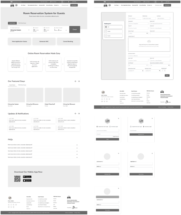
- Low Fidelity Wireframes
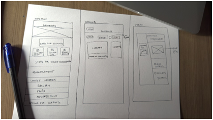
During the ideation phase, we engaged in the process of creating pen and paper wireframes. They served as a quick and effective way to visualize our design concepts and explore various layout possibilities. By brainstorming and sketching out different ideas on paper, we were able to rapidly iterate and refine our design concepts before moving on to more detailed digital prototypes

Moving from initial pen and paper sketches, the next crucial step is low-fidelity wireframing. This phase transforms concepts into digital layouts, outlining structure and user flow for the HIM ATITHI website. These simplified wireframes guide content hierarchy and navigation, setting the stage for a user-centric final product.
SOLUTIONS & IMPLEMENTATION
As we step into the Solution and Implementation phase of the HIM ATITHI website redesign, our focus shifts from conceptualization to actualization. Building upon the insights gained from the ideation and wireframing stages, this phase is where the design solutions take tangible form and come to life.
HomepageCurrent Issues:

- Lack of an accessibility bar affects users with disabilities, hindering their access to essential features and content.
- The hero image lacks visual appeal and fails to effectively communicate the website's purpose and mission.
- The absence of a clear navigation bar makes it challenging for users to explore different sections of the website.
- Call-to-action buttons lack visual accessibility, leading to low visibility and user engagement.
- Call-to-action buttons lack visual accessibility, leading to low visibility and user engagement.
Proposed Solutions:
- Integration of an accessibility bar for users with disabilities.
- Maintaining a consistent header design for navigation ease.
- Enhancing the hero section with appealing imagery and a user-friendly search bar.
- Showcasing main tasks with icons and concise descriptions.
- Designing an illustrative infographic for transparent room booking steps.
- Implementing a carousel to feature prominent guest houses with images and reviews.
- Adding a dynamic section for news and updates.
- Structuring FAQs for quick user access and information.
- Allocating a dedicated section for mobile app download with clear badges.
- Creating a comprehensive footer with essential links for user convenience.
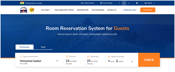
- Accessibility Enhancement: We have introduced an accessibility bar to ensure an inclusive user experience for all visitors, especially those with disabilities.
- Streamlined Navigation: By incorporating important links into the header, we have made navigating the website more straightforward, allowing users to access key sections with ease.
- Engaging Hero Section: The revamped hero section now prominently showcases the website's purpose, accompanied by an intuitive search feature. This allows users to efficiently check room availability in their desired guest house and location.

We have prominently displayed the main tasks of the website on the homepage, ensuring that users can quickly grasp the core functionalities. This design enhancement facilitates a seamless user experience by offering clear pathways for users to accomplish their goals, whether it's submitting a booking request, checking application status, generating Non-Availability Certificates (NAC), or other essential actions.

We have streamlined the room reservation process by providing clear and concise steps on the homepage. This user-centric design enables visitors to understand the booking process at a glance, eliminating any confusion or uncertainty.

We have introduced a dedicated section for "Featured Stays" on the homepage, showcasing the most sought-after accommodations. This design solution ensures that users can quickly explore and select from a curated list of guest houses, making their decision-making process more efficient.
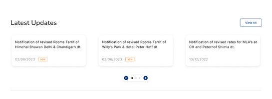
We have incorporated a "Latest Updates" section on the homepage, delivering the latest information and announcements directly to users. This solution keeps visitors informed about any developments, offers, or changes related to guest house accommodations.
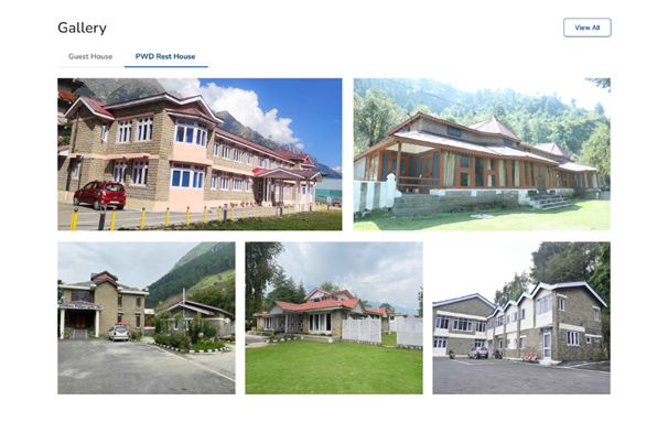
We have introduced a captivating "Gallery" section on the homepage, allowing users to explore visual representations of the guest houses and accommodations. This solution provides users with a glimpse into the quality and ambiance of the available stays, helping them make more informed decisions. By showcasing images of the guest houses' interiors, exteriors, and amenities, users can gain a better understanding of what to expect, enhancing their overall experience and confidence in their choices.
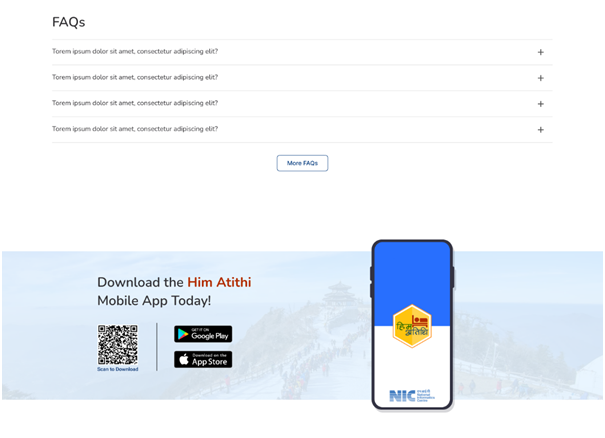
We've integrated a user-friendly "FAQs" section directly on the homepage, providing quick answers to common queries. Additionally, a dedicated "Download Mobile App" section offers easy access to the app for on-the-go reservations and management. This enhances convenience and user experience.

A well-designed and informative footer is now in place, offering users easy access to essential links, contact information, and navigation options. This inclusion enhances the overall user experience and ensures important details are readily available.
Link to the prototype - https://www.figma.com/proto/6UrLv3pHkqsOxBwmYCa6ja/Him-Atithi?page-id=76%3A2702&type=design&node-id=96-2983&viewport=223%2C280%2C0.1&t=2DHHFo3MzZ7V3Hl1-1&scaling=min-zoom&starting-point-node-id=96%3A2983&mode=designVALIDATION & CONCLUSION
- i. Usability Study Findings
During the validation phase, we conducted an internal usability study with a diverse group of team members, most of whom were non-designers and unfamiliar with the project. The results of this study revealed several positive findings that affirm the effectiveness of our proposed design solutions:
- Enhanced Navigation: Participants found it much easier to navigate through the website due to the revamped header and intuitive placement of important links. The simplified navigation structure received praise for its clarity.
- Clear Purpose:The hero section's redesign garnered appreciation as users now clearly understood the purpose of the website. The addition of a prominent search facility was highlighted as an efficient way to check room availability.
- Seamless Booking Process: The step-by-step room reservation process was applauded for its simplicity and transparency. Users felt confident in completing their bookings without confusion or uncertainties.
- Visual Hierarchy: Participants noted the improved visual hierarchy of information, making it easier to locate and comprehend essential tasks and information. The prominent display of main tasks received positive feedback.
- Timely Updates: The news and updates section was seen as valuable, providing users with relevant information about ongoing events and developments. This section was deemed useful by participants.
- Inclusive Color Scheme: The adjustment in colors for better accessibility was acknowledged, particularly by participants who are more sensitive to color contrast.
- ii. Summarizing the Result of Our Intervention
The outcome of our intervention in the HIM ATITHI website has brought about a substantial transformation that has been met with enthusiastic approval from our client department. The insights gleaned from their feedback emphasize the constructive influence our solutions have had on user experience and overall operational efficiency. Noteworthy among the enhancements is the optimally organized navigation made possible by the revamped header, which has remarkably simplified user journeys. The hero section's articulate depiction of the website's purpose has garnered significant commendation for effectively communicating its objectives.
The stepwise room reservation process, thoughtfully delineated, has demonstrably improved the accuracy of accommodation requests and considerably expedited the procedure. The integration of a news and updates section has proven instrumental in facilitating the timely distribution of information, while the heightened visibility of the mobile app download option has been instrumental in increasing user engagement.
The positive feedback we have received from the client department serves as a validation of our collaborative endeavor, which has ultimately yielded a website that is both user-friendly and strategically advantageous for managing guest house reservations.
OUR THOUGHTS & NEXT STEPS
The success of this project highlights the critical role of continuous improvement and adaptability. As we move forward, there are several steps we recommend for the further enhancement of the HIM ATITHI website:
- User Testing with Target Audience: Conduct extensive usability testing with the actual target audience, government officials, and employees, to gather real-time feedback and insights that can guide any further refinements.
- Integration of User Suggestions: Leverage user feedback, suggestions, and insights gathered during the audit and validation phases to refine the website further and address any emerging issues.
- Regular Content Update: Ensure that the content remains accurate and up-to-date. Regularly updating information about guest houses, availability, rates, and services will enhance credibility and user trust.
- Accessibility Enhancements: Continue to prioritize accessibility by implementing suggested solutions and staying up-to-date with accessibility handbook to cater to users with diverse needs.
- Continuous User Engagement: Establish a channel for users to provide feedback, suggestions, and report issues. Engaging users in the website's evolution can foster a sense of ownership and user community.
In conclusion, the transformation of the HIM ATITHI website showcases the powerful impact of user-centric design and systematic audit. Through thorough analysis, thoughtful design interventions, and iterative validation, we have paved the way for a user-friendly, efficient, and strategic digital platform. As we look ahead, the collaboration between design, technology, and user experience remains a driving force for creating impactful solutions that meet the evolving needs of both users and the organization.

