
INTRODUCTION
The E-Challan website in Himachal Pradesh, India, was developed to facilitate online payments for government fees and taxes. However, the website faced challenges such as poor content quality, mediocre design, unclear purpose, difficult navigation, and inaccessible information. This case study details the difficulties encountered while redesigning the E-Challan website's user experience.
Objective
The website aims at improving the payment convenience and efficiency for Himachal Pradesh residents by providing a user-friendly platform for fees, taxes, and government receipts. It enables seamless online transactions, reducing administrative burdens and enhancing citizen satisfaction through accessible and secure payment facilities.
TARGET AUDIENCE

Individual taxpayers, businesses of all sizes, and government agencies in Himachal Pradesh need to make various government payments such as taxes, licenses, permits, and fees for public services. Payment processes and requirements vary depending on the type of payment and the specific government department or agency involved.
THE TEAM
CTO, Project Head, Project Manager, Project Coordinator, Design Lead, 5 UX/UI Designers, 2 UX Copywriter, 6 Frontend Developers
TIMELINE
September 2022 - June 2023. Version 1 rolled out in June.
THE CHALLENGE

The stakeholders of the website faced several challenges necessitating a redesign. These challenges included subpar content quality with grammatical errors, affecting user experience and credibility. The visual design was mediocre, lacking modern aesthetics and balance. The website's purpose was ambiguous, making it difficult for users to understand its intent. Non-intuitive navigation and unclear instructions hindered user engagement. Vital information, such as the FAQ page, was inaccessible, leading to frustration. The complicated registration process also posed difficulties for users. These issues highlighted the need for a redesign to address content quality, visual design, website purpose, navigation, information accessibility, and registration procedures.
CURRENT INFORMATION ARCHITECTURE OF THE WEBSITE
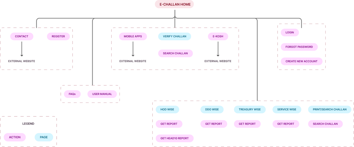
PRIMARY FLOW ON THE WEBSITE
We studied the payment flow for challans on the website, focusing on both registered and non-registered user scenarios.

usability study-I

We conducted a usability study to gain insights into the experiences and perspectives of users interacting with the website. Due to time constraints, we conducted a usability study with members of our team and individuals from our immediate network. Through this study, we aimed to validate and expand upon the findings of our UX audit, while also uncovering new insights.
USABILITY STUDY INSIGHTS

AUDITING THE CURRENT WEBSITE

Audit findings summarized

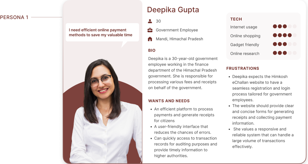
User personas
The research phase provided us with valuable insights into the experiences and pain points of users interacting with the Himkosh eChallan website. Armed with this knowledge, we embarked on the Defining phase to further refine our understanding and translate the research findings into actionable design solutions. To ensure a user-centered approach, we developed personas that represent key user archetypes
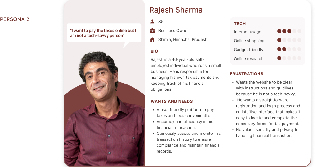
MAPPING USER JOURNEY AND EXTRACTING INSIGHTS
We have chosen to focus primarily on Rajesh Sharma, our user persona who represents a business owner. By concentrating our efforts on Rajesh, we believe that we can effectively capture key insights into the pain points, motivations, and behaviors specific to our target user group for the website.
Our user persona, Rajesh Sharma, a business owner, provided valuable insights into the motivations and challenges of users seeking convenient ways to fulfill their tax obligations online. By creating user journey maps, we visualized Rajesh's step-by-step experience, capturing his interactions, emotions, and pain points throughout the tax payment journey
User goal for Rajesh
Effortlessly pay business taxes without the need for time-consuming tasks like registration, maximizing productivity.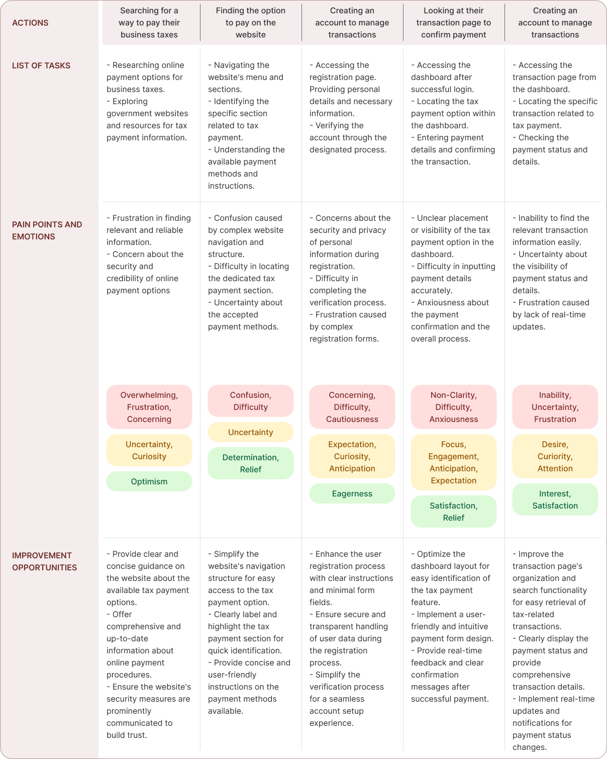
MAPPING THE JOURNEY TO A “USER STORY”
After analyzing Rajesh Sharma's user journey map, we gained valuable insights into the actions, emotions, and pain points users like Rajesh experience while interacting with the Himkosh E-Challan website. This journey map specifically focused on Rajesh's goals and needs as a business owner managing his taxes and financial records. It highlighted key touchpoints where Rajesh encountered challenges and opportunities for improvement. Based on these findings, we have distilled one of Rajesh's key needs into the following user story
RAJESH’S USER STORY

FRAMING CHALLENGES AND HYPOTHESIS
Having identified Rajesh Sharma's user story, we now turn our attention to formulating a problem statement that encapsulates the challenges he faces when using the Himkosh eChallan website.
PROBLEM STATEMENT
Rajesh Sharma, a busy business owner with limited time, needs easy and efficient access to the payment portal and a user-friendly way to view past transactions because the complex registration process and outdated dashboard design hinder Rajesh's productivity in managing business taxes and financial records

This problem statement will serve as a guiding force in our design process, ensuring that our solutions directly address Rajesh's needs and improve his overall experience with the platform Building upon the problem statement, our aim is to address the challenges faced by Rajesh Sharma and enhance his experience with the Himkosh eChallan website. Through a comprehensive analysis of user insights and pain points, we have formulated a hypothesis.
HYPOTHESIS STATEMENT
If we simplify the registration process, redesign the dashboard interface, and improve the transaction viewing experience, then Rajesh Sharma's productivity and satisfaction with the Himkosh eChallan website will increase

We believe that by addressing the identified pain points and creating a more intuitive and efficient user experience, Rajesh will be able to easily pay his business taxes and manage financial records more effectively.
In the upcoming sections, we embark on a creative journey to transform our findings into tangible design solutions. Through engaging ideation exercises, collaborative discussions, and insightful meetings with our client, we will breathe life into our insights.
EXPLORATION
Building upon the insights gained from the defining/synthesizing phase, we entered the ideation/exploration phase with a burst of creativity. Through exercises like Crazy 8, we sketched numerous ideas on paper, exploring different possibilities and refining our design concepts HMW (How Might We) exercise allowed us to explore different possibilities and frame problem statements in the form of open-ended questions. During the 'How might we' exercise, we focused on specific areas of the website such as the registration process, dashboard experience, homepage design, and navigation. We encouraged team collaboration and brainstormed numerous ideas to address the identified pain points and improve the overall usability and functionality of the website.

During the 'How might we' exercise, we focused on specific areas of the website such as the registration process, dashboard experience, homepage design, and navigation.
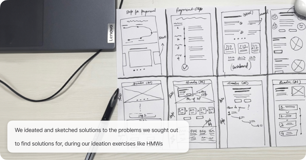
With the ideation process complete, we moved on to translating these ideas into tangible wireframes that would serve as the foundation for the redesigned website.

SOLUTIONS AND IMPLEMENTATION
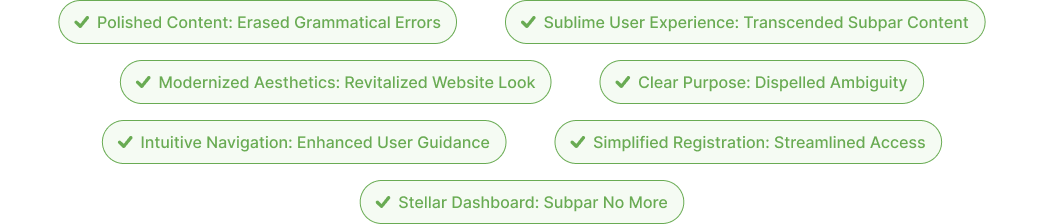
- We thoroughly reviewed and proofread all text content to address grammatical errors.
- We utilized grammar-checking tools or sought assistance from professional editors to improve content quality.
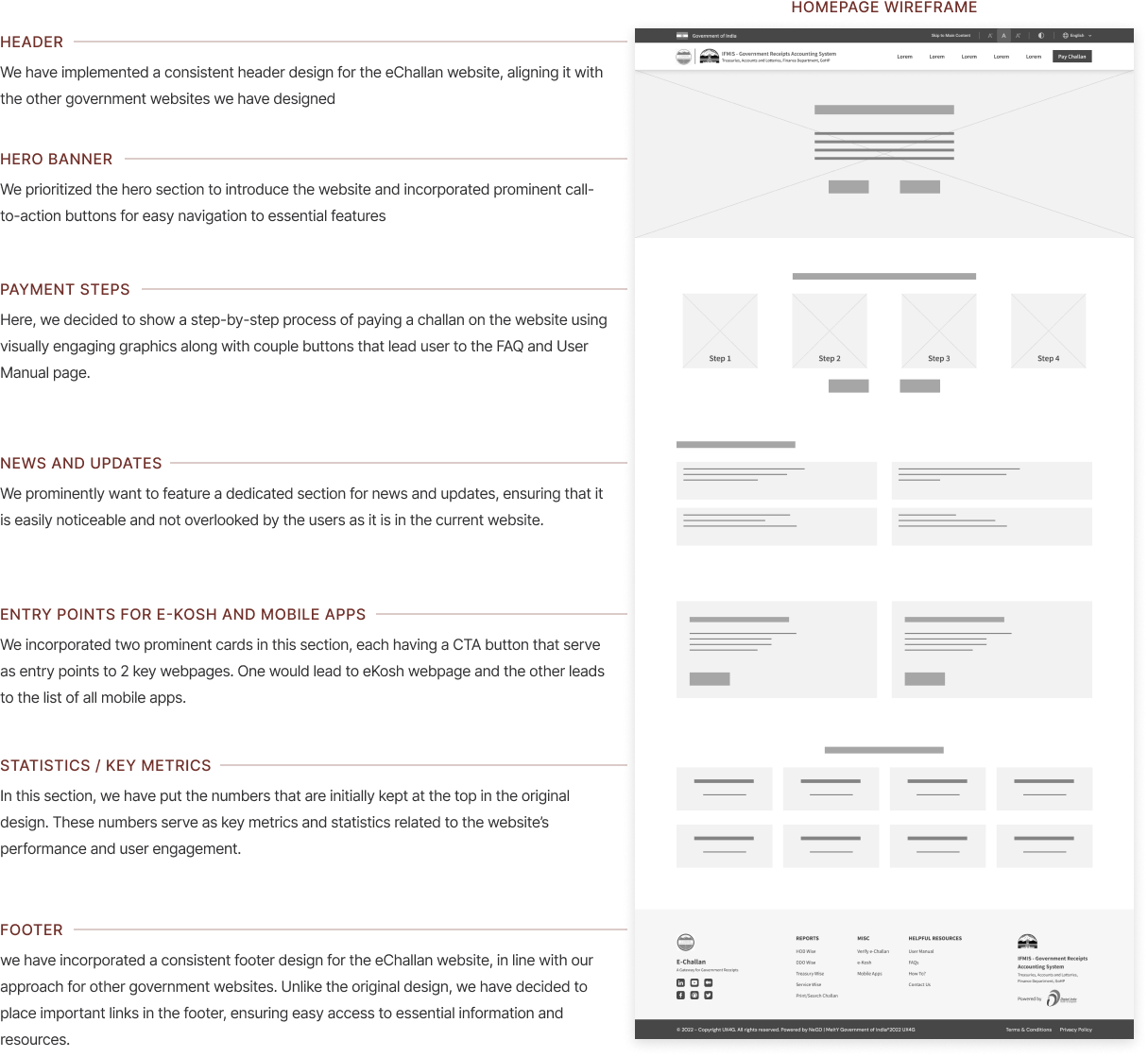
- We implemented a prominent hero section to showcase the website's purpose.
- We redesigned sections using modern design principles for visual appeal.
- We used appropriate typography, spacing, and layout to create a balanced and visually appealing interface.
- We included a footer section with essential links and a well-designed header for easy navigation.
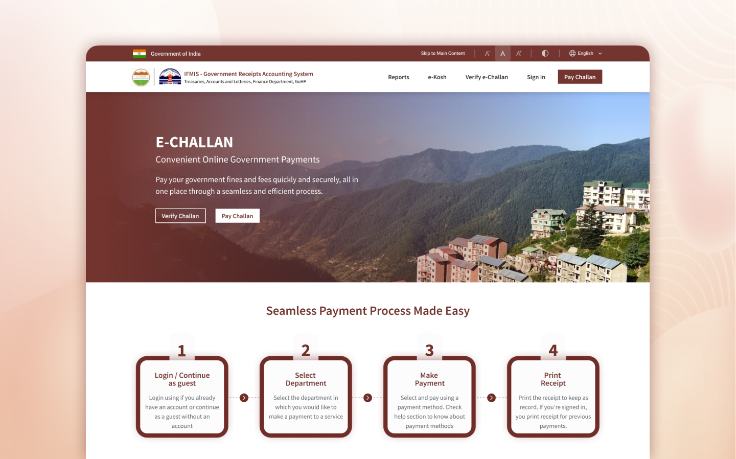
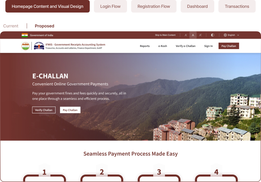
We introduced an informative hero section on the homepage, highlighting the website's purpose and value proposition. Two prominent buttons within the hero section provide easy access to key actions like verifying challans and making payments
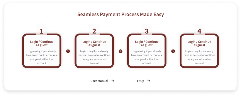
We streamlined the online E-Challan payment process with clear steps and added buttons for User Manual and FAQs for easy access to information and guidance

We incorporated two informative cards side by side on the homepage. One card directs users to the eKosh webpage with a dedicated call-to-action (CTA) button, while the other card provides information about mobile apps from the HP department, linking users to the respective webpage through a CTA button.
Through our ideation process, we have successfully translated the insights from the UX audit into tangible design solutions. By addressing key pain points and focusing on user needs, we have created a more user-friendly and intuitive experience for the eChallan website. The redesigned homepage, streamlined registration process, enhanced dashboard, and improved transaction screens all contribute to a more efficient and satisfying user experience.
Link to the prototype - https://www.figma.com/proto/yfW7NTERAdlTZOgvbl1pvp/eChallan-Himkosh?page-id=192%3A60180&type=design&node-id=192-61545&viewport=1707%2C353%2C0.2&t=Vq7fi7lVOGUKOHcj-1&scaling=scale-down-width&starting-point-node-id=192%3A61545&mode=designDid we hit the mark? It was essential to evaluate our efforts.
USABILITY STUDY - II
During our internal usability study, we received positive feedback from our team members who were not directly involved in the design process.
- Ease of Registration: Participants found the simplified registration process straightforward and easy to navigate. The activation link sent via email was perceived as a user-friendly and familiar method to verify their email address.
- Intuitive Dashboard: Users praised the redesigned dashboard for its clear layout and easy access to key features. The inclusion of past transactions and improved filters received positive remarks, as it allowed users to quickly find and review their payment history.
- Informative Homepage: Participants appreciated the new hero section, which effectively communicated the website's purpose and highlighted the key actions users could take. The addition of the FAQs and User Manual sections provided valuable information, helping users navigate the platform with ease.
Outcome Recap: Assessing the Impact of Our Intervention
Through our intervention and redesign efforts, we have significantly improved the user experience of the Himkosh E-Challan website. The positive feedback received from our team members and stakeholders from the client department further validates the success of our interventions.
The streamlined registration process, intuitive dashboard design, and informative homepage have been well-received by users. The simplified registration flow, with the use of activation links instead of credentials, has made the onboarding process more user-friendly and efficient. The redesigned dashboard provides users with quick access to key actions and displays important information such as past transactions, enhancing their ability to manage their financial records effectively.
Overall, our intervention has successfully addressed the identified usability challenges and has resulted in an improved user experience for both registered and non-registered users. The positive feedback received from users and stakeholders validates the impact of our design interventions and highlights the successful outcome of our collaboration with the client department.
OUR THOUGHTS AND NEXT STEPS
Reflecting on our journey, we are proud of the significant improvements we have achieved in enhancing the user experience of the Himkosh eChallan website. The UX audit helped us identify key pain points and areas for improvement, which guided our redesign efforts. Through a collaborative and iterative design process, we were able to address these challenges and create a more user-friendly and efficient platform.
In addition to the accomplishments, we have achieved thus far, it's important to note that UX design is an iterative process, and there is always room for further improvement. As the digital landscape evolves and user needs evolve with it, there are potential next steps that can be explored to further enhance the user experience of the Himkosh eChallan website. While we have outlined some suggested next steps, it's essential to adapt and respond to user feedback and emerging trends to ensure continuous optimization and innovation.
- Conduct user testing with a broader range of users to gather more diverse perspectives and feedback on the redesigned website.
- Continuously monitor user feedback and behavior to identify any emerging pain points or areas for improvement.
- Implement additional features and functionalities based on user needs and evolving requirements.
- Regularly update and maintain the website to ensure optimal performance and address any technical issues.
- Explore the possibility of integrating additional payment methods to provide users with more options and flexibility.
- Conduct a comprehensive content review to ensure accuracy, clarity, and consistency throughout the website.
In conclusion, this case study showcases our journey of conducting a UX audit, redesigning key elements, and improving the user experience of the Himkosh eChallan website. The collaboration between our team and the client department has resulted in a more intuitive, efficient, and user-centric platform. We are confident that the enhancements made will positively impact users and contribute to a seamless and satisfactory online payment experience.