introduction
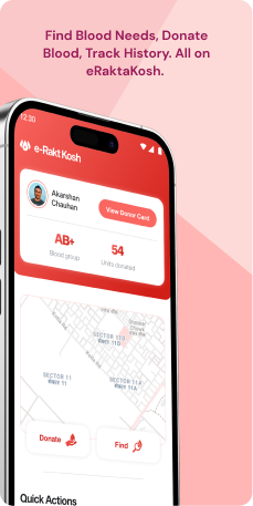
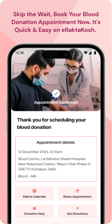
e-Raktkosh, a mobile application, streamlines blood donation and management in India by connecting donors with those in need. Serving as a centralized platform, it efficiently manages blood bank inventories. The application includes features for registering blood donation camps and tracking blood requests.
Objective
The primary objectives of Rakt Kosh are-
- Boost Voluntary Blood Donations-Increase the number of voluntary blood donations by simplifying and streamlining the blood donation process. Implement initiatives to make it easier for individuals to become voluntary blood donors.
- Improve Blood Access- Facilitate efficient connections between blood donors and recipients, ensuring timely and sufficient blood supply for patients nationwide. Implement strategies to enhance the accessibility of blood transfusions, promoting a more organized and responsive system.
- Strengthen Blood Bank Management- Empower blood banks with a centralized platform for effective inventory management, tracking of blood donations, and coordination with other blood banks. This will optimize the distribution of blood resources and enhance overall efficiency.
- Promote Voluntary Blood Donation- Raise awareness about the significance of voluntary blood donation and encourage individuals to become regular blood donors. Highlight the positive impact of voluntary contributions in meeting the demand for blood transfusions.
- Educate the Public-Provide easy access to educational resources on blood donation, dispelling myths and misconceptions surrounding the process. Promote responsible blood donation practices through informative campaigns to ensure a well-informed and engaged public.
Target Audience
eRaktkosh serves a diverse user base, including voluntary Blood Donors, timely Blood Recipients, responsible Blood Banks, organizers of Blood Donation Camps, and the General Public seeking information on blood donation and awareness. It streamlines the process, fostering collaboration for a more efficient and informed blood donation ecosystem in India.
The Challenge
The eRaktkosh mobile application grapples with several user experience (UX) challenges that impede its widespread adoption and effectiveness in facilitating blood donation and management in India. These challenges encompass limited user awareness, suboptimal user engagement, inefficient coordination of blood donation, and insufficient language accessibility. To overcome these hurdles, it is imperative to deploy strategies that target the root causes, such as conducting comprehensive user research, analyzing application usage data, optimizing the user interface, expanding language support, integrating with healthcare systems, and executing targeted awareness campaigns.
Addressing these UX challenges holds the potential to transform eRaktkosh into a more effective tool for facilitating blood donation and management in India, ultimately contributing to alleviating the country's blood shortage and enhancing healthcare outcomes.
Usability Study Findings
The usability study uncovered various insights. Users were actively using the application's main features on the home screen, but difficulties emerged when navigating the list of nearby blood centers and banks. These challenges highlighted problems with accessibility and information clarity. User preferences favored a simpler and more intuitive interface, underscoring the importance of enhancing user guidance and system responsiveness.
Home screen- Icon Clarity and Size-Users encountered difficulties swiftly identifying options due to the icons' small size and lack of clarity. This issue, particularly prominent among first-time users, significantly impacted the overall user experience.
- Text Readability-The use of small font sizes for accompanying text proved challenging for users, causing eye strain and hindering their understanding of labels associated with each icon. Some users reported readability challenges, thereby affecting the overall accessibility of the interface.
- Label and Terminology- Participants in the study found the term "Blood Availability" less intuitive and suggested alternatives such as "Find Blood Centers" to enhance clarity and readability for users.
- Information Hierarchy and Visual Distinction-The current presentation lacked a clear visual hierarchy within list items, making crucial details less prominent. Users expressed the need for improved organization through distinct visual styles such as font size, weight, and color.
- Visual Appeal and Readability-To enhance user engagement, users recommended incorporating subtle design elements, adjusting spacing, and enhancing typography to elevate the overall readability and scannability of information.
- Limited Location Options-Users desired the flexibility to manually enter a different location, citing the current restriction to the current location as limiting. Adding options for location selection would provide users with increased control.
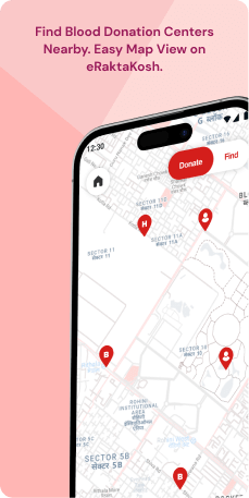
- Lack of Map Feature-The absence of a map feature in the blood center search screen was highlighted as a challenge for users in visualizing nearby locations. Integrating a map was suggested to aid users in making informed decisions about which center to visit.
- Redundant Blood Bank Search Screen-Users expressed confusion regarding the redundancy of the "Blood Bank Search" screen, which displayed the same information as the "Blood Availability" screen. This redundancy introduced unnecessary complexity and impacted efficiency.
- Redundant Camp Search Screen-Similar redundancy was observed in the "Camp Search" screen, duplicating information from other screens and potentially confusing users. Streamlining these screens into a unified interface was suggested for a more efficient user experience.
- Unified Login Screen and Role Selection-Users faced challenges managing separate login screens for different roles. Concerns included increased cognitive load, potential errors, and disruptions in user flow during role switching.
- Inconsistencies in User Experience-The existence of three separate login screens introduced inconsistencies and fragmentation in the user journey. A recommendation was made to implement a unified login screen with Role-Based Access Control for a seamless and tailored user experience.
- Redundant Hamburger Menus-The presence of two internal hamburger menus within the main menu structure added unnecessary complexity and navigation overhead for users. Streamlining the application's menu structure for increased user-friendliness was suggested.
Synthesizing Phase
With the insights gathered during the research phase, we have gained valuable understanding of the users' interactions and challenges while using the application of the e-Rakt Kosh, Government of India. Building on this knowledge, we have now entered the Defining phase, where our aim is to deepen our comprehension and transform the research findings into practical design solutions. To maintain a user-centric approach, we have created personas that embody essential user archetypes-
User Personas Persona 1: Volunteer VeerVeer, a 25-year-old tech enthusiast, aspires to contribute to society by regularly donating blood.
Goals-His primary goal is to use the eRaktkosh application to streamline his blood donation experience. Veer wants a user-friendly interface that allows him to easily find nearby blood donation camps, receive timely notifications about upcoming events, and track his donation history. Additionally, he wishes to stay informed about the impact of his voluntary contributions and hopes that the application will motivate him and others to become regular blood donors.
Pain Points-Veer faces challenges related to limited awareness about blood donation events happening in his vicinity. He also struggles with maintaining consistent engagement with the application due to a lack of personalized notifications and incentives. Veer's language preferences and understanding might differ, posing an additional challenge if the application's content is not available in his preferred language.
Persona 2: Responsible RiaRia, a 30-year-old healthcare professional, is responsible for organizing blood donation camps.
Goals-Her primary goal is to efficiently use the eRaktkosh application to coordinate and manage successful blood donation events. Ria wants features that allow her to easily register and promote donation camps, track donor turnout, and manage inventory in collaboration with local blood banks. She aims to use the application to ensure a steady and sufficient supply of blood for patients in need.
Pain Points-Ria faces challenges in coordinating blood donation camps effectively, with issues such as low attendance, lack of real-time communication, and difficulties in managing and optimizing blood resources. Additionally, language barriers may hinder her ability to connect with a diverse audience and convey the importance of blood donation. Ria needs the application to provide comprehensive support in overcoming these challenges, enabling her to contribute more effectively to the cause.
Mapping User Journeys and Extracting InsightsIn this exploration, we focus on Volunteer Veer, a 25-year-old tech enthusiast eager to contribute through blood donation, to gain profound insights into his experiences, challenges, and preferences while utilizing the eRaktkosh application. Veer's user journey acts as a valuable narrative, offering a comprehensive view of his engagement and highlighting potential areas for improvement within the application to enhance his overall user experience in the realm of voluntary blood donation.
Volunteer Veer's User Story"As a tech enthusiast who wants to contribute through blood donation, I seek a user-friendly and engaging experience on the eRaktkosh app. I want seamless navigation, personalized feedback, and better language support to enhance my overall participation in voluntary blood donation."
Framing challenges and hypothesisHaving analyzed Volunteer Veer's journey with the eRaktkosh application, we identify key challenges affecting his user experience. This process allows us to formulate a problem statement that encapsulates the hurdles Veer encounters, laying the groundwork for hypothesis formulation and potential solutions to enhance the application's usability for blood donors.
Problem Statement"Volunteer Veer, a tech enthusiast eager to contribute through blood donation, grapples with challenges in the eRaktkosh application related to navigation, notifications, post-donation engagement, and language support. These obstacles hinder his seamless participation in voluntary blood donation, necessitating improvements for a more user-friendly experience."
Hypothesis Statement"If we optimize the application's user interface to enhance navigation, improve the notification system for consistent and personalized alerts, implement features for engaging post-donation experiences, and enhance language support, Volunteer Veer's overall user experience with the eRaktkosh application will be significantly improved. This, in turn, will motivate him and other users to actively participate in voluntary blood donation, addressing key challenges identified in the user journey."
We believe that by addressing these challenges and implementing user-centric solutions, Volunteer Veer will have a more productive and satisfying experience while using the eRaktkosh application for voluntary blood donation. In the subsequent sections, we will explore and develop concrete design solutions to meet Veer's needs and improve his overall user journey on the eRaktkosh application.


