 Government of India
INTRODUCTION
The UX4G Design System is developed to improve the user experience across government applications, and digital services. The aim is to enhance the consistency, usability, and friendliness that a user experiences, ultimately promoting a unified and user-centric approach to public platforms.
Problem Statement
The design of government applications is hard to navigate, confusing, and unresponsive for the users, especially those who are inadequately friendly with the digital devices and platforms. This leads to lesser engagement, negative perception about the provider and limited access to critical information and services. As a result of the perceived unfriendliness of the digital platform, many users continue to rely on alternate channels (physical means and/or assisted mode).
THE TEAM
Project Head, Project Manager, Project Coordinator, Design Lead, 5 UX/UI Designers, 2 UX Copywriters, 6 Frontend Developers
TIMELINE
September 2022 - June 2023. Version 1 rolled out in June.
PLAN OF ACTION
- Conducted UX/UI Awareness and sensitization workshops for various government departments.
- Study of the acquired government applications - User Flow & Heuristic Evaluation.
- Identification and listing of all the improvement areas acquired from research and awareness & sensitization workshops.
- Appraised the stakeholders about the problem and issues being faced.
- Ideation & Brainstorming
- Design and development of the UX4G Design System
- Usability Testing
- Release of version 1
UX/UI Awareness Workshops
The UX4G team conducted 27 awareness and sensitization workshops for Central/State departments across all States/UTs to importance of User Experience (UX) and User Interface (UI) design in government departments. The workshops provided a comprehensive understanding of UX and UI. It also showcased real-life case studies of public portals with high volume service transactions such as driving/vehicle licenses, railway tickets, certificates/services from local bodies (e.g., e-District, Parivahan Seva and, IRCTC) etc., and emphasized the impact of UX and UI design on improving user satisfaction and task completion in paced manner. The workshops highlighted the benefits of adopting citizen-centric design approaches in public platforms. The workshops concluded with a Q&A session with the attendees asking questions/queries/feedback about implementation of best UI UX practices in their design and development process.
Many teams of the application implementation of public service providers connected with UX4G Team for assistance on improvement of their applications.
Study and Redesign of the acquired websites and applications

The team has performed multiple UX audits and suggested re-design in many websites and applications to the various providers from Central/State Government Departments such as Goa, Himachal Pradesh, Uttar Pradesh, Chhattisgarh, Uttarakhand, Delhi, Meghalaya etc. and extended support to many applications ‘team such as UMANG, DigiLocker, API Setu, Diksha, ABC, NAD, myScheme, Poshan Tracker, Yuva, eOffice, Parivahan Seva, FSSAI, Him Atithi etc.
Conclusion of all the research and awareness workshops
Common observations made after rounds of workshops and UX audits:
- Design process to be out up in place
- Usage of different design systems in one place
- Inadequate knowledge transfer
- Understanding of user centered design to be enhanced
- Responsive design to be considered
- Uniform design and standardization to take place
- Accessibility to be enhanced
- Usability testing to be performed
- Capacity building to be done on development skills
- Highlighting important features/services/products that are important for website users to be encouraged
- Branding structure to be done evenly
Addressing the problem to the stakeholders
The findings and suggestions accumulated after several workshops, leadership of NeGD/DIC and the leads of major initiatives such as UMANG, Digi Locker, Diksha, etc., were approached and consultations were done.
Suggestions from our team
The UX4G team has put forward an innovative idea to create a unified design system for all the government applications. Backed by extensive research, this system encompasses valuable tokens, reusable components, and templates. This initiative aims to seamlessly integrate the efforts of designers and developers, promising heightened consistency and efficiency across diverse government platforms.
Ideation & Brainstorming
During the brainstorming phase, the team collaborated to establish the vision, scope, and essential elements of the design system. This stage aimed to tap into the collective creativity and expertise of the team, setting a strong foundation for the system. In the ideation phase, the project team extensively explored and researched existing design systems, encompassing both commercial and government-used systems from various countries. This research provided valuable insights, highlighting effective design patterns, components, and handbook that could be adapted for the unified Design System.
In our primary research, 12 out of 15 designers demonstrated familiarity with design systems, with 10 of those being well-acquainted with frequently used Design Systems. This preference for commercially/widely used design system stemmed from its contemporary tokens and components that seamlessly integrate with the frequently used online design tools. Additionally, the comprehensible documentation—covering specifications, component handbook, and accessibility—enhanced its appeal.
Reasons:
- They found the Design tokens and components modern, good looking and easy to use on online design tools.
- They also found the documentation (specs, component handbook and accessibility handbook) to be very easy to find, understand and adapt to implement.
The team surveyed 43 developers, it was found that all were well-versed in Bootstrap technology, which is considered the simplest to set up and utilize. This preference for Bootstrap can be attributed to several reasons:
- Learning Curve: Bootstrap has a relatively low learning curve, especially for developers who are already familiar with HTML and CSS. Its documentation and examples are well-structured and beginner-friendly, allowing developers to quickly grasp its concepts and start using it in their projects.
- Flexibility: Bootstrap offers a balance between simplicity and flexibility. It provides a set of predefined styles and components that can be easily customized to match the design requirements of a project. While it has a certain visual aesthetic, it doesn't impose strict design language like other design systems, giving developers more freedom to adapt it to their specific needs.
- Browser Compatibility: Bootstrap is designed to work well across different browsers, ensuring a consistent experience for users. It handles browser limits/inconsistencies and provides fallbacks for older browsers, reducing the need for extensive cross-browser testing and troubleshooting.
- Grid System: Bootstrap's grid system is highly intuitive and makes creating responsive layouts easy. It uses a familiar 12-column grid structure that allows developers to define responsive behavior for different screen sizes. This grid system simplifies the process of building responsive websites or applications without requiring extensive CSS knowledge.

Google Material 2,3

Bootstrap 4,5

Fluent 2

Github - Primer

Atlassian Design
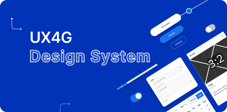
THE UX4G DESIGN SYSTEM

The UX4G Design System consists of these 5 main elements as per the Atomic Design by Brad Frost:
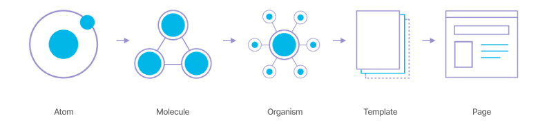
ATOMS
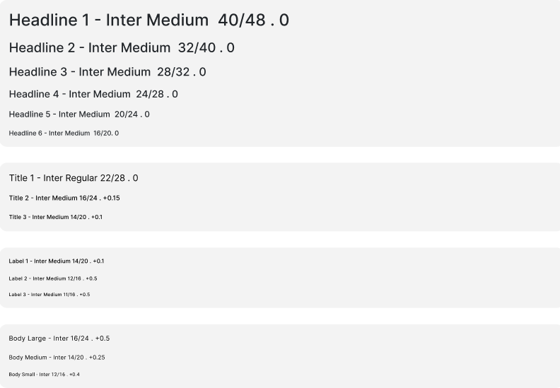
- Typography Tokens: UX4G presents a thoughtfully curated typography system that grants designers access to a diverse array of fonts and styles meticulously crafted to meet stringent government standards. Through prioritizing legibility and clarity, UX4G provides designers with the tools to fashion interfaces that seamlessly blend visual allure with user-centric functionality.
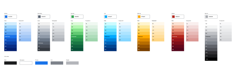
- Color Tokens: The discerningly chosen UX4G color palette serves as a powerful resource, ensuring not only visual charm but also inclusivity in experiences. By embracing this palette, design consistency flourishes, hierarchies are effortlessly established, and vital information finds an effective and engaging channel of communication.
- Elevated Design: A spectrum of elevation values is at the heart of this design system, each value corresponding to a distinct level of prominence. These values elegantly transform cards, dialogs, buttons, and other UI components, bestowing a unified and harmonious visual narrative that resonates cohesively.
- Layout Grid: Immerse yourself in the convenience of UX4G's pre-defined grid layouts, meticulously outlining column widths, gutters, and element spacing. This unwavering grid structure simplifies the design journey, empowering designers to seamlessly align and arrange elements. By embracing the layout grid, an aura of organization, equilibrium, and readability envelops designs, leading to a truly delightful user experience.
- Color Tokens: The UX4G color palette was carefully selected to provide visually appealing and accessible experiences. You can use this palette to maintain consistency, establish hierarchy, and effectively communicate important information.
- Elevations: The design system provides a range of elevation values, each corresponding to a specific level of prominence. These elevation values can be applied to cards, dialogs, buttons, and other UI components, ensuring a cohesive and harmonious visual language
- Layout Grid: The design system includes predefined grid layouts, specifying the column widths, gutters, and spacing between elements. This consistent grid structure simplifies the design process, allowing designers to align and arrange elements with ease. By following the layout grid, designers can maintain a sense of order, balance, and readability in their designs.

MOLECULES
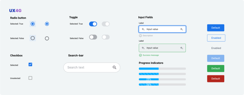
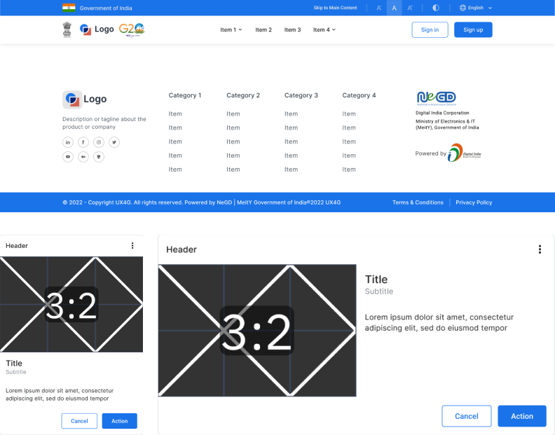
Reusable Components: UX4G provides designers and developers with the seamless ability to create interfaces that boast not only consistency and cohesiveness but also a remarkable degree of versatility. These meticulously crafted components are designed with modularity at their core, offering unparalleled adaptability. This empowers efficient customization, ultimately translating to significant time and resource savings.
ORGANISMS
USABILITY TESTING
After finalizing the initial draft of the UX4G Design System, it was shared with designers and developers across the country to collect feedback and ensure usability. These designers and developers represented diverse government agencies and departments, and they implemented the design system in a selection of their sample projects.
The feedback received from them played a pivotal role in pinpointing areas for improvement. Their insights proved invaluable in identifying usability issues and proposing enhancements. The recurring themes that surfaced encompassed responsiveness across various devices, adept handling of negative and edge cases, and the assurance of a uniform user experience. Drawing from this feedback, the design system underwent iterative refinement and fixes. Design patterns saw enhancements, component behavior was fine-tuned, and documentation was enriched. Regular communication channels were established with both designers and developers to nurture an ongoing collaboration and facilitate the exchange of feedback.
The iterative process of usability testing facilitated a constant enhancement of the UX4G Design System. Through the assimilation of feedback, the design system evolved into a more user-friendly version, effectively addressing usability concerns and catering to the diverse requirements of government platforms.
Development
Platform: HTML, CSS & JS
RELEASE
Version 1 release: 15th June 2023
Check out our development kit: Documentation
We are live on Figma Community: >Figma Design Kit
Thank you
To get started, visit the Figma Community: Figma Design Kit. In the UX4G - Design Kit 1.0, select Get a copy. You’ll get a copy of the file, components, and styles to start using in Figma. Publish the file as a library to make the design kit available through the assets tab to you and your team.
To view the developers kit(code), visit https://doc.ux4g.gov.in/
Let us know what you think! Thank you.